Using Size Traits with SwiftUI
So Many Sizes
This article was written for SwiftUI 1.0.
Nowadays mobile devices come in a dizzying array of sizes and shapes. I’ve got an Android tablet that’s much taller than it is wide (or much wider than it is tall). Apple products also have different sizes ranging from the Apple Watch, to the iPhoneSE, to the iPhone Pro Max, to the iPad, to the Apple TV, and to the iMac and MacBook computers. With Apple’s new generation of operating systems, you will be able to write apps using SwiftUI to run on all these devices with virtually the same code base. So how do you cope with all of the different screen sizes and resolutions?
If you are an Android developer you create layout files (among other things) for the different size screens your app supports. When your app runs, the OS finds the closest layout to the size of the screen of the device and loads that. Your app’s code just refers to the “login” layout and it’s none the wiser about the size of the screen. That’s all well and good, but if your app has a tricky layout, you might have to support a lot of layout files.
Apple has taken a different approach. While you can get the actual size of the device your app is running on and use those dimensions to programmatically set your UI, that’s probably the least attractive way to go. The better alternative is to use size traits.
Size Trait Classes
Size traits basically tell you the shape of the screen using two values in both dimensions. The two values are Regular and Compact. If you take an iPhone and hold it in portrait orientation, the size traits for this will be vertical Regular (or just R) and horizontal Regular as well. In other words, this is the device’s regular orientation. If you turn it to landscape orientation, then the traits change to vertical Compact (or just C) and horizontal R. The screen’s width is still considered normal or regular but vertically it has been compacted.
If you use an iPad, your app’s size traits are always Regular for both dimensions unless you use split screen (to share your app with another app). Then your horizontal size trait becomes Compact. The same will be true with Max size iPhone in landscape mode. If you app supports the main-detail split screen view, your main screen will become Compact.
If you are using UIKit and Storyboards, Interface Builder lets you set your constraints based on different size collections. That is not covered in this post.
The point is, your layout can just react to the size trait and not worry about the actual size or even orientation of the screen.
I’ll use one of my apps as an example. Below is the app running on an iPhone SE. On the left is the app in portrait orientation and the right is landscape orientation. Not very pretty in landscape - some parts have been cut off.

Left: portrait orientation, Right: landscape orientation. Not using size traits.
To solve that, I looked at the vertical size trait and adjusted the scaleEffect modifier of the view to shrink the UI a little so it all appears. Now compare the two screens again:

Left: portrait orientation, Right: landscape orientation. Size trait used to scale the UI.
Using Size Trait Classes
So how do you actually use size traits in a SwiftUI app? It’s actually really simple.
First, in the View you want to adjust based on size, declare @Environment vars for the orientations you are interested in handling. Here I am just looking at vertical:
@Environment(\.verticalSizeClass) var verticalSizeClass
Now I want to scale down my interface based on the size trait, so I set the .scaleEffect modifier accordingly:
VStack(alignment: .center) { // content}.scaleEffect( (self.verticalSizeClass ?? .compact) == .compact ? 0.75 : 1.0 )
Note that
verticalSizeClassis anOptionalso you need to unwrap it in some way.
When you change the orientation of the device, the verticalSizeClass environment value will change and because SwiftUI is now observing it (because you are using it) the body of your View will automatically be re-run and the scale will change.
I went through each of my views in different orientations and on different devices, making note of any adjustments needed. For the View above, scaling it seemed like the most logical choice to fit it all into the space and still be usable. But you have other choices:
Change the spacing between controls. I did that in another
Viewand just reduced some of the white space.Change the size of fonts. You would be surprised what a slightly smaller font can do to make things fit nicely.
Re-arrange the screen as shown below.
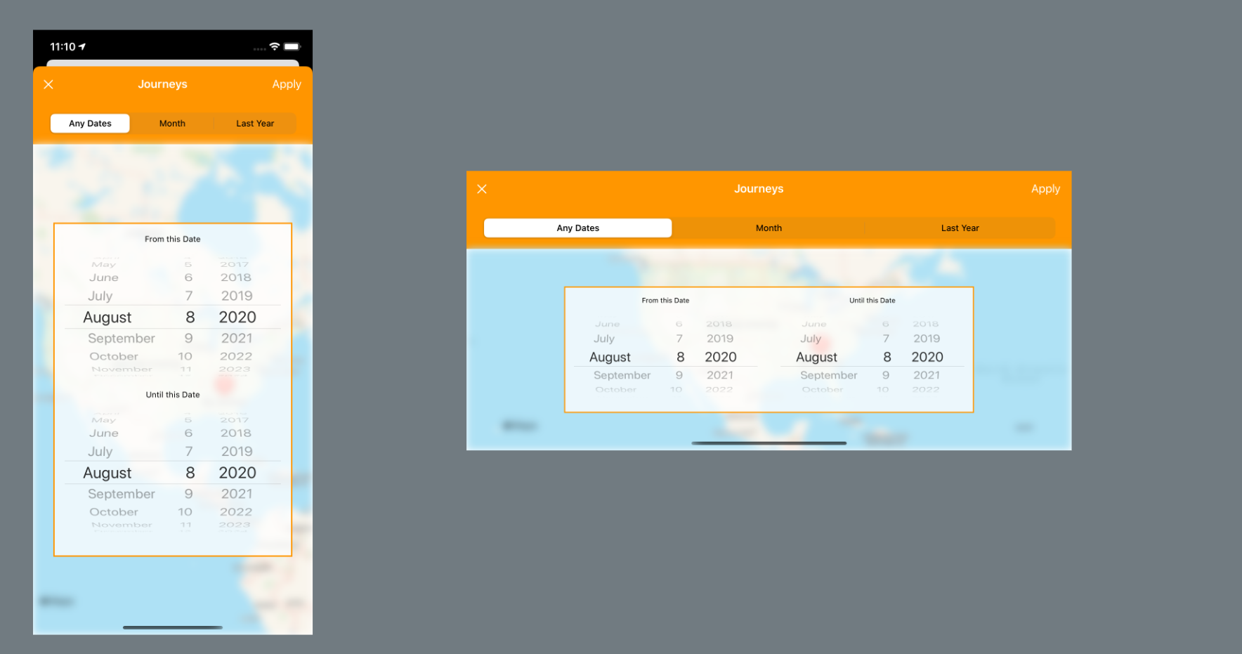
On the left the two DatePickers are arranged vertically while in landscape, on the left, they are arranged horizontally.
if self.verticalSizeClass == .compact {
// arrange elements in an HStack} else {
// arrange elements in a VStack}
Using the size trait classes in SwiftUI is easy:
Declare the
@Environmentvariable for the one(s) you want.Use a test in the layout code to determine how the UI should look based on the value,
CompactorRegular.
That’s all there is to it.