
No Joy At Christmas
A film idea about the first Christmas after a mass shooting.
This is an idea for a movie that I think really needs to be made.
Synopsis
No Joy At Christmas is the story of three families experiencing their first Christmas without their child who was killed that year in a mass shooting at their school.
A single mother with three children who lives with her parents.
A family with two children, twins, one stayed home from school because he was sick.
A single father raising his only daughter.
Plot
The film opens with each family sending their child off to school; just another normal day. The children reach their classroom and the teacher begins the day’s lessons.
Shortly thereafter the door opens, a figure enters, you quickly see a gun. Then the screen goes black.
BANG!
The screen fades to a flashback of one of the children at last Christmas, their little face happy at the presents and being with their family. Over the course of the next few minutes, their past year is replayed showing their family life. The flashback ends on the day the movie started. Then the screen fades to black again.
BANG!
The screen fades to a flashback of another child at their last Christmas and their year of happy times and memories. The flashback ends on the day the movie started. The screen fades to black again.
BANG!
The screen fades to a flashback of the last child at their last Christmas and quickly follows their year leading up to the fateful day they left for school. The screen fades to black.
BANG! BANG! BANG!
The screen returns and its just a few days before this Christmas. We see how each family is coping.
How does a single father, who now has no child, get through a Christmas, get through his daughter’s birthday? How does he handle the media coverage? Worse perhaps, how does he handle life when it feels like he’s been forgotten as the Country has moved on to another mass shooting?
How does a twin cope with the loss of his brother, his closest friend, at Christmas when they’d open their presents together and share them? How do the parents deal with the loss? Does their family survive?
How does the older brother, who just started high school, handle the anger he feels, the helplessness? How does he handle the harassment by insensitive politicans who claim its all a hoax? How does his single mother get through the day and provide a Christmas for the little one who misses her older sibling?
There is no joy at Christmas for the victims of gun violence.

SwiftUI Modifiers
Modifiers in SwiftUI can do more than apply styling.
Modifiers, in SwiftUI, are like styles in other systems. Modifiers simply add more features to a component view. For example, changing the background color of an HStack to blue or changing its foreground color to white. When you declare a component view you very often give it at least one modifier (I assume padding() is a top favorite).
Custom Modifiers
You can, of course, create your own modifiers. They behave mostly like the built-in ones, and can be a handy way to avoid replicating the same set of modifiers. For instance, you might want all of your primary buttons to be capsule-shaped, have a green background, with bold white lettering, and with a subtle shadow:
Button("Push Me") { }
    .padding(10)
    .background(Capsule().foregroundColor(.green))
    .foregroundColor(.white)
    .font(.system(size: 17, weight: .bold, design: .default))
    .clipped()
    .shadow(radius: 6)
That’s a bunch of code to duplicate each time you want to have a primary-style button in your app, so a custom modifier is the way to go:
struct PrimaryButtonModifier: ViewModifier {
    func body(content: Content) -> some View {
        content
            .padding(10)
            .background(Capsule().foregroundColor(.green))
            .foregroundColor(.white)
            .font(.system(size: 17, weight: .bold, design: .default))
            .clipped()
            .shadow(radius: 6)
    }
}
And its now easy to apply:
Button("Push Me") { }
    .modifier(PrimaryButtonModifier())
Packaging a bunch of styling modifiers into a single place is nice and all, but modifiers can be even more helpful. Here are two examples that I’ve recently created.
Tap to Copy
I have this app which displays a bunch of Text components inside of a Form. I wanted the user to be able to tap on one and have the text copied to the clipboard. Because I had more than one of these, I created a modifier to do it:
struct CopyModifier: ViewModifier {
    let field: String

    @State private var showCopyAlert = false

    func body(content: Content) -> some View {
        content
            .contentShape(Rectangle())
            .onTapGesture {
                UIPasteboard.general.string = field
                showCopyAlert.toggle()
            }
            .alert("Field was Copied", isPresented: $showCopyAlert) {
                Button("OK", role: .cancel) { }
            }
    }
}
This modifier has a property, field, which is the string to copy. The body of the modifier:
adds a
contentShapeso it has a large tappable area. I do this withHStackcomponents to make sure even the whitespace in it can be tapped;uses the
onTapGestureto receive the tap and copy thefieldto the clipboard (akaUIPasteboard). Then it triggers analert;adds an
alertto let the user know the field was indeed copied.
Now you can use it like this:
HStack {
    Text(data.field1)
    Spacer()
}.modifier(CopyModifier(field: data.field1))
Hide Sheet
In one of my apps, I wanted to make sure any sheets being displayed were closed when the app became inactive. In a non-SwiftUI app I might have sub-classed the view and handled the event there, but since we cannot subclass structs, the next best thing was a modifier. Since I had a few sheets in the app, I created a modifier to do it:
struct HideSheetModifier: ViewModifier {
    @Environment(\.presentationMode) var presentationMode
    @Environment(\.scenePhase) var scenePhase

    func body(content: Content) -> some View {
        content
            .onChange(of: scenePhase) { newPhase in
                switch newPhase {
                case .inactive:
                    presentationMode.wrappedValue.dismiss()
                default:
                    break
                }
            }
    }
}
You apply this modifier to the top level View of your sheet and it:
uses the
@Environmentobject,scenePhase, to detect when the app is going inactive;uses the
@Environmentobject,presentationModeto dismiss the sheet.
This modifier will only apply to any sheets active, usually one, but if you layer of sheets, this will dismiss each one that has this modifier.
Summary
SwiftUI modifiers are not just for making things look good and simplifying styling. Modifiers can be pretty powerful and really extend the function of Views. Modifiers can use @Environment and @EnvironmentObject objects, be passed properties, apply gestures, etc. Since they are structs you can also make use of @State and @StateObject as well as having functions of their own.
I suspect my future apps will have way more modifiers than they do now. I hope yours do too.

An Introduction to Combine
Replace the Delegate pattern with Combine
Using Combine to Replace the Delegate Pattern
Preface
There are now a lot of articles and books about Combine. You’ve probably tried it yourself. Maybe you thought it was just for SwiftUI and since you haven’t migrated apps to SwiftUI, you’ve ignored it for now. Well, I decided to hop on the Combine bandwagon at the urging of a co-working, and it was quite the revelation. Making me think in a whole new way. SwiftUI makes you think differently about writing UI code, and relies on Combine, but extracting Combine and using it with a UIKit app, can really drive home its power.
So I’ve cooked up a little example to show how you can replace a very well used design pattern, the Delegate Pattern, with Combine. I will skip the Combine intro since you can find that in many places now. Just suffice it to say that you have publishers and subscribers and I’ll show how these are used in place of delegates.
Set Up
Let’s set up a simple project to illustrate how to replace the Delegate Pattern with Combine publishers and subscribers.
I’m calling the project FoodFacts because I will expand on this in a future article and use the foodfacts.org API. But for now, the concentration will be on an example to show how delegates can be replaced with Combine.
In this example we’ll have a blank screen with a User Profile button that calls up a sheet with fields for a user’s first and last names along with a Save button. The idea is to transfer the data entered into the fields back to the calling UIViewController.
Your first reaction to doing something like this would be to create a UserProfileViewController and a UserProfileViewControllerDelegate. The main UIViewController would implement the delegate and when the Save button on the UserProfileViewController sheet was picked, invoke the delete’s function to transfer the values back. Here’s how you would do the same thing with Combine.
The code below shows the ViewController (the main controller) and the UserProfileViewController. There is a storyboard that goes with this but that is not particularly germane to this example.
class ViewController: UIViewController {

    @IBOutlet weak var yourNameHere: UILabel!

    override func viewDidLoad() {
        super.viewDidLoad()
        // Do any additional setup after loading the view.

        title = "Food Facts"
    }
}

class UserProfileViewController: UIViewController {

    @IBOutlet weak var firstName: UITextField!
    @IBOutlet weak var lastName: UITextField!

    override func viewDidLoad() {
        super.viewDidLoad()
        // Do any additional setup after loading the view.
    }

    @IBAction func saveProfile(_ sender: Any) {
        // to do
        dismiss(animated: true, completion: nil)
    }
}
You can see in the UserProfileViewController the action for the button as saveProfile(_:Any) which right now, just dismisses the sheet.
Now Combine
The first thing we’re going to do to UserProfileViewController is
import Combine
This brings in the Combine framework so you can begin using it. The idea is that when the Save button is picked, rather than calling upon a delegate and using its functions, we’re going to publish the values and the main ViewController is going to receive them and use them.
Essentially, the class you would normally use to implement a delegate’s method is the subscriber while the user of the delegate is the publisher.
Now we need something to publish. I created a simple UserProfile struct that contains the first and last name values and this is what will get published.
struct UserProfile {
    let firstName: String
    let lastName: String
}
Switching back to UserProfileViewController, add this line below the @IBOutlets:
public var userDataPublisher = PassthroughSubject<UserProfile, Never>()
This line creates a PassthroughSubject publisher that simply passes on whatever values it is given to send. Values that are UserProfile type and this publisher never produces any errors (ie Never).
Down in the saveProfile function, add these lines:
if let firstName = firstName.text, let lastName = lastName.text {
    let profile = UserProfile(firstName: firstName, lastName: lastName)
    userDataPublisher.send(profile)

    // done with this controller
    dismiss(animated: true, completion: nil)
}
Once the text from the first and last name UITextFields are extracted, a UserProfile is created from them and then sent through the userDataPublisher. That’s it. There is no delegate to access, you are just sending out a UserProfile to whatever is listening for it.
To that end, switch over the ViewController and import Combine into this file, too. Once you’ve done that, we need to subscribe to the userDataPublisher in UserProfileViewController.
I set the project up to use segues right in the storyboard, so we need to intercept the segue. If you were doing this with a delegate you would probably do that is the same place.
Override a function in ViewController called prepare(for:UIStoryboardSegue,sender:Any?) like this:
override func prepare(for segue: UIStoryboardSegue, sender: Any?) {
    if let destination = segue.destination as? UserProfileViewController {
        destination.userDataPublisher
            .sink(receiveValue: { (userProfile) in
                print("Received profile: \(userProfile)")
                self.yourNameHere.text = "Welcome, \(userProfile.firstName) \(userProfile.lastName)"
            })
    }
}
Once you’ve secured the destination UserProfileViewController, you set up the subscription. That’s done using the .sink function provided by the publisher interface. The value being received is the UserProfile created in the saveProfile function of UserProfileViewController. In this example I’m printing it out as well as setting the UILabel.
But wait, there’s a problem: the compiler is flagging the .sink with a warning that its return value is not being used.
One important thing about Combine publishers is that they don’t work without subscribers (which you created with the .sink). And subscribers do not exist unless you keep them someplace. The result of the .sink is something called a Cancellable which allows you to programmatically cancel a subscription which then means the publisher will no longer publisher.
At the top of the file, below the @IBOutlet for the UILabel, add this line:
private var userProfileSubscription: AnyCancellable?
This will hold the result of .sink. Here is the completed prepare function code:
override func prepare(for segue: UIStoryboardSegue, sender: Any?) {
    if let destination = segue.destination as? UserProfileViewController {
        userProfileSubscription = destination.userDataPublisher
            .sink(receiveValue: { (userProfile) in
                print("Received profile: \(userProfile)")
                self.yourNameHere.text = "Welcome, \(userProfile.firstName) \(userProfile.lastName)"
            })
    }
}
So what’s happening?
When the button in the UI is tapped to trigger the segue,
prepareis called.The
UserProfileViewControlleris assigned to thedestination.A subscription is created to the
userDataPublisherinUserProfileViewController.The subscription is stored in the
userProfileSubscriptionso it can be cancelled but more important, it will not disappear when thepreparefunction ends.
So now you can run the app.
Tap on the User Profile button. The sheet slides up.
Fill in the first and last name fields.
Tap Save.
The first and last name are printed and appear in the
UILabel.
Instead of using a delegate, you have used Combine. You published the data you wanted to transfer and picked that up by the ViewController.
The benefits to this are not obvious at first, except maybe that there is a good separation of the two parts (ViewController and UserProfileViewController). Any part of the app that has access to the publisher can subscribe to it. If the user’s profile is something that could change at any time from anywhere, you might consider moving the publisher out of UserProfileViewController to some place more universal and the view controller just becomes the interface to publish the changes and multiple places could pick it up. One place might change a greeting on the main navigation bar. Another place might store the profile in a database locally while another part of the app sends it off to a remote system. That just is not easily achieved using delegates.
Completion
The thing about publishers is that they keep publishing while there are subscribers and while they haven’t completed. Right now, the userDataPublisher sends out the UserProfile and then the UserProfileViewController is dismissed. A better way is to send all the data and when finished, send a completion. Open UserProfileViewController and go to the saveProfile function and add this line right below the send call:
userDataPublisher.send(completion: .finished)
What this does is send a notice of completion to all subscribers (aka, ViewController) that says “this is all I’m going to send, I’m done.” Now back in ViewController, change that .sink expression to this:
.sink(receiveCompletion: { finalResult in
        print("Final Result is: \(finalResult)")
 }, receiveValue: { userProfile in
        print("Received profile: \(userProfile)")
        self.yourNameHere.text = "Welcome, \(userProfile.firstName) \(userProfile.lastName)"
})
The .sink now has two parts: one to handle the completion event and one to handle the received value. In the receiveValue part, the UserProfile is put to use while in the receiveCompletion the finalResult is just printed. If you run this now, fill in the first and last names and pick the Save button, not only does the UserProfile get picked up, but the send(completion: .finished) is picked up in the receiveCompletion part and “finished” is printed.
This is a little more complex, but you’ll see below how useful this can be. In the meantime, remove the dismiss call from the saveProfile function of UserProfileViewController and put it inside the receiveCompletion handler.
Since the ViewController is responsible for presenting the User Profile sheet, it should also be responsible for taking it away. A great place to do that is in this completion handler of the .sink.
.sink(receiveCompletion: { finalResult in
        print("Final Result is: \(finalResult)")
        self.dismiss(animated: true, completion: nil)
}, receiveValue: { userProfile in
        print("Received profile: \(userProfile)")
        self.yourNameHere.text = "Welcome, \(userProfile.firstName) \(userProfile.lastName)"
})
If you run the app now, it works just as it did before, but the Save button code won’t dismiss the sheet; it gets dismissed as a result of sending the completion. Think about this for a second: the sink’s receiveValue is called each time the publisher has something to send. The receiveCompletion is called when a finish (or a failure - more on that below) is sent; this also closes the publisher and prevents any more things from being sent. It gives you an opportunity for clean up: close a dialog (like here), clear memory, save data, etc.
Improvements
While things are working, this is not the best way to implement it. One problem is that any object that gets hold of the userDataPublisher can publish UserProfile values. You really do not want that. Instead, for this example, you want only the UserProfileViewController to publish and ViewController to subscribe but not have the ability to publish.
Open UserProfileViewController again. You’re going to make a bunch of small changes which ultimately hide the actual publisher and offer a proxy instead which can only be used to listen for events.
First, rename userDataPublisher to userDataSubject and make it private as in:
private let userDataSubject = PassthroughSubject<UserProfile, Never>()
Ignore the compiler warnings and errors and add a new userDataPublisher:
public var userDataPublisher: AnyPublisher<UserProfile, Never> {
    userDataSubject.eraseToAnyPublisher()
}
From ViewController’s point of view, nothing has changed. The userDataPublisher is still a publisher. It’s a ‘generic’ publisher that sends out UserProfiles and never fails. The benefit here is only UserProfileViewController can send events due to userDataSubject being private. The generic AnyPublisher can only publish.
One more thing: the saveProfile has to use userDataSubject and not userDataPublisher so change that over, too.
When you run the app, it behaves just as it did, but now the publisher is more secure.
Errors
Up until now, the publisher sent out UserProfiles, but not errors. But what if the stuff you are having the user enter has an error in it? For example, they forget to enter the last name.
When you use delegates, you can handle this a number of ways: allow empty strings or nils to be sent through and let the ViewController worry about it. That’s not really good. A better way is to make use of the Error portion of Combine publishers.
Go back to UserProfile and add in this custom Error:
enum UserProfileError: LocalizedError {
    case firstNameMissing
    case lastNameMissing

    var errorDescription: String? {
        switch self {
        case .firstNameMissing: return "First Name is missing"
        case .lastNameMissing: return "Last Name is missing"
        }
    }
}
Go back into UserProfileViewController and change both the userDataSubject and userDataPublisher lines by replacing the Never error type with UserProfileError as the error type:
private let userDataSubject = PassthroughSubject<UserProfile, UserProfileError>()
public var userDataPublisher: AnyPublisher<UserProfile, UserProfileError> {
    userDataSubject.eraseToAnyPublisher()
}
You have to tell what you are publishing: the type of data (UserProfile) and the type of Errors (UserProfileError). Now make these changes to the saveProfile function:
@IBAction func saveProfile(_ sender: Any) {
        // create a UserProfile from the text fields and publish it
        if let firstName = firstName.text, let lastName = lastName.text {

            if firstName.isEmpty {
                userDataSubject.send(completion: .failure(.firstNameMissing))
            } else if lastName.isEmpty {
                userDataSubject.send(completion: .failure(.lastNameMissing))
            } else {
                let profile = UserProfile(firstName: firstName, lastName: lastName)
                userDataSubject.send(profile)
                userDataSubject.send(completion: .finished)
            }
        }
    }
Rather than just blindly send out whatever is entered into the first and last name fields, we’re going to check for validity and if either one is missing (blank), a failure is sent rather than a UserProfile or the .finished completion.
Think about this for a minute: when the data is good, you
sendit. But if there’s a problem, youfailit. And you can fail it with a customErrorthat can be as simple as static cases or it can include more data and information; whatever you need to convey the problem.
This gets handled in the .sink’s receiveCompletion handler back in ViewController:
      if case .failure(let error) = finalResult {
          let alert = UIAlertController(title: "Missing Data", message: error.localizedDescription, preferredStyle: .alert)
          alert.addAction(UIAlertAction(title: "OK", style: .default, handler: nil))
          self.present(alert, animated: true, completion: nil)
      }
I think if case is a new construct for Swift so its syntax is a little strange, but it lets you test enum values which are not Equatable without a full switch statement. If the finalResult is a failure, this will post an alert with the message from the error. If you run the app again and leave out one of the fields from the sheet, you’ll see the Alert pop up.
Summary
What I’ve done is abolish the Delegate Pattern, at least for simple things. If you have controllers with complex delegates, Combine might not be the best thing, but keep in mind that Combine can do some powerful stuff (like filter and map) or perhaps you will need several publishers. Making your app more reactive should also make it less vulnerable to problems and more easily scalable.
This is the complete ViewController.swift file. You can see that in the .sink completion, the dismiss function’s completion handler is used to examine the failure. This makes sure the sheet has been removed before posting the Alert; iOS gets touchy about having multiple view controllers showing up at the same time.
import UIKit
import Combine

class ViewController: UIViewController {

    @IBOutlet weak var yourNameHere: UILabel!

    // must retain the subscription otherwise when `prepare` function exits the
    // subscription will cancel.
    private var userProfileSubscription: AnyCancellable?

    override func viewDidLoad() {
        super.viewDidLoad()
        // Do any additional setup after loading the view.

        title = "Food Facts"
    }

    override func prepare(for segue: UIStoryboardSegue, sender: Any?) {
        if let destination = segue.destination as? UserProfileViewController {

            // when the segue is about to begin, set up the subscription to the publisher
            // to get the user profile data
            userProfileSubscription = destination.userDataPublisher
                .sink(receiveCompletion: { finalResult in

                    self.dismiss(animated: true) {

                        // using a custom Error you can give very specific feeback to the user
                        if case .failure(let error) = finalResult {
                            let alert = UIAlertController(title: "Missing Data",
                                            message: error.localizedDescription,
                                            preferredStyle: .alert)
                            alert.addAction(UIAlertAction(title: "OK",
                                                          style: .default,
                                                          handler: nil))
                            self.present(alert, animated: true, completion: nil)
                        }
                    }
                    // get rid of this dependency
                    self.userProfileSubscription = nil

                }, receiveValue: { userProfile in
                    self.yourNameHere.text = "Welcome, \(userProfile.firstName) \(userProfile.lastName)"
                })
        }
    }
}
This is the complete UserProfileViewController.swift file.
import UIKit
import Combine

class UserProfileViewController: UIViewController {

    @IBOutlet weak var firstName: UITextField!
    @IBOutlet weak var lastName: UITextField!

    // keep the publishing subject private so nothing else can publish data to it.
    private let userDataSubject = PassthroughSubject<UserProfile, UserProfileError>()

    // make this generic publisher availble instead and it can only be used to
    // listen for changes
    public var userDataPublisher: AnyPublisher<UserProfile, UserProfileError> {
        userDataSubject.eraseToAnyPublisher()
    }

    override func viewDidLoad() {
        super.viewDidLoad()
        // Do any additional setup after loading the view.
    }

    @IBAction func saveProfile(_ sender: Any) {
        // create a UserProfile from the text fields and publish it
        if let firstName = firstName.text, let lastName = lastName.text {

            if firstName.isEmpty {
                userDataSubject.send(completion: .failure(.firstNameMissing))
            } else if lastName.isEmpty {
                userDataSubject.send(completion: .failure(.lastNameMissing))
            } else {
                let profile = UserProfile(firstName: firstName, lastName: lastName)
                userDataSubject.send(profile)
                userDataSubject.send(completion: .finished)
            }
        }
    }
}
This is the complete UserProfile.swift file containing both the UserProfileError and the UserProfile itself.
struct UserProfile {

    let firstName: String
    let lastName: String
}

enum UserProfileError: LocalizedError {
    case firstNameMissing
    case lastNameMissing

    var errorDescription: String? {
        switch self {
        case .firstNameMissing: return "First Name is missing"
        case .lastNameMissing: return "Last Name is missing"
        }
    }
}

Using Targets to structure your IOS app
Using targets to separate your concerns.
Just thought I’d pass this concept along. If your app is big (code-wise) or is going to be big or you think it may become big, here is a technique to help you manage all of the parts in a nice, testable, compact way.
When you first start out writing iOS apps, you may have a vague notion about “targets” which is, simply, the thing that gets built. In other words, your app; the target of the build process is your app. You may have asked yourself, why would I want to use multiple targets in a project? One reason may be you have a Watch app to complement your app or you may have a Widget. Here, though, I will show you how you can use targets to organize your code to make your app more manageable.
I don’t have a GitHub repository this time, because the code itself is almost irrelevant. Its the concept here that’s important.
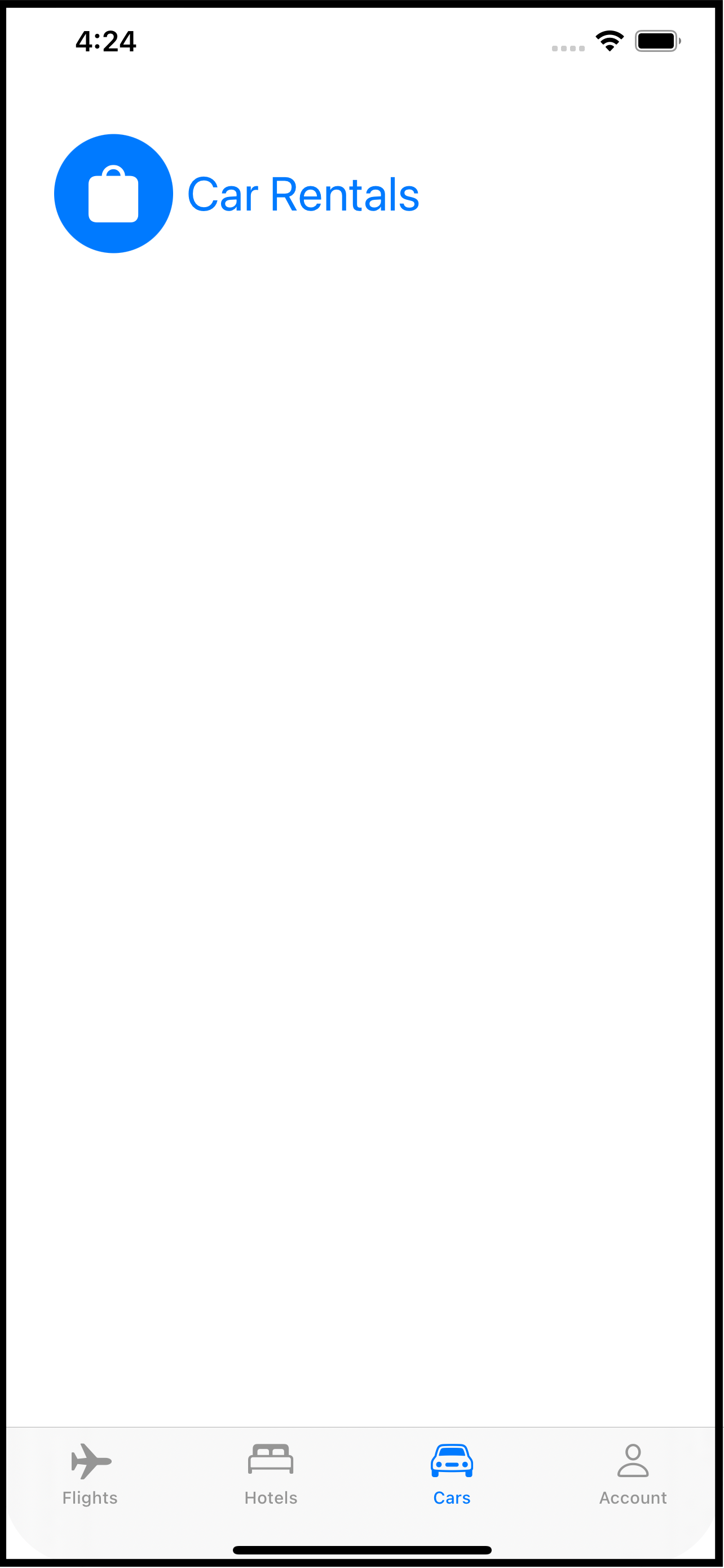
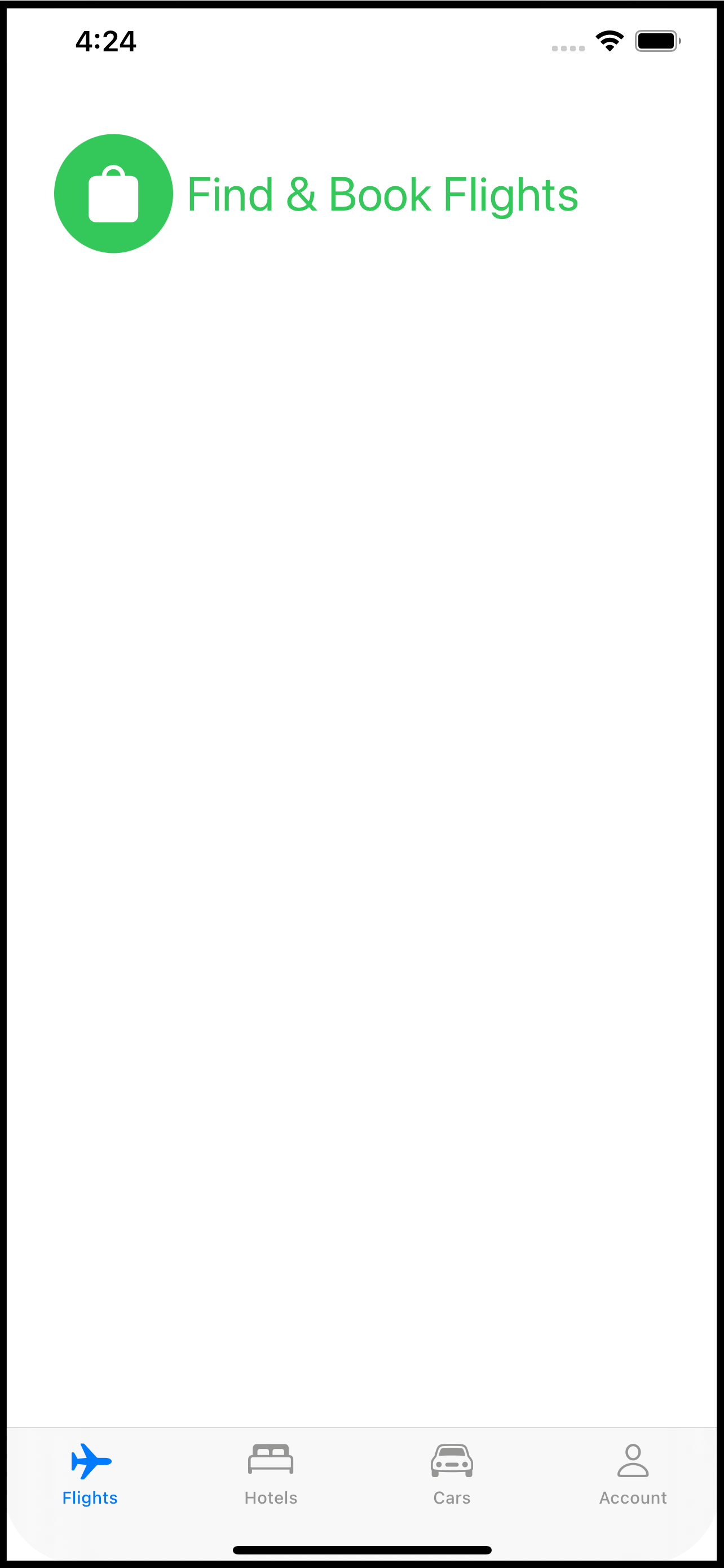
So imagine you have a travel app. The app has four distinct parts: booking a flight, reserving a hotel room, renting a car, and managing your travel account. For the sake of making my point, further imagine each of these parts has its own tab in the app. It is not important to this technique that your app use tabs but it is important that you divide your app into separate functional bits. Using tabs as an example makes it easier to conceptualize.
When you think about this app, it’s pretty clear that there are four distinct UI pieces. But there are a lot of things each piece shares. For example, string, graphic and color assets. Your app might also need to present a login screen at any time on any tab. Your app might have extensions to classes like Date, String, or View that are used on all of the screens involved with each tab.
Your app could be divided as follows (not comprehensive, just a sample):
Common Code
Assets (string, color, graphic)
Services (connection to remote systems)
Class extensions (Date, String, etc.)
Data models
Shared views (calendar picker, price calculator, chat with travel agent, login)
The App Itself
AppDelegateContentView
Booking tab
Booking View
Flight schedules
Flight selector
Hotel tab
Hotel View
Reservation systems
Car rental tab
Car Rental View
Car rental company selector
Rates and discounts view
Account tab
Profile View
Preferences and personal settings
Payment information
One more thing for your imagination: can you see developing each of things things almost independently? For example, booking flights by designing the screens to do that, updating the common data models, sending and receiving data between the app and the backend booking systems. That set of views that make up the booking tab is almost in and of itself, an app.
And this is where Xcode targets come in. Each of those bullet points above could be an Xcode target. Doing that separates the parts and allows each part to be independently built and tested. Each time you create something you can ask, “Is this going to be used exclusively here or could it be used in another part of the app?” If the answer is the latter, then you put that into the Common target.
Doing this is easier than you might think. If you already have an Xcode project set up to build an iOS app, follow these steps to add another target:
Select File-> New -> Target from the File menu.
In the dialog that appears, scroll down to the Application section and pick “App”. If you are a seasoned Xcode you, you could actually use something else, but picking an actual App as a new target allows you to run your code on its own. For example, as you build the Account target, your app can log into the backend system, create a user, update it, etc. You do not need to launch the whole (Main) app to test these pieces.
On the next screen, fill in the name (eg BookingModule or BookingTab) and pick Finish.
Your target is now part of your Xcode project. If you look at the schemes menu, you will see each appearing which means each can be built, tested, and run separately.
Go head back to the Common target which you can add in exactly the same way. The purpose of this target is to be a single place for all of the code that’s shared between the other targets. To use any of the code in this target (Common) with another target (say, Booking), you need to make sure it is included in the build for that target.
Pick a file in the Common target and open the File Inspector (options+command+1). There’s a section in the panel called “Target Membership”. The Common target will already be selected. Check the box next to all of the other targets that will use this common file.
You may have heard or read that building your own SDK is a good idea (such as the code that would be in the Common target of this example). And it is - it certainly makes building your app faster as the code in the SDK is built once, on its own, and just linked into the app. That would be the next level beyond this technique and if you want to do that, go for it!
Once all of the files are selected to be included in the right targets you can assemble the app in the App target. This will be the original target that is the app itself. It will be just like building an app normally, except most of the files will reside in other targets.
The advantages to this technique are:
Forces you to think about your app as an assembly of parts.
Each part of the app is nearly independent and can be run and tested, to some degree, without the other parts. Don’t under estimate the value here. While you develop the hotel reservation target, your QA team could be testing the flight booking target.
Organizing common code into its own target makes it easier to update as the changes apply across the app.
Faster on-boarding of new team members and its easier to divide up the work.
How you divide your app up is, of course, up to you. But if this gets you thinking about code organization - even if you just use folders instead of targets - then it will be worth it. New members to the team will have a much easier time figuring out where things are and how the app works.
Happy Coding

Modal Dialogs with SwiftUI
A centralized way to display modal dialogs from anywhere inside a SwiftUI app.
A modal dialog is an interaction that interrupts the normal workflow and prevents anything happening except the dialog. The old Alert is a perfect example. When an Alert comes up you can do nothing but engage with the Alert.
SwiftUI has the Alert, but if you want to roll your own modal dialogs you have a take some things into account. You can use a SwiftUI Alert anywhere in your app. When the Alert is activated, it rises about all other content and puts up an input block to the rest of your app. Once the Alert has been addressed, it and the block go away.
And this is a key point: it rises above all other content no matter where in your View hierarchy it has been dispatched. If you want this same behavior in a custom modal dialog, you have to place it at the top of your View hierarchy, generally on the ContentView or whatever you are using as your main View.
I’ve come up with a way that makes it easier to mange and allows you to invoke your dialog anywhere in your app. The solution lies with two things: ObservableObject (in the form of a model) and enums with associated values.
A little while ago I wrote two blog articles: MultiDatePicker and custom sheets using .overlay. I’m going to combine these two in this article to show you what I came up with.
The Problem
First, it is not important that you use MultiDataPicker. I am using it here because its a control that takes a binding element and could work well as a modal dialog. But I could also use a TextField just as well. The custom sheets article basically moves the presentation of the sheet into a ViewModifier. I will use some of that here.
Secondly, I am creating a single modal dialog, but if you want to have different types (eg, pick a date, enter a phone number, rate a restaurant, etc.), you can easily adapt this example.
The idea is that from anywhere in your app you want to present the user with a modal dialog. The dialog should be above everything else and it should provide an input blocker so the user cannot use the app without addressing the modal dialog. Now I’m not saying using modal dialogs is a good or bad idea. But sometimes you need to get some info from the user at a particular point in time. For example:
You are on a travel site and pick the tab at the bottom for hotels.
The tab shows you a view with a list of hotels. You tap one of the hotels and navigates to a detail view about that hotel.
You pick the “Reservations” button, taking you a step deeper into the app to the reservations view.
Now you are on the Reservations view with a place to set your dates. You have traveled to:
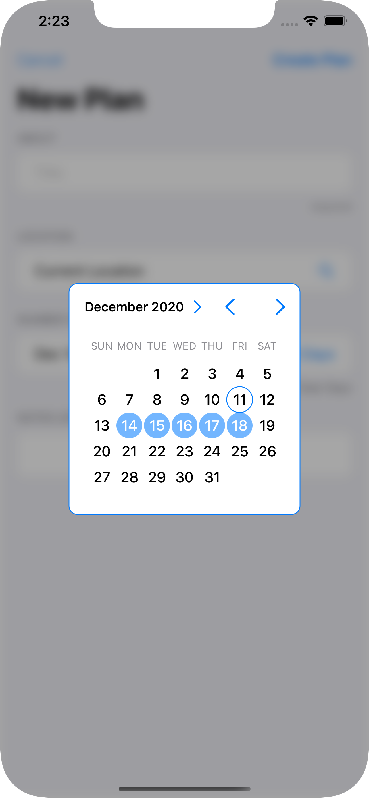
ContentView->Hotel List View->Hotel Detail View->Reservations View.You now tap the dates field. If the app uses the SwiftUI
DatePickeryou are golden because it already operates as a modal dialog. But the developer of this app wants you to pick a date range (eg, check in, check out) decided to useMultiDatePickerinstead.The
MultiDatePickerappears floating above all other contents - the Navigation bar and the Tab bar, too, not just the content of the Reservations Screen (which might actually be a sub-area of another screen).
The Solution
The Dialog Model
We begin with the Dialog Model. This is a class that implements ObservableObject because we want to use it to set the type of dialog to open.
class DialogModel: NSObject, ObservableObject {
    @Published var dialogType: DialogType = .none
}
You see that it has a single @Published value for the dialogType. That is an enum defined as follows:
public enum DialogType {
    case none
    case dateDialog(Binding<ClosedRange<Date>?>)
  // add more enum cases and associated values for each dialog type.
}
What’s interesting about this enum is that for the dateDialog member, there is an associated value of ClosedRange<Date>? wrapped as a Binding. And it just so happens the MultiDatePicker has an initializer that also calls for an optional closed date range.
The Dialog Modifier
The next thing we are going to do is create a ViewModifier to activate the modal dialog based on the dialogType value of the DialogModel.
private struct DialogModifier: ViewModifier {

    // 1.
    @ObservedObject var dialogModel: DialogModel

    func body(content: Content) -> some View {
        content
            // 2.
            .overlay(
                Group {
                    switch dialogModel.dialogType {
                    // 3.
                    case .dateDialog(let dateRange):
                        ZStack {
                           // 4.
                            Color.black.opacity(0.35)
                                .zIndex(0)
                                .onTapGesture {
                                    withAnimation {
                                        self.dialogModel.dialogType = .none
                                    }
                                }
                            // 5.
                            MultiDatePicker(dateRange: dateRange)
                                .zIndex(1)
                        }
                        .edgesIgnoringSafeArea(.all)
                    default:
                        EmptyView()
                    }
                }
            )
    }
}
Some important bits about this DialogModifier:
This
ViewModifierneeds to use theDialogModelinstance, so it is declared as an@ObservedObjectbecause it implements theObservableObjectprotocol and because we want this to react to changes in its@Publishedmember,dialogType.An overlay is used to place Views above the
content. AGroupis used to select what to put into the overlay: anEmptyViewif no dialog is being displayed or aZStackwith the overlay Views.A
switchandcasestatement select for the dialog and grabs theBindingfrom the enum’s associated value.A simple
Coloris used for the blocker and a tap gesture set to make it possible to dismiss the dialog.The
MultiDatePickeritself, passing theenum’s associated value (dateRange) at initialization.
One thing to note: use static .zIndex values if using transitions with Views (which I did not use here, but you might want them).
Now let’s make this clean to use in the application with a little View extension:
extension View {
    func dialog(_ model: DialogModel) -> some View {
        self.modifier(DialogModifier(dialogModel: model))
    }
}
Applying the Dialog Modifier
This little extension function makes it a little bit nicer to apply the modifier:
import SwiftUI

@main
struct PlanWizardApp: App {
    // 1.
    @StateObject var dialogModel = DialogModel()

    var body: some Scene {
        WindowGroup {
            ContentView()
                // 2.
                .environmentObject(dialogModel)
                // 3.
                .dialog(dialogModel)
        }
    }
}
Declare and instantiate the
DialogModel. You want this to stick around so use@StateObject.Pass the
DialogModeldown into the app content views.Apply the
DialogModifierthrough the handy extension function, passing along theDialogModel.
That has set everything up. I told you that the dialogs needed to be at the top level, so it is in the App definition! When the DialogModel’s dialogType enum is set, the DialogModifier will take notice and display the appropriate dialog as an overlay on ContentView.
Showing the Dialog
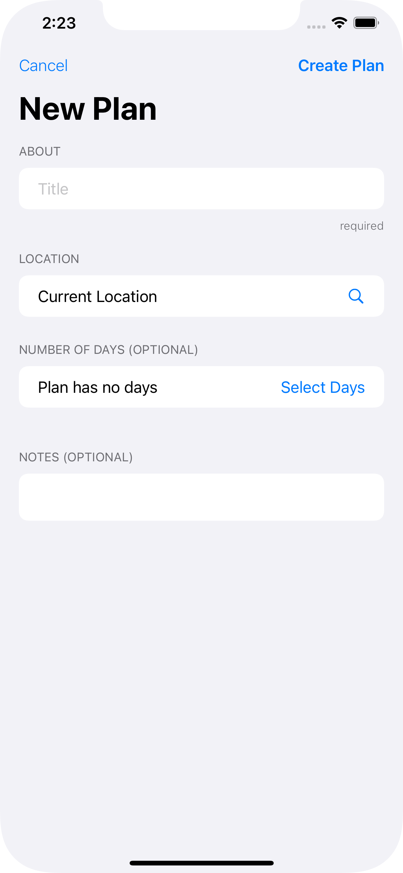
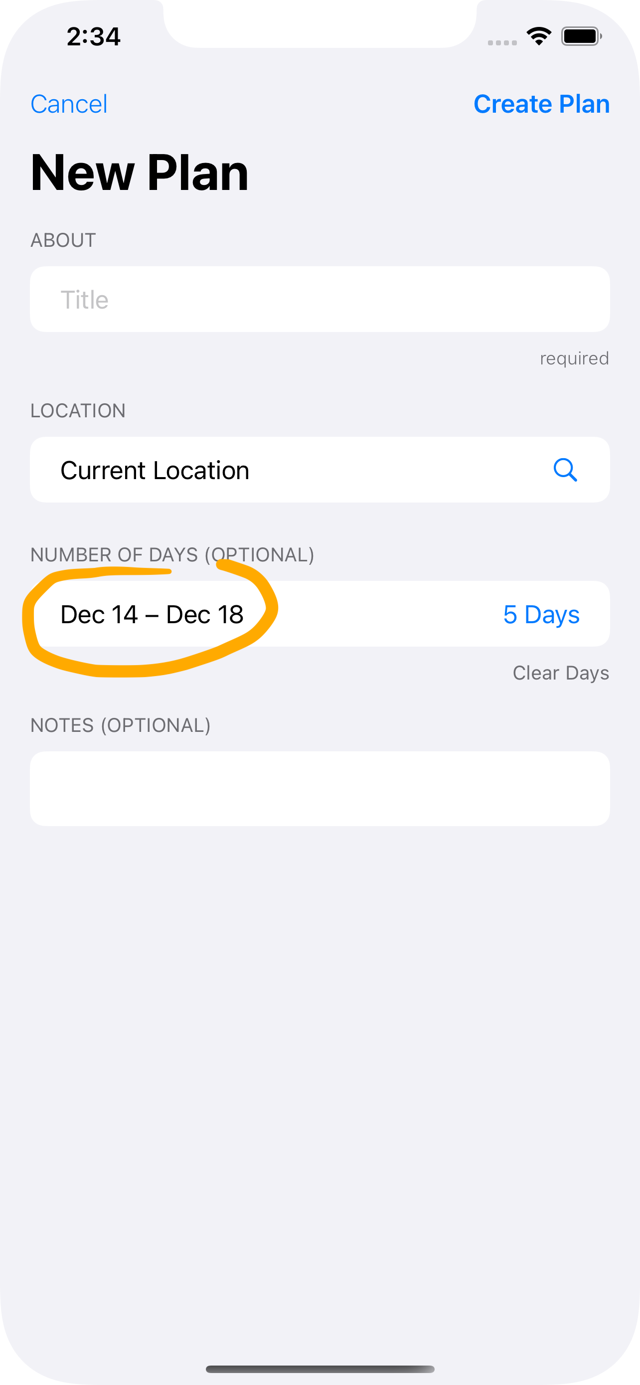
So how do you actually make this work? Let’s assume you’ve got a Form someplace and it is from there you want to pop up the MultiDatePicker and display a date:
// 1.
@EnvironmentObject var dialogModel: DialogModel
// 2.
@State private var dateRange: ClosedRange<Date>? = nil
Form {
  // ...
  Section(header: Text("Dates")) {
    HStack {
      Text("\(dateRange)") // 3.
      Spacer()
      Button("Pick Dates") {
        // 4.
        self.dialogModel.dialogType = .dateDialog(self.$dateRange)
      }
    }
  }
}
Bring in the
DialogModelfor use in this View (see step 4).Declare a
varto hold the selected date range. In a real app you probably have this as part of some data model.Display the range selected. You will need a little more code here, but the idea is to show that this value has in fact changed.
Here is the key. When the
Pick Datesbutton is tapped, theDialogModelis set with the.dateDialogvalue and the associated value for theenumis set as a binding toself.dateRange. This is passed into theMultiDatePickerby theDateModifier. And because thedialogTypeis an@Publishedvarof theDialogModel, SwiftUI will cause theDateModifierto be executed and theMultiDatePickerwill appear as an overlay ofContentViewinside aZStack.
Summary
Maybe the ending was a little anticlimactic, but I think it paid off nicely.
Overlays only apply to the View they are attached to. If you want a “dialog” to appear above all other content you have to place the overlay on the topmost View. In this case,
ContentView. And do so in theAppdefinition.Overlays are modifiers, so a good place to encapsulate them is with a custom modifier like
DialogModifier. It can check a flag to see if the dialog view should be displayed or not. In this case itsdialogTypeof theDialogModel.You need to communicate the desire to see the dialog from anywhere in the app code all the way up to the
appdefinition. The best way to do that in SwiftUI is with anObservableObjectshared throughout the app using@EnvironmentObject(you could also define this as an@Environmentif you prefer).You also need to communicate data from the dialog back to whatever wants to see it (generally to a
@Statevar declared in the View that triggered the dialog’s appearance). One way to do that is through anenumwith an associated value that is aBinding.Combining the
enumsetter with@Publishedin theObservableObjectmodel make a good way to trigger the appearance of the dialog as well as provide a data bridge using aBinding.
So there you have it. I hope if you need dialogs (or even a centralized location for .sheet and .alert modifiers) you will find this solution handy.

Filter Bar with SwiftUI
An alternative to the text-only search bar.
Sometimes you want do a search on categories or groups rather than on specific words or strings. I threw together this filtered search bar to help. You will have to combine the parts in ways that make sense for you, but at least you’ll have some pieces to use.
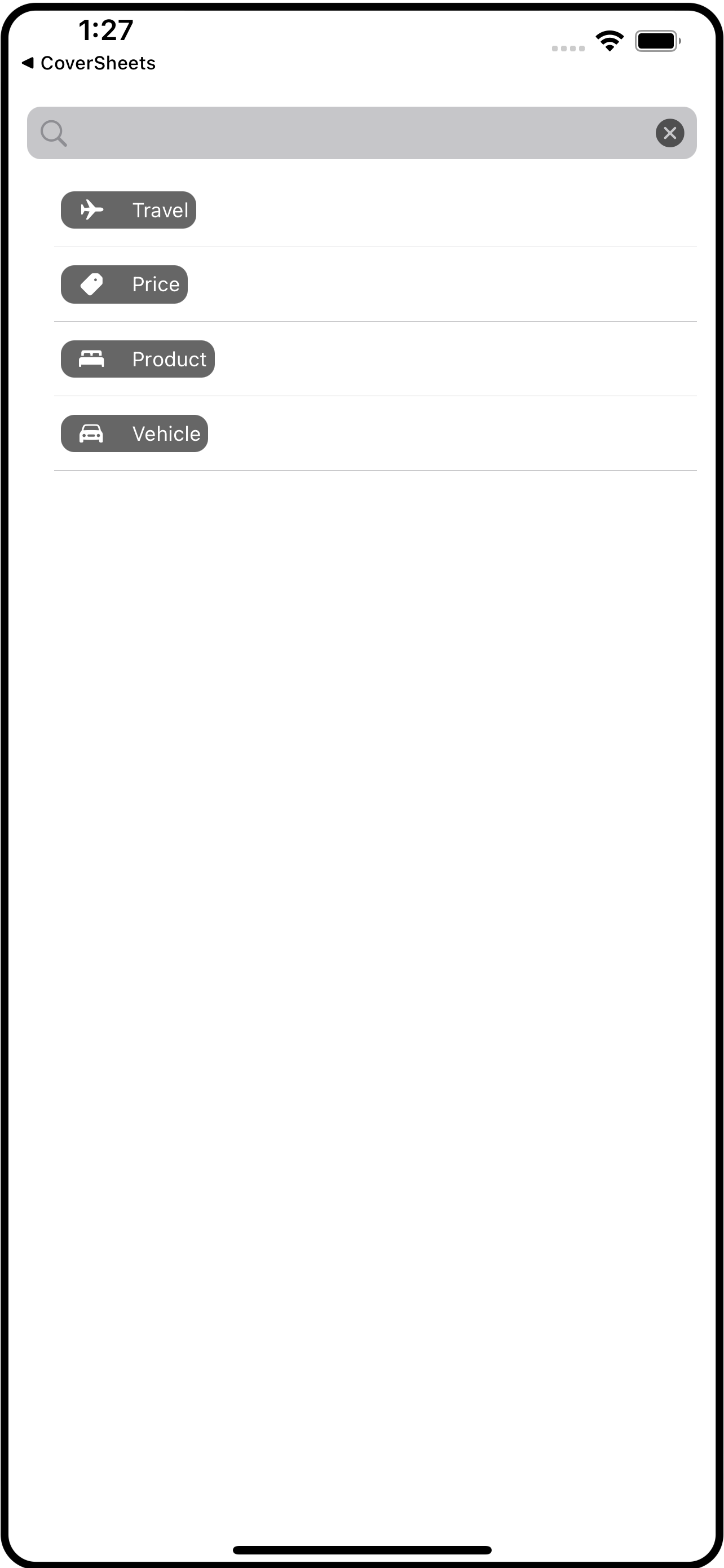
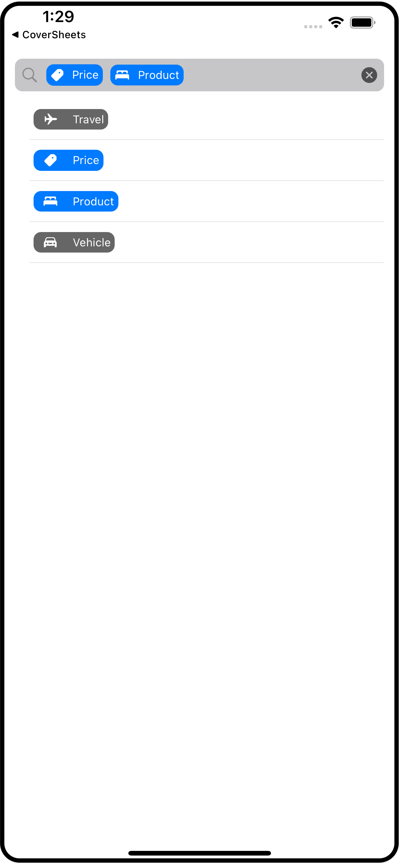
The idea is that you have a search bar-like area that gets filled with “filters” which I represent using image+title pairs (SwiftUI’s Label component).
Let’s begin with the model. Create a file called FilterModel.swift and place this definition of FilterData into it (you could put this into its own file, but it goes with the model):
struct FilterData: Identifiable {
    var id = UUID()
    var imageName: String
    var title: String
    var isSelected: Bool = false
}
Below that, in this same file, define FilterModel itself.
class FilterModel: NSObject, ObservableObject {

    // 1. normally you would get this data from a remote service, so factor that in if you use
    // this in your own projects. If this data is not static, consider making it @Published
    // so that any changes to it will get reflected by the UI
    var data = [
        FilterData(imageName: "airplane", title: "Travel"),
        FilterData(imageName: "tag.fill", title: "Price"),
        FilterData(imageName: "bed.double.fill", title: "Product"),
        FilterData(imageName: "car.fill", title: "Vehicle")
    ]

    // 2. these are the FilterData that have been selected using the toggleFilter(at:)
    // function.
    @Published var selection = [FilterData]()

    // 3. toggles the selection of the filter at the given index
    func toggleFilter(at index: Int) {
        guard index >= 0 && index < data.count else { return }
        data[index].isSelected.toggle()
        refreshSelection()
    }

    // 4. clears the selected items
    func clearSelection() {
        for index in 0..<data.count {
            data[index].isSelected = false
        }
        refreshSelection()
    }

    // 5. remakes the published selection list
    private func refreshSelection() {
        let result = data.filter{ $0.isSelected }
        withAnimation {
            selection = result
        }
    }
}
The model’s job is to provide the data for the UI to display. Here we have:
The
datais the list ofFilterDataitems. In a real app this list would come from a remote API server. For this example they are just hard-coded.The
selectionare thoseFilterDatathat have been picked by the user for the search. Notice that this is@Publishedwhich means the UI can observe changes to this variable. More precisely, the UI will not notice changes to the array itself, just whether or notselectionitself has changed.The
toggleFilterfunction adds or removes aFilterDatafrom the selection. It does this by building a new array from theFilterDatawhere an item’sisSelectedvalue istrue.The
clearSelectionfunction just sets everyFilterData.isSelectedin thedatatofalse.The
refreshSelectionfunction is private and is called fromtoggleFilterandclearSelection. It is the function that builds a newselection. Notice that when it setsselectionto the new value it does so within anwithAnimationblock. You’ll see how this is used later.
Now that we’ve got a model, let’s look at how a FilterData is represented visually. Create a new SwiftUI View file called FilterTag.swift and put this code into it:
struct FilterTag: View {
    // 1
    var filterData: FilterData

    // 2
    var body: some View {
        Label(filterData.title, systemImage: filterData.imageName)
            .font(.caption)
            .padding(4)
            .foregroundColor(.white)
            .background(
                RoundedRectangle(cornerRadius: 8)  // 3
                    .foregroundColor(filterData.isSelected ? .accentColor : Color.black.opacity(0.6))
            )
            // 4
            .transition(.asymmetric(insertion: .move(edge: .leading), removal: .move(edge: .leading)))
    }
}
This
structhas aFilterDataproperty because that is what it going to reflect, visually.The
bodyis just a SwiftUILabelwith some modifiers to give it rounded rectangle background.Notice that background color is dependent on the
isSelectedproperty of theFilterData.Finally, you can see the
transitionproperty. This is where thewithAnimationcomes into play. This transition will be applied when theFilterTagis appears (inserted into the display list) and when it disappears (removed from the display list). I picked a slide effect but you can do whatever you think looks nice, of course.
The last piece is the FilterBar itself, so go ahead and create a FilterBar.swift SwiftUI View file and place this code into it:
struct FilterBar: View {
    // 1
    @EnvironmentObject var filterModel: FilterModel

    // 2
    var body: some View {
        HStack {
            Image(systemName: "magnifyingglass")
                .foregroundColor(.gray)
            // 3
            ScrollView(.horizontal, showsIndicators: false) {
                HStack {
                    ForEach(filterModel.selection) { item in
                        FilterTag(filterData: item)
                    }
                }
            }
            Spacer()
            Button(action: { filterModel.clearSelection() }) {
                Image(systemName: "xmark.circle.fill")
                    .foregroundColor(Color.black.opacity(0.6))
            }
        }
        .padding(6)
        .background(RoundedRectangle(cornerRadius: 8).foregroundColor(Color.gray.opacity(0.5)))
    }
}
The
FilterBarneeds aFilterModelto work. I usually pass around models using@EnvironmentObjectbut you could also pass it in as a property and declare it with@ObservedObjectsince you want this UI to watch for changes to it (ie, theselectionproperty).The “bar” is an
HStackwith a magnifying glass image, a horizontally scrollable collection ofFilterTagviews, and a clear button.The scrollable portion is itself an
HStackbuilt using aForEachcomponent using the model’sselectionproperty. Becauseselectionis a@Publishedproperty of anObservableObject, SwiftUI automatically watches it. When it gets changed, SwiftUI will re-run thisForEach.
To see all this in action, let’s modify ContentView to display the list of filters in the model’s data and when on is tapped, make it selected (or not):
struct ContentView: View {
    @ObservedObject var filterModel = FilterModel()

    var body: some View {
        VStack {
            FilterBar()
                .environmentObject(filterModel)
            Spacer()
            List {
                ForEach(0..<filterModel.data.count) { index in
                    FilterTag(filterData: filterModel.data[index])
                        .onTapGesture {
                            filterModel.toggleFilter(at: index)
                        }
                }
            }
        }
        .padding()
    }
}
And there you have a different type of search bar - one that uses “filters” that represents subsets of the data.
I used a simple list to present the filter choices, but you might need something more complex. For example, you might have a section for pricing. Each item of that section might be prices from $1000 and up, from $500 to $1000, from $250 to $500, from $100 to $250, and below $100. But the filter bar would just show the same visual tag - its just so the user knows they are filtering by price. You could expand FilterData to include enums or whatever else you needed to capture all the information so it can be easily sent to your backend system to carry out the filtering (or if you have all the data already loaded, do it instantly).
I hope you find some use in this or that it sparks some ideas.

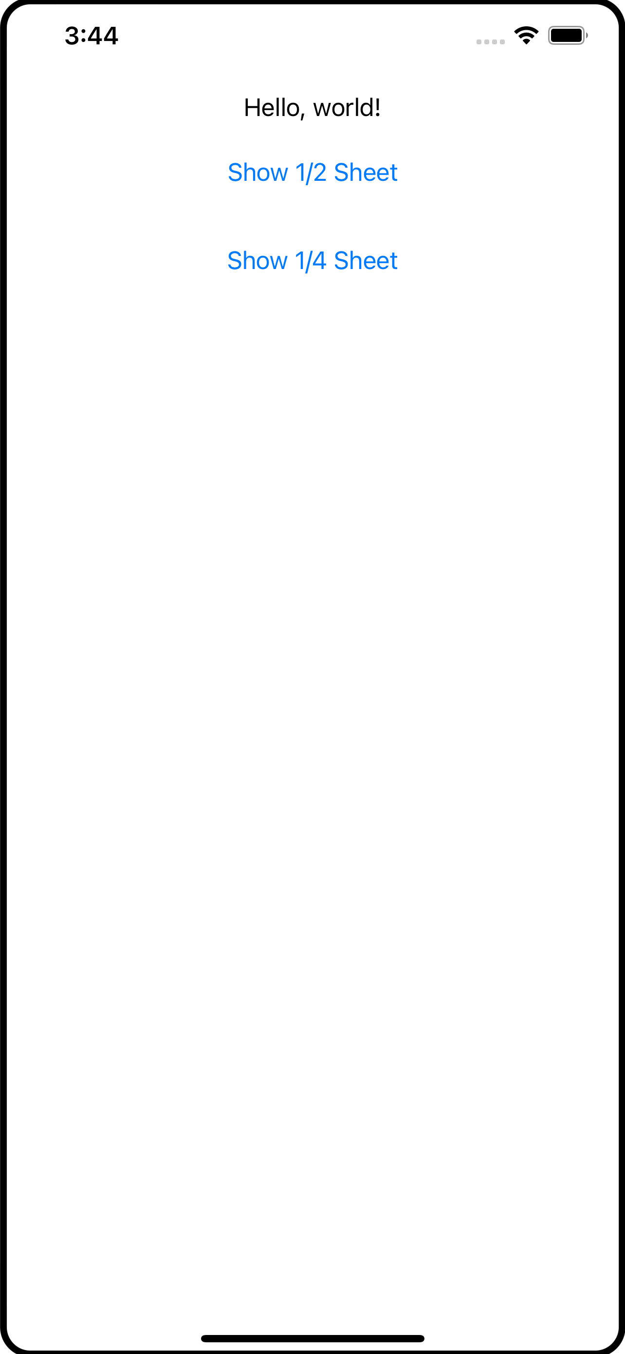
Sheets with SwiftUI
An alternative to full screen action sheets using overlays in SwiftUI
If you’ve been using SwiftUI for a while now, you have undoubtedly come across the .sheet modifier. This takes a View and turns it into a slide-up view. Sheets are a great way to quickly display ancillary information or get some quick input from the user.
The problem with .sheet is that on the iPhone, it is a full screen affair. If you want to bring up a few details, a full screen sheet may not be what you want; the .sheet on the iPad is different; it floats up to the middle of the screen and does not take over the entire display.
What I’ve come up with is a different take on the sheet, using the .overlay modifier. In this article I will show you my HalfSheet and QuarterSheet overlays.
The code for this article is available in my GitHub Repository.
Normally, an article like this takes you on a journey, from the inception to building up the code to the final version. I’ve decided to just jump right into it and explain how it works. I’ll begin with how to use my half- and quarter-size sheets. Bear in mind that these are overlays and come with the caveats around overlays. Which are:
Overlays are the width of the view they are overlaying. You can modify that using
.framewith the size of the screen. I have not done that in this exercise.Overlays only overlay the view they are attached to. If you are expecting the overlay to always be on top, you should use
.overlayat the highest level (eg,ContentView).
How to Use The Sheets
The syntax for these sheet overlays is:
.halfSheet(isPresented: Binding<Bool>, content: ()->Content)
.quarterSheet(isPresented: Binding<Bool>, content: ()->Content)
You pass a binding to the sheet overlay and supply the content you want to see inside the sheet overlay. For example:
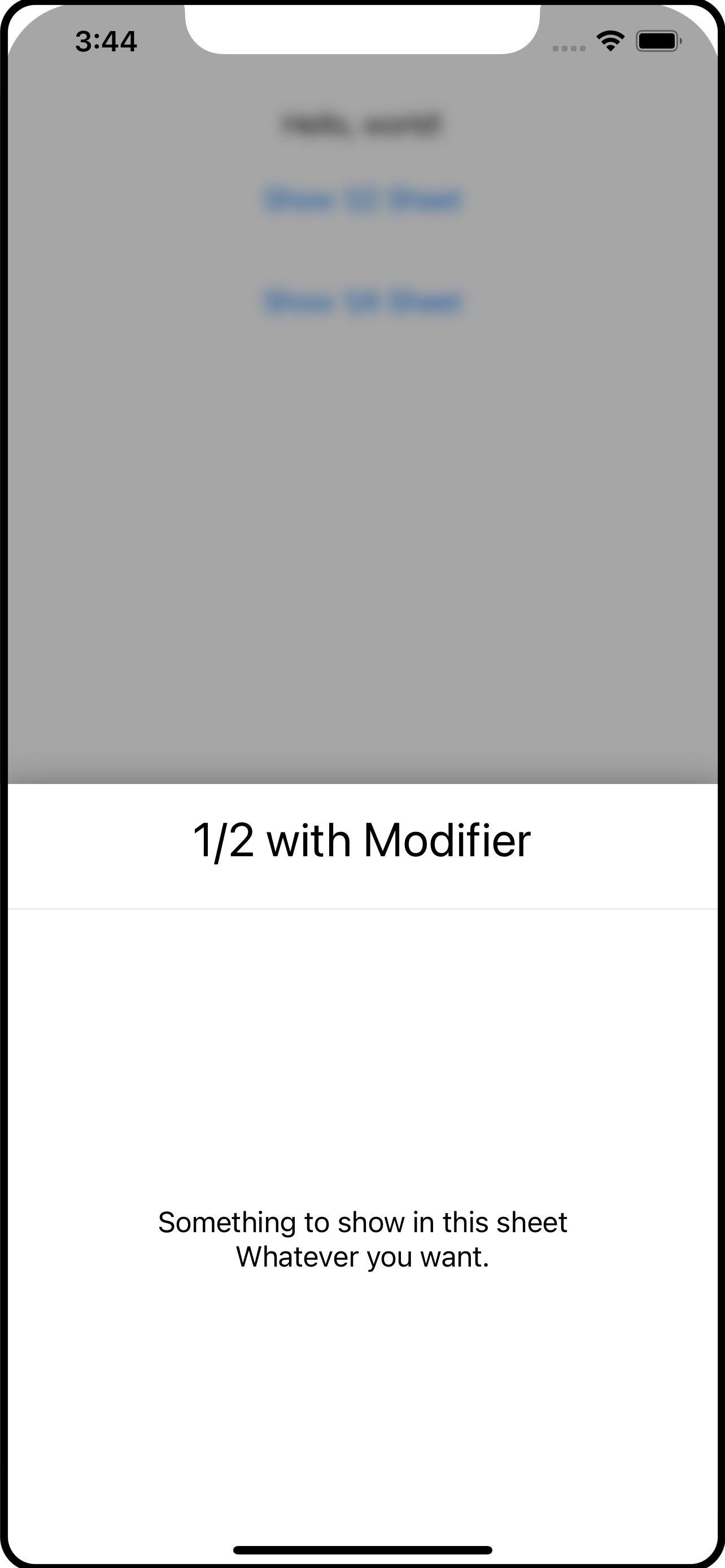
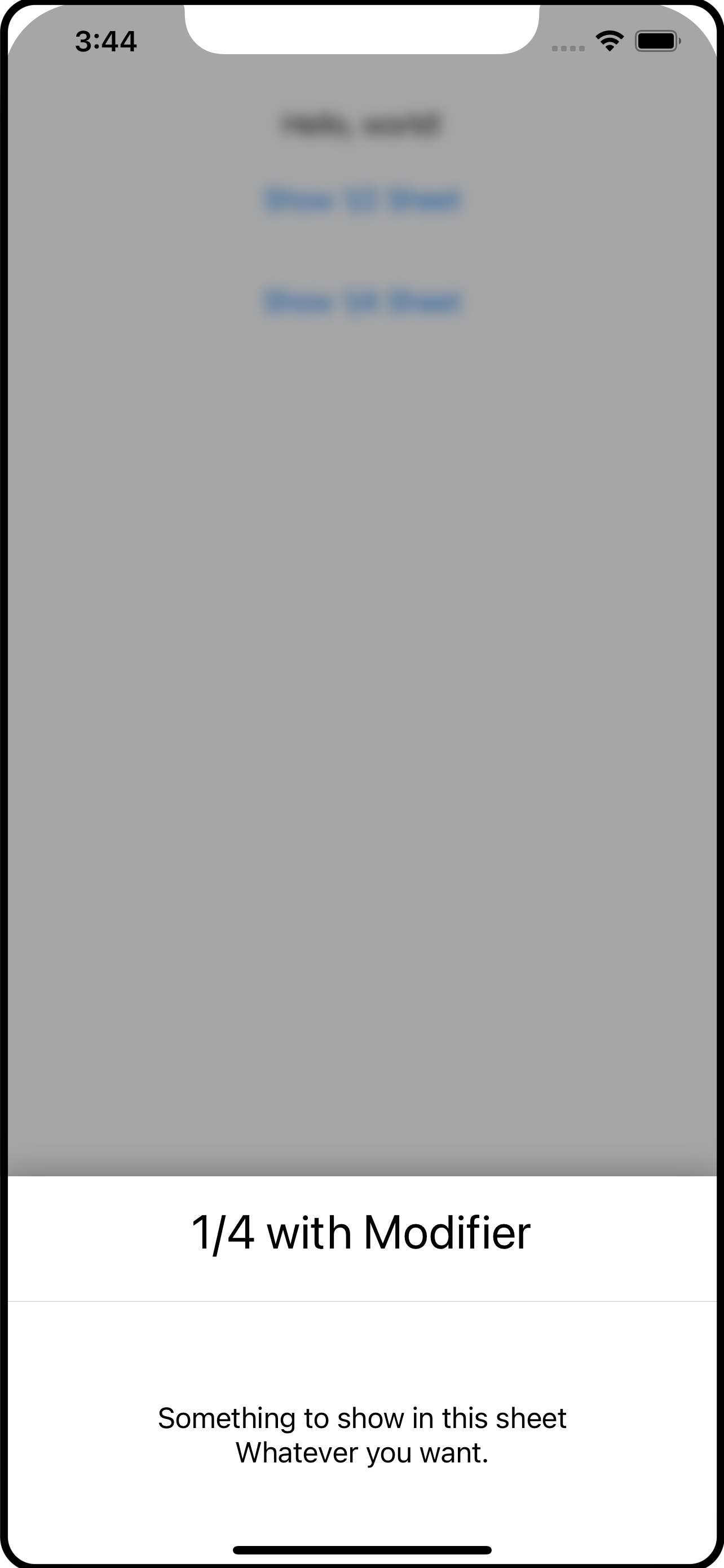
AnyView()
    .halfSheet(isPresented: self.$showHalfSheet) {
        SheetContents(title: "1/2 with Modifier")
    }
    .quarterSheet(isPresented: self.$showQuarterSheet) {
       SheetContents(title: "1/4 with Modifier")
    }
The SheetContents() view is irrelevant and you can see it in the screen shots. It’s just the content of the sheet.
To show the sheet, the app should change the binding within a withAnimation block. For example:
Button("Show 1/2 Sheet") {
    withAnimation {
        self.showHalfSheet.toggle()
    }
}.padding()
The withAnimation is necessary to trigger the transitions that are set up on the sheet overlays, which is shown later in this article.
So what are halfSheet and quarterSheet exactly? Let’s leave that for a moment and look at the overlay content itself.
The Code
PartialSheet
If you look at the code, you will find PartialSheet. This is actually the overlay content being shown as the sheet. It is what wraps SheetContents that you don’t see. Both the quarter and half sheet overlays use this.
struct PartialSheet<Content: View>: View {
    @Binding var isPresented: Bool
    var content: Content
    let height: CGFloat

    @State private var showingContent = false

    init(isPresented: Binding<Bool>, heightFactor: CGFloat, @ViewBuilder content: () -> Content) {
        _isPresented = isPresented
        height = heightFactor
        self.content = content()
    }
    var body: some View {
        GeometryReader { reader in
            ZStack(alignment: .bottom) {
                BlockingView(isPresented: self.$isPresented, showingContent: self.$showingContent)
                    .zIndex(0) // important to fix the zIndex so that transitions work correctly

                if showingContent {
                    self.content
                        .zIndex(1) // important to fix the zIndex so that transitins work correctly
                        .frame(width: reader.size.width, height: reader.size.height * self.height)
                        .clipped()
                        .shadow(radius: 10)
                        .transition(.asymmetric(insertion: .move(edge: .bottom), removal: .move(edge: .bottom)))
                }
            }
        }
        .edgesIgnoringSafeArea(.all)
    }
}
PartialSheet has three properties: the isPresented binding, the content to show inside (eg, SheetContents from above), and the height which is the percentage of the height to use.
The content comes in the form of a @ViewBuilder which is what lets this accept any View to use as the sheet (content inside).
I’ve used a GeometryReader to be able to get the dimensions of the area for the overlay which is used in the .frame and sets the height from the height value passed in.
I’ve used a ZStack to layer the components. There is BlockingView which is just a Color with a .onTapGesture to let the user tap in this area to dismiss the overlay; it is the translucent area between the sheet and the main app contents (see the screen shots).
When using transitions with
ZStackit is important to use fixed.zIndexvalues. This tells SwiftUI that these views should be reused and not re-created. If you leave off the.zIndex, SwiftUI will create new instances when the transitions happen and the transitions will not work as you expect.
Above the BlockingView is the actual content with a bunch of modifiers. One of the modifiers is the .frame to give it its height and a .transition to handle is appearance and disappearance. The .move will bring the view onto and off of the screen from the bottom. There is also a .shadow (and use .clipped so the shadow does not leak into the content).
The .edgesIgnoringSafeArea is applied to the outer component (GeometryReader) so you get a nice effect on the edges of the screen.
BlockingView
The BlockingView provides a means to shield the main app content from gestures while the overlay sheet is visible. You do not have to use this, but I think its a nice feature and consistent with the presentation of pop-ups and other overlays; it can be detrimental to your app if you allow the user to engage with the content while an overlay is visible.
private struct BlockingView: View {
    @Binding var isPresented: Bool
    @Binding var showingContent: Bool

    // showContent is called when the Color appears and then delays the
    // appearance of the sheet itself so the two don't appear simultaneously.

    func showContent() {
        DispatchQueue.main.asyncAfter(deadline: .now() + 0.25) {
            withAnimation {
                self.showingContent = true
            }
        }
    }

    // hides the sheet first, then after a short delay, makes the blocking
    // view disappear.

    func hideContent() {
        withAnimation {
            self.showingContent = false
        }
        DispatchQueue.main.asyncAfter(deadline: .now() + 0.25) {
            withAnimation {
                self.isPresented = false
            }
        }
    }

    var body: some View {
        Color.black.opacity(0.35)
            .onTapGesture {
                self.hideContent()
            }
            .onAppear {
                self.showContent()
            }
    }
}
The BlockingView is pretty simple: it shows a Color (I picked black but white gives a frosted feel). When the Color appears it triggers the showContent() function. An .onTapGesture captures a tap by the user and calls the hideContent() function.
The idea here is that you want to dim the view - THEN - show the sheet. When the sheet disappears, you want the sheet to go away BEFORE the Color fades out. The showContent() and hideContent() functions use asyncAfter to introduce a short delay while these effects run. And, importantly, they both use withAnimation blocks to change the state. This allows that transition on the content in PartialSheet view run correctly.
Test Run
You now have enough parts to make use of them, like this:
@State var showSheet = false
var body: some View {
  VStack { // just for something to look at
    Text("Hello World")
    Button("Show Sheet") {
      withAnimation {
        self.showSheeet.toggle()
      }
    }
  }
  .overlay(
    Group {
        if self.showSheet {
            PartialSheet(isPresented: self.$showSheet, heightFactor: 0.5) {
                SheetContents(title: "Trial Run")
            }
        } else {
            EmptyView()
        }
    }
  )
}
The .overlay uses a Group so that it shows either the PartialSheet or an EmptyView. The button changes the Bool and the sheet is displayed, SwiftUI running the transition to show it.
Let’s all well and good, but kind of messy. Your app code certainly needs to own and manage the boolean that is used to present the overlay sheet (eg, showSheet). But the .overlay and its content is just asking a lot, I think, if you need to use this in several places in your app.
And this is where .halfSheet and .quarterSheet come in. These are custom extension functions on View which makes use of ViewModifier.
View Extension
If you open the View+Modifiers.swift file, you will see how halfSheet and quarterSheet are defined:
extension View {
    func halfSheet<Content: View>(isPresented: Binding<Bool>,
                                  @ViewBuilder content: () -> Content) -> some View {
        self.modifier(PartialSheetModifier(isPresented: isPresented,
                                           heightFactor: 0.5
                                           sheet: AnyView(content())))
    }

    func quarterSheet<Content: View>(isPresented: Binding<Bool>,
                                     @ViewBuilder content: () -> Content) -> some View {
        self.modifier(PartialSheetModifier(isPresented: isPresented,
                                           heightFactor: 0.25
                                           sheet: AnyView(content())))
    }
}
The halfSheet function, for example, applies the PartialSheetModifier (defined below) and passes down the isPresented binding, a heightFactor of 0.5 (to make it a half sheet) and the content view. Using this, as shown at the beginning of this article, makes it easier for the developer to toss in a half or quarter sheet in the same vein as the SwiftUI .sheet modifier.
Notice that
@ViewBuildercontinues to follow through the code. However, when it reaches this point, we want to actually execute the builder and create the View, which is what happens in the call to the sheet initializers -content(). As you’ll read in a moment, the customViewModifieris expecting anAnyViewnot a builder.
The final piece of this is PartialSheetModifier:
private struct PartialSheetModifier: ViewModifier {
    @Binding var isPresented: Bool
    let heightFactor: CGFloat
    let sheet: AnyView

    func body(content: Content) -> some View {
        content
            .blur(radius: isPresented ? 4.0 : 0.0)
            .overlay(
                Group {
                    if isPresented {
                        PartialSheet(isPresented: self.$isPresented, heightFactor: heightFactor) {
                            sheet
                        }
                    } else {
                        EmptyView()
                    }
                }
            )
    }
}
PartialSheetModifier is a ViewModifier which is given the content (the View being modified, like a VStack) so you can add your own modifiers. Here, the content is given a blur effect if the sheet is being presented, and here you see the actual .overlay finally. As you read above in the trial run, the .overlay is a Group with a test that presents the sheet or an EmptyView.
To sum this up
An
.overlayis used to show the “sheet” which is whatever content you want in that sheet.@ViewBuilderis used to make it as flexible as possible to show content.The
.overlayis placed into a customViewModifierwhich itself is placed inside of a View extension function (eg,halfSheet).The
halfSheetandquarterSheetView extension functions usePartialSheetjust to pass in a specific height value (0.5 or 0.25).The
PartialSheetis aZStackwith aColorto block the user from interacting with the main app and the actual sheet content.Tap gestures to activate or dismiss the overlay sheet are done within
withAnimationblocks so a transition can be used to hide and show thePartialSheet.
I hope you’ve found this useful and can use it or even parts and concepts in your own apps.

Widgets with SwiftUI
A guide to adding widgets to your iOS app.
I thought I’d look into widgets, the latest craze on iOS. I intended to read up on them, do some experimental code, craft a clever example, and help you get a jumpstart. They say the road to Hell is paved with good intentions. And while widgets did not turn into fire and brimstone, it turned out to be more challenging than I thought.
When you first read about them, you think, “that’s seems reasonable and straightforward.” Then you try an example which isn’t too complex. That works, kind of. It seems to do what the documentation says. So you go, “OK, fine. I’ll extend this and try out some of the other aspects of widgetery.” And then comes trouble.
Here’s the TLDR; part: there’s a bug, actual two bugs, with widgets in iOS 14. The first is that when you run them from Xcode, some strange things might happen. The second is during runtime when things don’t happen exactly as they said they would.
I spent a few hair pulling hours trying to figure out how I could have misunderstood something that seemed “fairly clean” (in Apple-speak, that means it has at least two interpretations of how its supposed to work).
Let’s jump into widgets using my example and I’ll explain. In the end it works nicely, albeit not as perfectly as you would like. I’m sure Apple is fixing it right now.
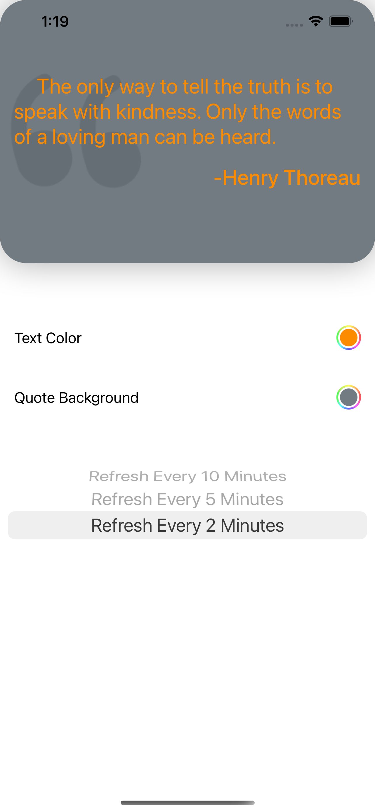
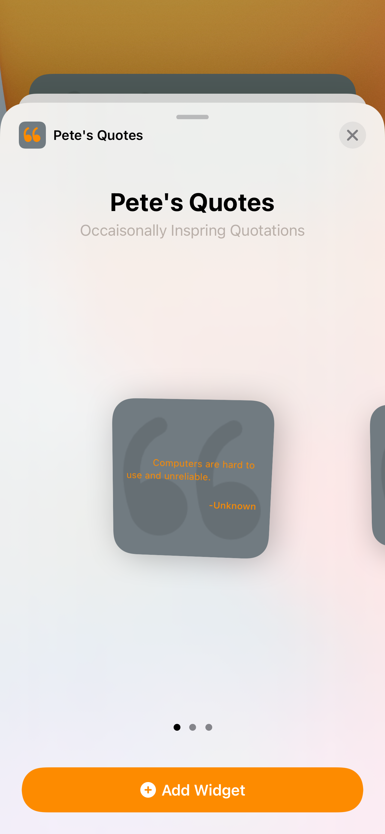
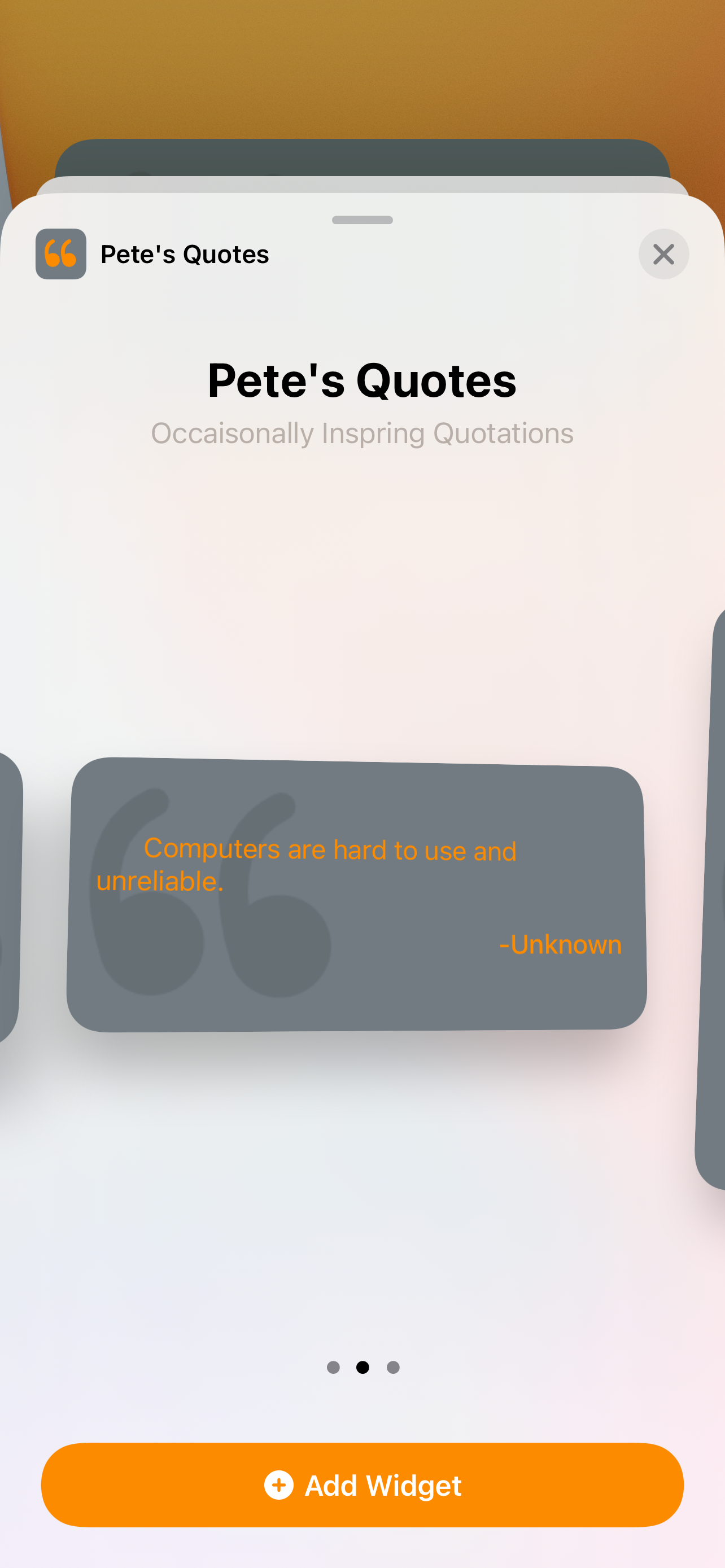
A widget is supposed to be a mini-app or a mini version of an app. For my “Pete’s Journal” app, I’m making the widget find an event from the previous year so you can say “wow, it’s been a year already!”.
In this example, the tables are turned - the widget is the star and the app just supports it. The widget is “Pete’s Quotes” (not quotes actually from me) which uses a free quotation (famous sayings) service and presents a quote every-so-often (this is the point of trouble). Take a look at the three screen shots and you will see the three different possible sizes for widgets.


The app that supports the widget lets you change the background and text colors as well as how frequently the quotation changes. So of a quote-a-day type of thing.
This example shows you:
How to write a widget.
How to use a remote API with a widget.
How to address the different widget sizes.
One way to share data between your widget and your app.
You can find the source code to this project on my GitHub Repository.
Creating the Widget
A widget is another build target in your Xcode project. You typically share some code between your app and your widget. In this case, the code shared includes:
The
QuoteServicewhich is what fetches the quotations from the free remote system and caches them.The
QuoteViewwhich shows the quotation against the selected color.The
Settingswhich houses the background color, text color, and refresh rate.The Assets which contain icons and color sets.
If you design your views with intention, you can make good use of reusability. In this case, QuoteView, is used by the app as an example to show that the color combination looks like as well as by the widget itself to display the quotation.
Widgets work using Timelines. Apple has a good scenario where the widget is part of a game app and shows a character. Once a character does a battle, its power level drops. The widget shows its charge and it takes 4 hours to bring the character to full capacity. The Timeline for the widget is set at hour intervals where each hour the character is given a 25% boost in power. Once 100% is reached, the Timeline stops and the widget remains static. If the app is opened and the character played, the app sends a message to the widget to restart its Timeline.
Timelines can be specified in one of three ways:
Automatically refreshed once the last entry of the timeline has been used.
Stops refreshing after the timeline has been played through. This is Apple’s example.
Refreshed again at some point in the future. Again, Apple has an example of a Stock widget the works Monday through Friday, but on Friday, the Timeline is set to be refreshed the following Monday morning.
My quotation widget uses the last refresh type. Let’s say the quotation should update every morning at 8am. The Timeline will have a single entry for 8am and then signal that it wants to be reactivated at 8am the following morning.
Here is where the bugs came into play. I did not want to wait until 8am every morning to test this. Instead, I had the Timeline refresh every minute or two. The first entry in the Timeline was “now” and then was given “now+1 minute” as when to refresh again. Seemed reasonable to me.
When I ran this from Xcode, I saw multiple Timelines getting created! And then while it was running, I’d see the Timeline refresh around when I wanted, then suddenly refresh again, then maybe two or three times longer. When I finally looked for help, I saw entries in stackoverflow.com that pointed to known bugs. Once I kicked off my widget from Xcode and then disconnected, the Timelines behaved much more predictively, but still, they didn’t always run when I expected (bug number two).
So, when you develop your widgets, just launch them from Xcode, then disconnect, unless Apple has fixed this by the time your start to explore widgets.
Widget Target
The first thing you want to do is add a new target to your project. In Xcode, do File->New Target and pick Widget as the target. In the dialog that appears, make sure Intents is NOT checked (this is for Siri integration which I am not covering here).
When done, your project will have a new build target. If you’ve never worked with multiple build targets before, here are some tips:
A target is something that can be built. You can have a target be for a completely different app, but mostly targets are for libraries or accessories to your main app like a watch app or a widget.
A target can have its own set of code, completely independent of the main or first target. More likely however, is that you will want to share code between targets. In this example, a couple of the files are shared and its something you want to think about in your architecture.
You share code between targets by selecting the file you want to share, opening the
File Inspectorin Xcode, and checking all the targets that should include the file. This article will cover that below. The files being shared remain in their original location, but you might want to make an Xcode group or folder for shared files if that makes more sense for your project.
In the Widget target there are some files of particular importance:
PetesQuotes_Widget.swift - This is the main file for the widget. You can split its contents into multiple files, of course, but Apple packed it all into one place.
Assets - This contains assets specific to the widget. You will probably also share the Assets from your main project if you have color sets or images you want to use.
info.plist - The projects settings. Depending on what your widget does, you may need settings similar to ones in your main project. For example, in Pete’s Journal, the widget needs permission to access the calendar database.
If you open the widget file (PetesQuotes_Widget.swift) you will see that it has a number of structs in it. Briefly,
struct Provider: TimelineProvider - I mentioned above that Widgets work on a timeline. This struct is used to build the timeline. More about its content below.
struct SimpleEntry: TimelineEntry - Think of a TimelineEntry as a data model. The TimelineProvider creates instances of these TimelineEntry structures to be used as data to the widget’s UI.
struct PetesQuotes_WidgetEntryView : View - This is the View of the widget. It is given a TimelineEntry to present.
struct PetesQuotes_Widget: Widget - This is the widget’s main application entry point.
The lifecycle goes like this:
The widget’s main app (
PetesQuotes_Widget) is launched.Its
bodyis a widget configuration that consists of aTimelineProviderand a closure that is invoked when a timeline event occurs.The configuration’s
TimelineProvideris called upon to produce aTimeline. This is an asynchronous call which gives theTimelineProviderimplementation the ability to itself make asynchronous calls to remote services.Once a timeline has been received, the OS runs it according to the
TimelineEntryevents in the timeline array. Each event is run on theDate(which is day AND time) given. Once that’s done the next one is run on itsDate.Once all events in the timeline have been run, what to do next is determine by timeline’s
policy.If the policy is
.neverthen the whole thing stops and the widget just sits there looking like it looks from the last event. Only the app can trigger a new timeline sequence.If the policy is
.atEndthen a new timeline is requested from theTimelineProviderand the process repeats.If the policy is
.afterthat provides aDateon which a new timeline will be requested from theTimelineProviderwhich starts the process again.
Each time a
TimelineEventis requested, the closure attached to the configuration is called to provide a newViewto be displayed by the widget.
That’s how it’s supposed to work. And it does largely, given the caveats above. But even if all goes as it should, iOS does not guarantee that a TimelineEvent will occur exactly at the date and time specified; just thereabouts, and always at or after that date and time.
So that’s how a widget lives. Now let’s get to this specific example.
Sharing Files
In this example project, some files need to be shared between the main target and the widget target. The QuoteService.swift file is one of them. Follow these steps to share a file:
Select the file you want to share from the Project Navigator.
Open the File Inspector (Option+Cmd+1).
Look for Target Membership. You should see
PetesQuotesalready selected.Select
PetesQuotes_WidgetExtensionto add the file to that target (it is already added for you, but you get the idea).
And that’s it! The files shared between the targets are:
QuoteServiceQuoteViewSettingsAssets.xcassets
When making a widget for your own app, keep in mind dependencies in the files. You may need to bring in a lot more files or maybe there is a way to engineer the code to reduce the dependencies. Keeping the widget small is a recommendation. I don’t know what the limitations to this are, but its always safe to err on the side on smallness.
Quote Service
We start with the app, even though that is not the star of this show. If you open the ContentView of the app you will see that it’s just a bunch of Views in a stack. At the top of the stack is the QuoteView which is shared with the widget. Below that are a couple of ColorPickers and a standard Picker to set the refresh rate.
The quotations come from a free data source. This is handled by QuoteService. I use Alamofire to make the one and only remote call because it’s easy to use. If you want to use URLSession go right ahead.
QuoteService does two things: fetches the quotes from the remote API and provides a random quote from the result. The result of the API is stored in an array of Quote objects. Its pretty simple stuff.
Back in ContentView you will find an onAppear modifier that triggers the QuoteService to fetch the quotes. The fetchQuotes function invokes the service and provides a callback closure to get a random quote and stuff the result into the @State vars passed to QuoteView.
Settings
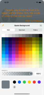
Along with the quotation (and author), there is also the matter of the appearance and frequency of updating the quotation in the widget. The Pickers let you change the values. The values are stored in Settings.
Take a look at Settings and you’ll find functions to load and save the settings. Each time a Picker’s value changes it tells Settings to make a save.
If you have used UserDefaults before you most likely used UserDefaults.standard. That’s fine for the app itself, but none of its accessories (watch, widget) can access it. They have their own defaults. To enable sharing data between targets, you need to do two things:
Add Groups to your project. Go to your project file and tap on a target (eg,
PetesQuotes). Tap on theSigning & Capabilitiestab. OpenApp Groupsand you will see a group calledgroup.PetesQuotesand it is checked. If you do the same for the widget target you will see the same group. The group’s name will be passed as thesuiteNamein the next step. In your own app would use an appropriate group name and maybe even several if that meets your needs.Use
UserDefaults(suiteName:)instead ofUserDefaults.standardin both the main app and the widget. This is easy because its all encapsulated inSettingswhich is shared between the targets.
QuoteView
Take a quick look at QuoteView. It’s not really that interesting. It gets all of the information it needs via its parameters. It uses a ZStack to place a color below and images below the quotation and author Text views. And that’s it. You can change it however you like. The point is that it relies on nothing outside of itself.
The app’s only purpose is to put values into Settings or rather into UserDefaults(suiteName: “group.PetesQuotes”) so it can be used by the widget.
The Widget Itself
Take a look at struct PetesQuotesWidgetEntryView inside of PetesQuotes_Widget.swift. Here is the content of that file, annotated.
struct PetesQuotes_WidgetEntryView : View {
  // 1 - environment
    @Environment(\.widgetFamily) var family: WidgetFamily
    var entry: SimpleEntry
    var backgroundColor: Color
    var textColor: Color

    // 2 - widget sizes
    // use the widget's size to determine how large the
    // text should be
    func textSize() -> CGFloat {
        switch family {
        case .systemSmall:
            return 10
        case .systemLarge:
            return 25
        default:
            return 17
        }
    }

  // 3 - display the quote
    var body: some View {
        QuoteView(
            quotation: entry.quote?.text ?? "Computers are hard to use and unreliable.",
            author: entry.quote?.author ?? "Unknown",
            textSize: textSize(),
            background: backgroundColor,
            textColor: textColor)
    }
}
The points of interest are:
This widget supports different sizes: small, medium, and large. The widget configuration specifies which sizes you want to display. The default is small. The
Environmentfamilyis set to the size this particular widget should use.For this widget, the size is used to determine how large the text in the quotation should be. Your own widget might display more or less information or even display completely different looks depending on the size.
Finally, the
bodyuses theQuoteView, passing to it values fromSettingsand the text size determined by the widgetfamily.
Quote Service and the Timeline
There’s an important part that I have glossed over. I mentioned the TimelineProvider and that its job is to provide a set of TimelineEvents and what to do once the last event has been activated.
In this widget though, the data to build the TimelineEvents - SimpleEvent in this example - comes from a remote service. There’s only one place you can safely make a remote call from a widget. Now I have experimented with putting a remote call in different places, and wasn’t really getting what I wanted. To be honest, I was trying to figure out what was going on from Xcode debugger and, there’s that bug I didn’t know about. However, Apple’s documentation alludes to putting remote, asynchronous calls, into the TimelineProvider - QuoteProvider in this example.
If you open the Swift widget file, you’ll find the TimelineProvider. Look for the getTimeline function:
func getTimeline(in context: Context, completion: @escaping (Timeline<Entry>) -> ()) {
    var entries: [SimpleEntry] = []

    // refresh the settings before generating a new timeline
    // so the display syncs with the data.
    settings.loadSettings()

    // 1 - get a quote
    // ask the QuoteService for a quote. this will return
    // immediately because its cache has one or
    // it will make a remote call, fill its cache, then return
    quoteService.getQuote {
        // 2 - set up an entry for immediate use
        let currentDate = Date()
        entries.append(SimpleEntry(date: currentDate, quote: quoteService.randomQuote()))

        // 3 - set up for next one
        // we want a new timeline once the refreshRate expires (eg, 10 minutes from now).
        let nextTime = Calendar.current.date(byAdding: .minute,
                                             value: settings.refreshRate.rawValue,
                                             to: currentDate)!

        let timeline = Timeline(entries: entries, policy: .after(nextTime))

        // 4 - return the finished timeline
        completion(timeline)
    }
}
After the Settings are loaded, the
quoteServiceis called to get a quote. What this function is doing is making a remote, asynchronous call, to the quote API. The function takes a closure and calls this closure when the API finally returns a list of quotes. A side effect is that theQuoteServicewill cache the results so if there are already a cache of quotes, thegetQuotefunction immediately calls the closure.Inside the closure a single
TimelineEntryorSimpleEntryfor this example, is created. It is given the current date/time and a random quote from theQuoteService. This is placed into an array of entries.Because of the nature of how I want this quote to work, rather than use the
.atEndpolicy, I calculate the next time aTimelineis needed based on the refresh rate stored in theSettings. This is passed as the.afterpolicy when creating theTimeline.Finally, the
completionhandler of thegetTimelinefunction is called to pass back theTimeline.
What is happening is that whenever a Timeline for this widget is needed, it first asks the QuoteService to get quotes. That either invokes the closure immediately or after all of the quotes have been fetched. The Timeline created has a single entry - what to display “now” and is told a new Timeline isn’t needed until refreshRate minutes have passed. If you wanted the quote to be once a day, then the nextTime should be set to the currentDate + 1 day at say, 1am.
Placeholder and Snapshot
One thing I’ve ignored up to this point is the TimelineProvider functions placeholder() and getSnapshot. These functions are used to display the widget in their previews when the user has decided to add a widget to their home screen. I haven’t figured out which one is used when, so the best thing I can tell you is to provide your widget view with a default look. In my case I use a nil Quote which tells the QuoteView to use a default saying and author.
Launching from Xcode
Now that you’ve got something a widget put together, you probably want to try it out. Go to the target bar in Xcode and select the widget target rather than the app target.
Theoretically you can debug widgets. I’ve had marginal success with this. Sometimes my breakpoints and print statements work, most of the time they are ignored.
When you do launch the widget from Xcode you may see that your TimelineProvider’s getTimeline() function is called multiple times. That’s the bug. It may even cause a crash. Just disconnect Xcode and the widget should (eventually) begin behaving like you think it should.
If by the time you read this you think I’m crazy and it all works well, then Apple have fixed it.
The debugging experience isn’t what I would call “great”. So don’t get discouraged if you are trying to hit breakpoints and things are not working out. Just run it without the debugger and see if behaves close to what you want.
Summary
Widgets are fun. While it was frustrating for a bit, I think they can add a new dimension to your app. I chose this quotation app/widget because it focuses nicely on the widget. But in most apps the widget is supplemental and gives your user an at-a-glance indication of something. Maybe that’s the latest mortgage rates or a user’s current net worth. Or just a bit of inspirational text for the day.

A SwiftUI Sidebar
A nice way to add a sidebar menu to your SwiftUI app.
Many apps use a sidebar, or menu, that appears when the user taps a control, typically in the upper left corner of the main screen. The menu slides in from the left and remains until dismissed somehow. This article shows you a very SwiftUI way of making a sidebar.
Let’s begin by making a Sidebar component that wraps some content with a NavigationView. Putting the content inside a NavigationView gives the sidebar a title area and you can put other controls there if you like using the .toolbar modifier (which I did not use for this example).
struct Sidebar<Content : View> : View {
    var title: LocalizedStringKey
    var content : Content

    init(title: LocalizedStringKey, @ViewBuilder content: () -> Content) {
        self.title = title
        self.content = content()
    }

    var body: some View {
        NavigationView {
            content
                .navigationTitle(title)
        }
        .navigationViewStyle(StackNavigationViewStyle())
    }
}
The Sidebar view uses @ViewBuilder and takes a title to display along with the content to wrap. You can use it like this:
Sidebar(title: "Main Menu") { List { Button("Home") { } Button("Actions") { } } }
Let’s give the Sidebar an actual menu of items to display. Create a new SwiftUI View file called MenuItems.swift like this:
struct MenuItems: View {

    enum MenuCode {
        case home
        case search
        case folder
        case edit
        case delete
    }

    var action: (MenuCode) -> Void

    var body: some View {
        List {
            Divider()

            Button(action: {self.action(.home)}) {
                Label("Home", systemImage: "house")
            }
            Button(action: {self.action(.search)}) {
                Label("Search", systemImage: "magnifyingglass")
            }
            Button(action: {self.action(.folder)}) {
                Label("Folder", systemImage: "folder")
            }
            Button(action: {self.action(.edit)}) {
                Label("Edit", systemImage: "pencil")
            }

            Divider()

            Button(action: {self.action(.delete)}) {
                Label("Delete", systemImage: "trash")
            }
        }
        .listStyle(SidebarListStyle())
    }
}
The menu is a list of buttons and tapping one calls the MenuItems action callback. You’ll see how to use this in a little bit.
Now you’ve got the sidebar itself squared away and can look at the bigger picture. What we want is to have the content of the app with a sidebar sliding over it to reveal the menu and sliding away once a menu item has been picked. Typically, when a sidebar is viewed, it does not cover the entire screen and the visible portion “below” the sidebar should not be enabled.
Basically you want this structure when the sidebar appears:
ZStack {
   // 1 - your main app content
    MainView()
        .zIndex(0)
   // 2 - a shield against using the main content
    Color.black
        .zIndex(1)
        .opacity(0.25)
        .edgesIgnoringSafeArea(.all)
   // 3 - SideBar with its menu
    SideBar(title: "Main Menu") {
        MenuItems() { menuItem in
            // do something with the menuItem
        }
    }
    .zIndex(2)
    .frame(width: 300)
    .transition(.asymmetric(insertion: .move(edge: .leading), removal: .move(edge: .leading)))
}
The main content for your app.
The “shield” is just a translucent color that sits above your main content and covers the entire screen
The
Sidebaritself with its content and action handler. It also has atransitionfor when it is added and removed.
“Notice that each item in the ZStack has been given an explicit zIndex. This is important when applying transitions, which is added to the Sidebar.”
The code above, if used, would show the main content, the translucent black shield, and the Sidebar. You want some control over whether or not the Sidebar should appear. We can do that with a Bool, an IF statement, and a Button to control the state of the Bool.
Above the code in the last code block, insert this:
@State var presentSidebar = false

func toggleSidebar() {
    withAnimation {
        self.presentSidebar.toggle()
    }
}
When the toggleSidebar function is called, it changes the state of the presentSidebar but does so within an animation block. Doing this will trigger the transition applied to the Sidebar and, as a bonus, animate any other changes on this screen. This includes the appearance of the color shield. Here is that code block once again, but with the presentSidebar incorporated:
ZStack {
   // 1 - your main app content
    MainView()
        .zIndex(0)
   // 2 - a shield against using the main content
    if presentSideBar {
        Color.black
            .zIndex(1)
            .opacity(0.25)
            .edgesIgnoringSafeArea(.all)
   // 3 - SideBar with its menu
        SideBar(title: "Main Menu") {
            MenuItems() { menuItem in
                // do something with the menuItem
                self.toggleSidebar()
            }
        }
        .zIndex(2)
        .frame(width: 300)
        .transition(.asymmetric(
            insertion: .move(edge: .leading),
            removal: .move(edge: .leading))
        )
    }
}
Now all you need is a button to toggle the value of presentSidebar. You sidebar would slide in and when a menu item was picked, its action handler would flip the presentSidebar toggle and cause the sidebar to slide away.
Before adding this button - which would just be temporary to show how this works - let’s make this block of code into a more generic container.
Create a new SwiftUI file called MainViewWithSidebar.swift and put all of this into it:
struct MainViewWithSidebar <Sidebar, Content> : View where Sidebar : View, Content : View {
    @Binding var presentSidebar: Bool
    var sidebar : Sidebar
    var content : Content

    // 1 - using @ViewBuilder again
    init(presentSidebar: Binding<Bool>,
         sidebar: Sidebar,
         @ViewBuilder content: () -> Content)
    {
        self._presentSidebar = presentSidebar
        self.sidebar = sidebar
        self.content = content()
    }

    // use animation to change the presentSidebar value; this way
    // the menu will slide closed.

    private func toggleSidebar() {
        withAnimation {
            self.presentSidebar.toggle()
        }
    }

    var body: some View {
        ZStack(alignment: .leading) {
            // 2 - the main content of the app
            self.content
            .zIndex(0)
            .blur(radius: self.presentSidebar ? 6.0 : 0)

            // 3 - show or hide the translucent shield
            if presentSidebar {
                Color.black
                    .zIndex(1)
                    .opacity(0.25)
                    .edgesIgnoringSafeArea(.all)
                    .onTapGesture {
                        self.toggleSidebar()
                    }
            }

            // 4 - show or hide the sidebar itself
            if presentSidebar {
                self.sidebar
                .zIndex(2)
                .frame(width: 300)
                .transition(.asymmetric(
                            insertion: .move(edge: .leading),
                            removal: .move(edge: .leading))
                )
            }
        }
    }
}
This looks pretty much like the code above it, except now it is its own View and uses @ViewBuilder to take the content of the main view as well as the Sidebar (which you’ll see how this is used below).
As with the
Sidebarcontainer, this container also uses@ViewBuilderso you can use any View you like as content.self.contentis whereMainView()was before. In addition to thezIndex, there is also ablurthat depends on thepresentSidebarboolean. Blurring the main content while the sidebar is visible is a nice touch and, using animation, SwiftUI will fade the blur effect.This is the Color shield. Here, a
onTapGesturehas been added as a way to make the sidebar disappear if the user taps outside of the sidebar.The sidebar presentation itself.
So how would you use this MainViewWithSidebar component? Like this:
// 1 - boolean to track the visibility of the sidebar
@State showSidebar = false
// 2 - a way to communicate the sidebar menu choice to the MainView
@State var selectedMenuItem = MenuItems.MenuCode.home

// 3 - a tidy way to present the sidebar
private var sidebarView: some View {
    Sidebar(title: "Main Menu") {
      MenuItems() { itemNumber in
        self.selectedMenuItem = itemNumber
        self.toggleSidebar()
      }
    }
}

var body: some View {
  // 4 - the container
  MainViewWithSidebar(presentSidebar: self.$showSidebar, sidebar: self.sidebarView) {
    NavigationView {
      MainView(menuCode: self.selectedMenuItem)
        // 5 - using .toolbar to add some controls
          .toolbar {
            ToolbarItem(placement: .navigationBarLeading) {
              Button(action: {self.toggleSidebar()}) {
                Label("Menu", systemImage: "sidebar.left")
              }
            }
          }
    }
  }
}
This is the boolean we’ll toggle to get the sidebar to appear. It gets passed as a binding to
MainViewWithSidebar.This state variable gets set from the
MenuItemscomponent and is then passed down to theMainViewand used however it wants to use it.This
sidebarViewencapsulates the actualSidebarcontainer built at the beginning of this actual and wraps theMenuItems.Now you see how to use the
MainViewWithSidebarcontainer. Pass in the binding for the boolean to show/hide the sidebar, and pass in the sidebar itself:sidebarView.Finally, add
.toolbarand place a button at the top to control the appearance of the sidebar. Thetoolbarapplies to theNavigationViewwrapping theMainView.
So there you have it, a more or less, generic way to present a sidebar menu. Using @ViewBuilder allows you to put any View as the sidebar as well as abstracting the mechanism of presenting the sidebar from the app itself. All you need to do is create your sidebar content and your application’s content, whatever that may be.

A Multi-Date Picker for SwiftUI
A date picker that allows you to select more than a single day.
The information presented here is now obsolete with the introduction of iOS 16 and SwiftUI 4.0.
Many applications have the need to pick a date. But what if you have an app that requires more than one date to be selected by the user? Perhaps you are writing a hotel reservation system or an employee scheduler and need the user to select starting and ending dates or just all the days they will be working this month.
MultiDatePicker
To help facilitate that task, I’ve written the MultiDatePicker, a handy component that can deliver a single date, a collection of dates, or a date range, to your application. You can see screen shots below.


The MultiDatePicker is pretty easy to use. You first need to decide which selection mode you need: a single day, a collection of days, or a range. You create a @State var to hold the value and pass that to one of the MultiDatePicker’s constructors. When the user makes their selection your binding will be updated.
Source for
MultiDatePickercan be found in my GitHub Library
Here are some examples:
Single Date
@State var selectedDate = Date()MultiDatePicker(singleDay: self.$selectedDate)
In singleDay selection mode, the MultiDatePicker acts similarly to the SwiftUI DatePicker component. Unlike the SwiftUI component, MultiDatePicker can only select dates, not times.
The calendar in the control shows the month/year of the singleDay given.
Collection of Dates
@State var anyDays = [Date]()MultiDatePicker(anyDays: self.$anyDays)
With the anyDays selection mode, the binding contains the user’s selected day sorted in ascending order. If the selection order matters, you should write a custom binding to intercept the changes or use the onChanged modifier.
Tapping a day will select it and add it to the collection; tapping the day again will de-select it and remove it from the collection.
The calendar in the control will show the month/year of the first date in the anyDays array. If the array is empty the calendar will show the current month and year.
Date Range
@State var dateRange: ClosedRange<Date>? = nilMultiDatePicker(dateRange: self.$dateRange)
With the dateRange selection mode, the binding is not changed until the user selects two dates (the order does not matter, the MultiDatePicker will sort them). For example, if the user picks two dates, the binding will have that range. If the user then taps a third date, the binding reverts to nil until the user taps a fourth date.
The calendar in the control shows the month/year of the first date in the range given. If the dateRange is nil the control shows the current month and year.
The Model
Making all of this work is the model: the MDPModel. As with most SwiftUI components, the views are data driven with a model containing the data. Often you’ll have a service (a connection to a remove system or to something outside the app) that deposits information into a model which then causes the view to react to the change in the data and refresh itself with the changes.
In the case of the MultiDatePicker, there is no service, instead the model creates the data. And the data for the model are the days of the month in the calendar displayed. My example of MultiDatePicker shows how preparing the data up front can make writing the UI easier.
The model works from the control date - any Date will do, as only its month and year are important. Once the control date is set, the model constructs a calendar - an array of MDPDayOfMonth instances that represent each day. Days that are not displayed are giving a day number of zero (these are days before the beginning of the month and after the last day of the month). As the MDPDayOfMonth items are created, the model determines if each is selectable (see below), if one represents “today”, and what its actual Date is so that comparisons at runtime can be efficient.
Once the days have been created they are set into a @Published var which triggers the UI to refresh itself, displaying the calendar. The UI can then quickly examine each MDPDayOfMonth to see how it should appear (eg, draw a circle around “today” or highlight a selected day).
More Options
In addition to the selection mode, MultiDatePicker has other parameters, all of which have defaults.
Selectable Days
If you look at the Any Dates screen shot you can see that the weekend days are gray. These days are not selectable. The MultiDatePicker can be told which days are eligible for selection by using the includeDays parameter with a value of allDays (the default), weekendsOnly, or weekdaysOnly (shown in the screen shot).
Excluding Days
Other options you can use with MultiDatePicker are minDate and maxDate (both default to nil). If used, any dates before minDate or after maxDate are not eligible for selection and shown in gray.
Jumping Ahead (or Back)
The increment (>) and decrement (<) controls move the calendar forward or backward one month. If the user wants to skip to a specific month and year, they can tap on the month and year (which is a button) to bring up the month/year picker, as shown in the last screen shot.
The month/year picker replaces the calendar with two wheels to select a month and a year. Once the user has done that, they tap the month/year button again and the calendar returns, showing the newly selected month/year combination.

Weather Demo for SwiftUI
A SwiftUI app to help get you started writing your iOS apps.
When you are starting out learning a programming language or system, you often go through tutorials which give you a sense of what everything is about. But then you try to code something yourself and things get fuzzy. You read about concepts and techniques and try to put them together for your own work. Its really a learn-as-go process.
I thought I’d help out a little and I created a small, but complete, SwiftUI app. The link to the GitHub repo is below. Its called “WeatherDemo” and, as the name suggests, is a weather app. I picked weather because there are a lot of weather apps so another one wouldn’t make any difference. More important though, the point of the app is straightforward but can cover a lot of topics. Being a small app its also easy to get your head around and understand the flow of the data and the lifecycle of the elements.
Here are the topics covered by WeatherDemo, in no particular order:
How to ask permission to get the device’s current location.
How to use Core Location to search for places.
How to use Core Data.
How to use URLSession with Combine to make REST API requests from openweathermap.org
How to use the Decodable protocol to digest JSON data from the remote request.
How to create custom SwiftUI components.
How to use the Size Trait Classes to handle different screen orientations.
How to create Extensions to classes.
How to do simple localization to support multiple languages.
How to use SVG images in SwiftUI apps.
The app requires iOS 14 and Xcode 12. You will also need an account with openweathermap.org (the free account is enough) in order to run the app.
You can download or clone the GitHub repository here at weatherdemo-ios.
There is an extensive README in that repository; this article is merely an introduction.
The WeatherDemo app’s structure goes like this:
Services are used to get the device location and to fetch weather information from openweathermap.org.
A controller (or model) coordinates between the services, fetching new weather information as needed. The controller is an
ObservableObjectand@Publisheda set of values which are observed by the UI components. These areCombineframework items.The
ForecastViewdisplays the weather data in the controller. Because of the way SwiftUI and Combine work, telling the controller to get weather info for a new location will cause theForecastViewto update.The
LocationSearchViewis asheetthat displays search history as well as search results while you type. Pick a search result and the controller fetches the weather for that location.
That’s really all there is to the app. You’ll find a folders for helper components for both the ForecastView and the LocationSearchView. These are custom SwiftUI components that do things like display the wind speed or a colored temperature bar or the search term field.
SwiftUI really encourages breaking your app down into small parts and composing your app out of the them. You will find that a lot but not 100% throughout the app - it gives you a chance in some places to try it out yourself.
One of the things the WeatherDemo app does is display a graphic that represents the weather (like the sun or moon in clear conditions). These images were hand drawn by me (I’m not bragging, as you’ll see, just pointing out there are no copyright issues with the images) using an SVG editor. Using SVG images in iOS app is very recent. Normally you create a graphic at three resolutions so iOS can choose the best one for the devices. As there are more and more iOS devices with different resolutions, it is much better to use scalable vector graphics. Not only do they look good across all devices, but it means there is only one image to maintain. Plus, most graphic artists can make SVG or export SVG fairly easily.
I hope you get something out of this project. I would not take WeatherDemo and hold it up as an exemplar of best practices or a template for all your endeavors. It is meant to be a bit of a hodgepodge to demonstrate techniques with a reasonable amount of coherence. With that in mind, enjoy!

SwiftUI and the Responder Chain
A nifty way to let your users travel from field to field.
While I love working with SwiftUI, there is a piece missing which I hoped Apple would address with SwiftUI 2 - the responder chain. Or more specifically, responders with respect to keyboard input. If you are unfamiliar with the concept of a responder, it’s simply how apps receive and handle events. In other words, how app components respond to events they receive. Tapping on a key in the virtual keyboard (for iOS) or a physical keyboard (for macOS) generates an event. That event must find its way to an object that will handle - or respond - to it.
The SwiftUI TextField is woefully bereft of the ability to be assigned responder responsibility. It’s not that TextField cannot accept input from the keyboard. It can and works just great. But what if you have a set of TextFields such as login and password field. Normally you would tap on the login field (which causes it to become a responder and the keyboard appears), type in the user name, then press the “return” key - which is most often labeled “next” in this circumstance - and the caret jumps to the next field.
That is still not possible with SwiftUI. If you place two TextFields on a screen, enter text into one, press “return”, nothing happens. With TextField you can receive information once the “return” key is pressed and you can programmatically dismiss the keyboard. But you cannot get the current TextField to resign being the responder and get the next field to become the responder. Just isn’t going to happen.
The solution is still to write a custom component using UIViewRepresentable. That’s not too hard and I’ll show you one way in a moment. What I do not understand is why Apple has not addressed this. I can understand not providing some automatic input field chaser, but to not provide the tools to do it yourself does not seem good form. You could argue that using UIViewRepresentable is their solution, but given what Apple have done with SwiftUI 2, seems a shame.
GitHub
I have a public GitHub repo with some code you can use and build upon. Its nothing fancy and you can muck with it as you like. It basically works like this:
It is a
UIViewRepresentablethat makes aUITextField.It has a
Coordinatorthat implementsUITextFieldDelegate.The
Coordinatoris handling thetextFieldShouldReturnmessage. It scans the surroundingUIViewhierarchy looking for the next field as specified by the current component. If it finds one, that becomes the new responder.If there is no next field, the current component resigns as the responder, effectively removing the keyboard.
To make this work, the component (cleverly called TextFieldResponder) assigns each underlying UITextField a unique tag, incrementing the tag numbers. The default tag is 100 for the first one, 101 for the second, and so forth. When the textFieldShouldReturn function is called, it checks the given textField for its tag, increments it, then finds a UIView with that tag and makes it the responder.
You use it like this:TextFieldResponder(title: “Login”, text: self.$login)TextFieldResponder(title: “Password”, text: self.$password) .isSecure(true)
As with SwiftUI TextField, the title becomes the placeholder and the text is a binding that gets changed as the user types. There is also a trailing closure you can implement which is called when the “return” key is tapped.
You can find my GitHub repository at: peterent/TextFieldResponder
Modifiers
You can see in the above example, the Password field is being made secure by the presence of the .isSecure(true) modifier. This is not actually a real modifier as UIViewRepresentable does not support SwiftUI modifiers. This is really an extension function that returns self. There are few more I added:
keyboardTypeto change which keyboard to use for the field;returnKeyTypeto change the appearance of the “return” key;autocapitalizationto change how capitalization works;autocorrectionto turn auto correct on or off.
Just use them as you would any modifier.
TextFieldResponder(title: "Login", text: self.$login)
  .keyboardType(.emailAddress)
.autocorrection(.yes)
.autocapitalization(.none)
Final Thoughts
This is not a perfect solution, but if you have a bunch of input fields in your app and you would like the user to quickly move between them without having to leave the keyboard and go tap on this, this is a way to do it.

SwiftUI 2.0 - First Days
A short tour of SwiftUI 2.0
I’ve spent the last couple of weeks or so looking into SwiftUI 2.0 and wanted to document my thoughts about it while it was relatively fresh. Its often good to go back and look at early impressions of things to see how your thoughts or opinions changed.
I’m pretty happy with SwiftUI 2.0 - Apple added some new “native” components and fixed some things that I had developed work-arounds for; now those are obsolete. I looked through a list of the new features and created a simple App to learn about each new thing. Then I spent time upgrading my two apps (Journal and Password) to be SwiftUI 2.0 compliant; as of this writing I have not yet released them to the Apple App Store.
Impressions
This is a brief description of some of the new components available in SwiftUI 2.0 and how I made use of them.
Maps
The idea of a native Map component was something I was looking forward to using. I created my own MapView for SwiftUI 1.0 using UIViewRepresentable. With SwiftUI 2.0 the expectation was that I could toss that aside.
Alas, not so quick. While SwiftUI 2.0 comes with a nice implementation of MKMapView, it lacks interactivity that I need. You can place annotations (markers or pins) on the map, but they are not tappable. And there does not seem to be a way to get the user’s current location to indicate or track.
I decided to stick with my own MapView for now. I’m sure Apple will address this somehow. This was the only component I was disappointed with.
Grids
One thing lacking in SwiftUI 1.0 was a way to present collections in columns or rows. What people have done is wrap UICollectionView to do this. With the new LazyVGrid and LazyHGrid you do not need to do that. The “lazy” part of their names means they won’t create any children until they need to. Some folks call these virtualized lists.
Laying out a grid is easy: You create an array of GridItem instances that describe how many columns or rows there should be and how they should be sized (basically fixed or variable). Then you just fill them. If you need to scroll them, wrap them in a ScrollView. Each element that’s being presented should be given enough information to fill itself out. I used a LazyHGrid to present a strip of photos that were taken near a Journal entry’s location. As each thumbnail is exposed it requests a UIImage from the Photo library on the device, showing an activity spinner (ProgressView for SwiftUI 2.0) until the image is available.
Scrolling
Speaking of scrolling, one pretty irritating shortcoming in SwiftUI 1.0 was the inability to scroll to a specific element within a ScrollView. To solve that, SwiftUI 2.0 introduces ScrollViewReader which you place inside of a ScrollView. If you want to have a specific item brought into view, just give the ScrollViewReader its ID. If you place your request inside of a withAnimation block, the ScrollView will slide nicely right to the item.
I used this in my Journal app. When the app opens it shows a calendar. If you tap on a date, the next screen is a list of all of the entries in the month and it scrolls the view to the date you selected. In the SwiftUI 1.0 version I used a wrapped UITableView to accomplish that. Now I can discard that part to do this exclusively in SwiftUI 2.0. This really reduced the footprint of the app and it seems to be a bit quicker, too.
Tabs
You’re probably familiar with using a tabbed application: the bottom of the screen has icons and labels for different sections of the app. Facebook for example, has your home, market place, notifications, etc. Creating these with SwiftUI 2.0 and TabView is pretty easy.
There is however, something more that TabView can do for you: paging. You know those screens that have tiny dots at the bottom and you swipe left and right to go between them? Well by simply using the tabViewStyle modifier with TabView and giving it a PageTabViewStyle specifier, you turn your old tabs into pages. Pretty handy.
I used this with my Journal app to present a set of full-size images that might be associated with a journal entry. Once you tap on a thumbnail in the LazyHGrid, that action displays a new screen with the full size images. You can zoom and pan on them (like Instagram) or swipe to go to another image without returning to the previous screen to select a new image.
Final Thoughts
What impresses me most is that Apple really stuck with its view composition model. For example, the LazyHGrid does not scroll by itself. If you want that behavior, place it inside of a ScrollView. Likewise, you can add functionality with modifiers rather than having massive components with tons of options that you won’t use most of the time. Same goes for animation. The ScrollView will not slide to show you the item you want, you have to trigger it by placing your change inside of an animation block. This allows you to decide if you want the list to bounce into view, zip and slow down, take 2 minutes, etc.; it’s up to you.
I gave you a little taste of what is available in SwiftUI 2.0. I did not include changes to the Combine framework and Swift 5.3, but those were also welcome and I barely touched the surface of what’s capable there.
If you have been holding off going to SwiftUI, now is the best time to jump in. It is far more robust and capable than SwiftUI 1.0 - and I built a commercial app with that!
It’s so much easier and faster to build apps with SwiftUI. All of the tedium of layout constraints, actions, outlets, storyboards, XIB files, are - poof - gone.
And you do not have to go 100% into a re-write. Using the SwiftUI UIHostingController you can wrap SwiftUI components into your UIKit code. So if you have a new screen to develop that has animation or a tricky list layout, give SwiftUI 2.0 a try.
I will try and and do another one of these in a few months as I get more experience and we can compare notes.

Simple Charts with SwiftUI
Simple, animated, charts using SwiftUI
The information in this article is now obsolete with the introduction of iOS 16 and SwiftUI 4.0
This project shows one way to use SwiftUI to make some simple charts. There is a ColumnChart, a BarChart, a LineChart, and a PieChart that animate when their data changes. The data for these charts is an array of Double values that represent percentages. To make things a little easier there is a ChartModel that can take any array of Double and transform it into percentage values.
An example shows how to use the chart views, including custom data formatters to show values on the charts. Axes and grid lines can also be applied.
You can find the source code for this on my GitHub repo.
The Charts
The charts themselves are pretty simple. They are composed of SwiftUI Shape elements and then layered in a ZStack to give the desired effect:
GridView(optional)The chart (
BarChart,ColumnChart, LineChart, orPieChart)AxisView(optional)
Model
The data for the chart is an array of Double values. The values are percentages of the chart's primary dimension (height for ColumnChart, width for BarChart). The model, ChartModel, converts the user data (temperatures in my example) into percentages so the chart user does not have do that conversion. The model can either use the data or it can be given a specific range (eg, -100°F to +100°F) when calculating the percentages.
The model for the PieChart is a little different so there is a PieChartModel, a subclass of ChartModel. The data for the PieChart is represented by a pie wedge which is a percentage of the total. However, to make things easier for the PieChart, the PieChartModel transforms the data not into a vector of percentages, but a vector of angles (in degrees).
The percentages (or angles) are then stored in a very special data type: AnimatableVector (see below) which is @Published in the model. When the model's data changes it triggers a new set of values and refreshes this vector.
AnimatableVector
The key to SwiftUI animation is SwiftUI's ability to interpolate between starting and ending values. For example, if you have an offset of 10 and then change it 100, if the element has an .animation modifier, SwiftUI will smoothly move the element from the first position to the next position.
SwiftUI makes it easy to animate its own modifiers like offset, scale, and opacity (among others). But you can create your own custom animatable data. Check out Paul Hudson's post on Animating Simple Shapes.
Unfortunately, SwiftUI does not provide more than animating a single value and a pair (AnimatablePair). What's needed for a chart is animating an array, or vector, of values.
This is where Swift's VectorArithmetic comes in. I won't go into details here, but thanks to Majiid Jabrayilov, there is AnimatableVector which makes chart animation possible (see Acknowledgements below). By giving a set of values to the vector, a change in that set can be animated by SwiftUI, causing the chart to fluctuate. Its a nice effect and, of course, you can play with the effects used (I just use a simple ease-in-out, but you can use others).
The App
The code in this repository is a runnable app using SwiftUI 1.0. The app itself presents both types of charts with some toggles to turn on/off some of the features.


Please feel free to use this code for your projects or to use it as another way to understand animation or just SwiftUI in general. I will probably be updating it from time to time as I learn more and improve my techniques.
Acknowledgements
Without AnimatableVector this project would not be possible. My thanks to Majiid Jabrayilov for showing me how wonderful Swift math can be. Check out his article on the magic of animatable values.
My Swift life would not be complete without Paul Hudson's Hacking with Swift blog. The man must never sleep.
Also: if you are looking for a radar (or spider) chart, check out this article from Jimmy M Andersson: Data Visualization with SwiftUI: Radar Charts.

Using Size Traits with SwiftUI
Size traits make it easy for your app to handle different screen sizes and orientations.
So Many Sizes
This article was written for SwiftUI 1.0.
Nowadays mobile devices come in a dizzying array of sizes and shapes. I’ve got an Android tablet that’s much taller than it is wide (or much wider than it is tall). Apple products also have different sizes ranging from the Apple Watch, to the iPhoneSE, to the iPhone Pro Max, to the iPad, to the Apple TV, and to the iMac and MacBook computers. With Apple’s new generation of operating systems, you will be able to write apps using SwiftUI to run on all these devices with virtually the same code base. So how do you cope with all of the different screen sizes and resolutions?
If you are an Android developer you create layout files (among other things) for the different size screens your app supports. When your app runs, the OS finds the closest layout to the size of the screen of the device and loads that. Your app’s code just refers to the “login” layout and it’s none the wiser about the size of the screen. That’s all well and good, but if your app has a tricky layout, you might have to support a lot of layout files.
Apple has taken a different approach. While you can get the actual size of the device your app is running on and use those dimensions to programmatically set your UI, that’s probably the least attractive way to go. The better alternative is to use size traits.
Size Trait Classes
Size traits basically tell you the shape of the screen using two values in both dimensions. The two values are Regular and Compact. If you take an iPhone and hold it in portrait orientation, the size traits for this will be vertical Regular (or just R) and horizontal Regular as well. In other words, this is the device’s regular orientation. If you turn it to landscape orientation, then the traits change to vertical Compact (or just C) and horizontal R. The screen’s width is still considered normal or regular but vertically it has been compacted.
If you use an iPad, your app’s size traits are always Regular for both dimensions unless you use split screen (to share your app with another app). Then your horizontal size trait becomes Compact. The same will be true with Max size iPhone in landscape mode. If you app supports the main-detail split screen view, your main screen will become Compact.
If you are using UIKit and Storyboards, Interface Builder lets you set your constraints based on different size collections. That is not covered in this post.
The point is, your layout can just react to the size trait and not worry about the actual size or even orientation of the screen.
I’ll use one of my apps as an example. Below is the app running on an iPhone SE. On the left is the app in portrait orientation and the right is landscape orientation. Not very pretty in landscape - some parts have been cut off.

Left: portrait orientation, Right: landscape orientation. Not using size traits.
To solve that, I looked at the vertical size trait and adjusted the scaleEffect modifier of the view to shrink the UI a little so it all appears. Now compare the two screens again:

Left: portrait orientation, Right: landscape orientation. Size trait used to scale the UI.
Using Size Trait Classes
So how do you actually use size traits in a SwiftUI app? It’s actually really simple.
First, in the View you want to adjust based on size, declare @Environment vars for the orientations you are interested in handling. Here I am just looking at vertical:
@Environment(\.verticalSizeClass) var verticalSizeClass
Now I want to scale down my interface based on the size trait, so I set the .scaleEffect modifier accordingly:
VStack(alignment: .center) { // content}.scaleEffect( (self.verticalSizeClass ?? .compact) == .compact ? 0.75 : 1.0 )
Note that
verticalSizeClassis anOptionalso you need to unwrap it in some way.
When you change the orientation of the device, the verticalSizeClass environment value will change and because SwiftUI is now observing it (because you are using it) the body of your View will automatically be re-run and the scale will change.
I went through each of my views in different orientations and on different devices, making note of any adjustments needed. For the View above, scaling it seemed like the most logical choice to fit it all into the space and still be usable. But you have other choices:
Change the spacing between controls. I did that in another
Viewand just reduced some of the white space.Change the size of fonts. You would be surprised what a slightly smaller font can do to make things fit nicely.
Re-arrange the screen as shown below.
On the left the two DatePickers are arranged vertically while in landscape, on the left, they are arranged horizontally.
if self.verticalSizeClass == .compact {
// arrange elements in an HStack} else {
// arrange elements in a VStack}
Using the size trait classes in SwiftUI is easy:
Declare the
@Environmentvariable for the one(s) you want.Use a test in the layout code to determine how the UI should look based on the value,
CompactorRegular.
That’s all there is to it.

Localizing your SwiftUI App
Tips on making your app available in other languages.
“Localization” is the process of making your app usable in multiple languages. This is different from “internationalization” which is taking localization to the next level where you handle colors and icons in a meaningful way to the locale of the app’s user. This also includes being sensitive to the format of currency, numbers, and dates and times. Fortunately, iOS does some of this for you - if you have used the right APIs. For example, if you create a Date() and then display it using DateFormatter with DateStyle.short, iOS will see to it that the date reads correctly in the device locale (eg, 7/28/2020 in the United States and 28/7/2020 anywhere else in the world).
Xcode isn’t exactly as friendly as Android Studio when it comes to making your English-only (hard-coded strings) code ready for localization, so my post here shows you one way to handle this. There is a program called genstrings that can help, but I am not covering that here.
It is helpful to pick a second language to start with. You can use British English but the differences aren’t as obvious as say using Dutch, so I will go with that.
Project Step
You will need a file that contains the original - English for myself - strings you want to be available in other languages.
Use Xcode’s File->New->File menu command and in the template selector, pick Strings File in the Resources section. Name the file Localizable.strings for this example (it can be any name you want). The file will be empty; you will add content to it below.

String Extension
Next make an extension to the String class to make some usages easier, which will make more sense a bit later in this post. For now, create a new Swift file called Strings+Extensions.swift and put this into it:
extension String {
   func localized() -> String {
      return NSLocalizedString(self, comment: self)
   }
}
Extraction Step
Open the English version of Localizable.strings and put it into is own Window (or vertically split the Xcode editor so that the strings file is in one half the other half you can use for source code). Open one of your files that contains hard-coded strings. For example:
Button(“Close”) { … }
In the Localizable.strings file, add the line:
”close-button” = “Close”;
Note that both sides of the equal sign (=) are in double-quotes and the line ends with a semi-colon (;). This format is very important and Xcode will flag it as an error if the formatting is not correct.
Back in the source code, replace ”Close” with ”close-button” which is what is on the left side of the equal sign in the Localizable.strings file.
Button(“close-button”) { … }
I use identifiers for the string key codes (the left side) rather than the English text, but you could also have used
”Close” = “Close”in the localization strings file. Some people prefer the source code to read with the original strings. I find using codes makes it easier to spot missing translations.
Let’s say you have this in your code:
var defaultAddress = “Unknown Street”
You add ”default-address” = “Unknown Street” to the Localizable.strings file and then replace the code:
var defaultAddress = “unknown-street”
When you run the app, the default address will be “unknown-street”! What happened to the localization? The Button shows up as “Close” and not “close-button”.
This is because most SwiftUI components, like Button and Text not only take String arguments but LocalizedStringKey arguments as well. In other words, when you pass ”close-button” to the Button initializer, SwiftUI looks to see if that string is a localization key and if so, uses what it finds in the Localizable.strings file; if not, it uses the string as passed.
In the case of defaultAddress, you want to initialize it like this:
var defaultAddress = “unknown-street”.localized()
That String extension I added above comes in handy to quickly add code to programmatically switch to the localized version. The down-side is that if you use a code like I do, if you forget to put that code (or misspell it) into the Localizable.strings file, the app will display the code at runtime. Which is why a lot of people use the English string as their code and not the way I do it. But that’s just my preference.
Localize
Now that you have all of the English code/value pairs in the Localizable.strings file, it’s time to prepare it for translation. In the Project Navigator, select the Localizable.strings file, then open the File Inspector (⌥+⌘+1). Tap the Localize button.

This will create the English localization for this file and create a directory in your project called en.lproj (you can see it with Finder).
Now open your project file from the Project Navigator (make sure your project is selected and not the target) and open the Localizations section of the Info tab. You will see English - Development Language.

Tap on the Plus (+) button and pick your languages. I picked Dutch.
A dialog opens for you to select the resources to localize. For SwiftUI you can uncheck LaunchScreen.storyboard and just localize Localizable.strings.

Once you have done that, look at the Project Navigator and you will see the Localizable.strings entry is now folder with the different language files in them.

Translation Step
Unless you know people who speak the languages you are going to use (or you a native speaker - yeah for you!), you will find Google Translate to be your new best friend.
What I did was open Google Translate in new browser window and set it aside. Then I open the Localizable.strings file for the language I’m working on. Let’s say Dutch in this case.
If you did the
Localizable.stringsfile for English before creating new localizations like I suggest in the steps above, Xcode will copy all of the English strings into the Dutch file for you - saving you a lot of time.
Now all you need to do is copy the English phrase to the Google Translate window where it will automatically get translated, then copy it back and paste it into your Localizable.strings file for that language.

Go ahead and translate all of the strings.
As good as Google Translate it, it may not be perfect. It is best to get someone who knows the target language well to proof read your app. Sometimes the context will change which word to use and you do not want to offend anyone!
Testing it Out
First, run your app in a simulator to make sure you do not see any string code keys (eg close-button) showing up. If you do, make sure you put the correct key in the Swift code and it is spelled correctly (“closed-button” is different from “close-button” as is “Close-Button”).
Now you want to make sure the localization works and it’s pretty easy to do that.
In Xcode, edit the current schema (you can also create a new one, even one per language):

In the schema editor, change the Application Language and Application Region drop-downs. Here I’ve changed them to “Dutch” and “Netherlands”.

Now run your app. When it appears in the Simulator, it will behave as if it in the Netherlands and you should see all of the strings you changed now in Dutch!

One More Thing
Let’s say you are writing a SwiftUI view. For example, something that displays a product title. You might write it like this:
struct ProductTitle: View {
let label: String
let title: String
    var body: some View {
HStack {
        Text(label)
        Spacer()
        Text(title)
    }
   }
}
Now you want to use this new view and pass it different labels which you have put into the Localizable.strings files:
VStack {
ProductTitle(label: “primary-label”, title: product.primary)
ProductTitle(label: “secondary-label”, title: product.subtitle)}
When you run this, you do not get your localized text, but instead you see the code words (eg, “primary-label”). That’s weird, because the string you are just passing directly to a SwiftUI Text view so it should work, right?
No, because the Text view has multiple initializers. It has one which takes a String and one which takes a LocalizedStringKey. You passed it a String.
So you could simply do:
ProductTitle(label: “primary-label”.localized(), title: product.primary)
but that’s kind of messy. A better approach would be to change the data type of label inside of ProductTitle to:
let label: LocalizedStringKey
and now the data types match what you want. When you run your app, you will see the localized strings as you expect. This is a little more versatile in that you can also pass it a string that is not a localization key.
Summary
So there you have it. Create a Localizable.strings file with ”key-code”=“value”; pairs (do not forget the semi-colon), use Google Translate to do the translations for you, and test it out by editing the runtime schema (or create new ones).
Een fijne dag verder and have fun and take the world by storm!

Drive-In App
A 21st century American drive-in movie experience.
Going to the drive-in as a kid was always a fun experience. I remember my Uncle getting me and my cousins into his Chevy with the bench seats and going to the drive-in. We’d get there and hook the speaker box onto the car door window then us kids would run down to the concession to buy YooHoo, hotdogs, and popcorn. The movie would start and the speaker would crackle to life, its tinny sound making its way into the car. My Uncle would shhh us kids so we could hear it.
Today, in the midst of a pandemic, the American drive-in is having a bit of a renaissance as musicians are giving concerts to cars and movies are being played again. I even read that Walmart is going to covert some of its parking lots into drive-in theaters. So I wondered what the drive-in experience is like today and imagined this little app to make it a much more 21st century experience.
Imagine if you will, an app that runs on your phone and in your car via Apple CarPlay or Android Audio. You use your phone app to order the tickets and present them on your way into the theater’s arena. You pick a spot next to a pylon with the space number and tap your phone against it, registering your location. The app knows which theater you are at using GPS.
Now you reach for your car’s infotainment screen and activate the in-car drive-in app. This app connects to the drive-in’s system and syncs up with it. Instead of that awful window speaker, the movie plays over your car’s multi-speaker system, giving you probably the best movie sound you have ever experienced. Not only that, the in-car app can display closed captioning and functions as an ordering system for the concession which can deliver your YooHoo, hotdogs, and popcorn right to your car.
So imagine nestling into your car’s seats, reclining as much as you please, enjoying massive sound, eating traditional snacks, and enjoying the American Drive-In experience.
The phone app lets you purchase tickets, arrange food delivery upon arrival, and, if your car is not Apple CarPlay or Android Auto capable, a way to transmit the movie’s sound to your car’s speakers via bluetooth.
The parking spot pylons at the drive-in provide WiFi hot-spots as well as electric car charging stations.
The CarPlay/Auto app provides closed captioning, surround sound through your car’s speakers, and a way to order food for delivery.
I don’t have the resources to make this app, and who knows, maybe by the time it would be finished and tested and ready to roll out, the pandemic would be over. But I think we may be missing something about piling the kids into the car and heading off into the night to enjoy a show under the stars.
Thanks for reading and indulging in my app fantasy from yesteryear.

Adventures with React Native
Some considerations for you if you are thinking about using React Native.
The promise of React Native
The goal of React Native is to answer a high-tech Holy Grail: Write Once, Run Everywhere. And by and large, that is true, at least for iOS and Android which are the only platforms I used with it.
My exposure to React Native (RN, henceforth) is limited. I am not a professional RN developer and I do not know all of the ins and outs of using it. But the 6 months I spent with it were interesting. I started at a small company as the new (and only) mobile developer. I took over the RN mobile app someone else had written. They wanted some new features and to see if its performance could be improved. I was hired for my iOS and Android experience because the CTO thought the RN application should be scraped and re-written natively for iOS and Android. I just had to make some improvements before I could begin the re-write.
Their app uses a complex data set, real-time data feeds (via WebSocket), maps, lists, barcode scanning, and some other things. The data can be just a few hundred items or it could be thousands.
React Native apps are mostly written in JavaScript (the native parts are written in the platform’s code - Objective C or Java - and then bridged into the JavaScript). When you start a RN project you have RN generate the actual platform-specific application which forms a container to host your “application” (JavaScript) code. Its essentially a JavaScript interpreter that uses the native bridge to get components to appear and input to be received. For all that it does, its actually quite fast. But remember, your application’s code is not being run directly on the hardware, it is being interpreted (well, translated to byte code, then that’s run) within a virtual machine.
In some ways, React Native is like Android itself, which runs on a variety of processors. Your one Android application (in Kotlin or Java) is executed in a Java Virtual Machine which as been built specifically for the hardware of the device.
The company’s app’s performance problem stemmed from the very fact of RN’s existence: the code is not run optimally for the hardware. Imagine downloading 2,000 items and then rendering them onto the map. Then moving the map around, zooming in and out, etc. Very very slow. Plus there were lots of graphics going on. It was just a performance mess.
Getting Started
I mentioned above that when you start a React Native app you have RN generate the application shell - the actual native application which runs on the device and hosts your JavaScript app code. That’s true, but there’s more to the story.
When you write an iOS or an Android app, you start off by getting the respective IDE: Xcode for iOS and Android Studio for Android. That’s it. Download those, make a quick test app, run it, and start building. You may need some more complex software that you can purchase or find for free (like a barcode scanner) if you do not want to take the time to build it yourself (which, in these environments, is always an option).
When you want to start off with React Native you need a small army of new programs: brew, npm, node.js to name a few. That plus React Native itself. If you just recently upgraded your macOS, you may find the versions of these haven’t quite been upgraded to match, but generally these are pretty solid.
Once you get React Native to generate its shell program you’ll find your directory divided into two parts: one for iOS and one for Android. Inside the iOS directory is a real iOS workspace and project. Go ahead and open that. What you’ll find will be a surprise. This is a very large app (after all, its a full blown advanced JavaScript interpreter with code to host and bridge to native modules). But what I found the most surprising, and the first disappointment, were the nearly 900 compiler warnings. Most deprecation warnings, but also syntactic irregularities. And it was all Objective C. It made me wonder if anyone was actually working on this app full time to remove those because, to me, compiler warnings are not show stoppers, but they should be addressed. I like delivering apps without warnings if at all possible.
True or False
When you build a RN application you run into a lot of things you need. For example, we needed a barcode scanner and access to the camera for both the barcode and so the user could take photos. After doing some digging I discovered this entire world of React Native developers. Basically, if you need to do something in your React Native app, someone has probably already written a plugin to do that. For this article, I’ll focus on the barcode scanner module, but what I’ll describe happened with a couple of modules.
I found a couple of barcode scanner modules for React Native. One thing to look for is the platforms they cover; sometimes the author only supports one platform. When I found one that looked promising I created a new separate RN app to test it out. Good modules come with complete instructions: how to incorporate the module into your code (for Android, change the gradle.build file, for iOS change the project info.plist for instance or some are even simpler). Some modules leave it up to the interested reader to figure out the installation.
I cannot stress enough how grateful I am for stackoverflow.com; a troupe of heroes.
Once I got the module running in a test application and understood how to use it, I replicated the installation into the main application and hooked it up. That worked for the most part EXCEPT in this situation: The company’s app already existed which means its React Native directory/codebase was generated months earlier before I started - it was all in git for me to just clone locally. My test RN app was recently created. I was using a newer version of a RN app in my test than was being used in the company’s app. In other words, version incompatibilities.
I had to tinker with the code from the barcode scanner module to make it compatible with the RN application code for the main app. Most 3rd party apps come with their source code, but it was the wrapper code to fit it into the RN environment that was the cause of the problem.
This brings me to the actual heart of this article: upgrading.
Upgrading
During the course of my involvement with the company’s original RN app - and early on in the involvement - I accidentally let my computer upgrade Xcode (from 9 to 10 at the time). I didn’t think much of that until I tried to run the app. This began a journey into a land of frustration like no other I have experienced in my years of writing software. Were I a better writer, I could craft for you an Orwellian tale to make you lose a few nights of sleep. But I am not, so I will keep this as brief as possible.
When Xcode upgraded it also upgraded the iOS SDK which brought with it some deprecations but also a few out and out changes - you know, when the deprecated code is finally dropped.
The React Native version used to build the app used some of that now defunct code. Which meant it failed to build. After searching on stackoverflow.com I found a couple of workarounds: update to a newer version of React Native or go into your RN code and change it. Now keep in mind that this is code that is generated and could be replaced at any time should you need to rebuild the directories; you really should not need to edit it.
I was able to make the changes to the RN code and move on. But that only lasted a few minutes because several of the many (many) 3rd Party modules used to build the app also had similar problems. One fix for one of them was to just get the newest version of that module. In my naiveté I did that.
This started a chain reaction of updating modules because module A now didn’t like the dependency on module B which was now incompatible with iOS - I had to upgrade React Native. To do this you change a few control files, erase all of the modules and re-get them (ie, all that work trying to upgrade them by hand goes out the window) and then re-generate the React Native shell application.
Your React Native app may turn out to be highly dependent on community software, written and, hopefully, maintained by people who are often not being paid full time to write these modules. They may have written them to do their own work and donated them or are just hobbyists.
Now as it happens, some of the 3rd party RN plugin modules were no longer being supported and thus, not compatible with the new React Native code. So while some modules were just fine, others were non-functional. For those I had to find newer replacements (recurse to the above section).
The bottom line here: Upgrading your OS or IDE can open a days-long can of worms with React Native. You find 3rd Party modules cannot be upgraded or they are not supported or the authors have intentions to update too, but just don’t have the time yet to do that.
Hello Simulator? It’s Me
Earlier I mentioned you run your app on device simulators (or emulators for Android). You can also run them on real devices. This is all great - when it works. Remember that upgrade process? Well, iOS upgrades also change the simulators. More important - they change the location or name of the simulators. When you go to run your RN app, there are scripts that run which hunt down the simulator you want and launch it. When the Xcode 10 update came through, the names of the iOS simulators changed and even the latest version of RN that I upgraded to had no clue where these simulators were.
So again, back to stackoverflow.com for the answer: edit the RN execution script that finds the simulators and change it so it detects the simulators. And that was fine for a while until another update to Xcode ended that and I had to go back and change the script again. Keep in mind that should I have had to update React Native again, I would have had to change this script.
Debugging
When you use an IDE on a native application, you just set a break point right in the code and launch the app. The app runs until it hits a break point then you can examine the current state, etc.
You cannot easily do this with React Native. And of course, there are several ways to get debugging to work. The easiest one I found was to open Chrome and attach it to the JVM running inside the iOS simulator (I could not get it work with an Android emulator). You could then set a break point in the JavaScript code and most of the time it would work. Sometimes (like 40% of the time) it would break inside minified code which is always fun.
There is a React program you can use but I never had much luck with that. I think it was more suited to web-based React than React Native.
The starting up of the debugger (you had to get the incantation just right or it would not work), the attachment to the process, the running of the React Native mobile environment, hoping your break points were still there (often you have to reset them), was just another frustration.
Thoughts
At this point you are probably thinking I am not a fan of React Native. And you’d be mostly correct. Following my experience with RN, I got to re-write the company’s app natively for iOS and Android. For Android I chose Kotlin rather than Java and for iOS I went with SwiftUI since it was just out and looked super cool - PLUS - it is a reactive framework and that is one thing I really liked about React. In fact, I liked the state flow so much I used a Kotlin version - ReKotlin - in the Android app.
Oh - and I stuck with iOS for this blog post, but I also had similar issues when it came to Android and updates to gradle.
The promise of React Native: Write Once, Run Everywhere, holds true to a point. And that point is upgrading. Once your app has been written for a while, along comes an OS update and an IDE update. This can send you into a tailspin. You have React Native core code that becomes unusable. You have 3rd Party modules that are incompatible with newer version of RN itself. At one point I thought it was hopeless because it was a vicious cycle of changes.
My final take away for you is this: if you use React Native, understand that for long haul, its an investment. I see the appeal as I wrote the same app twice for different platforms. If there is a problem I may have to fix it twice. But the upgrades are easier and the app is way, way, faster. I like Kotlin and Swift far more than I like JavaScript, which is just a personal preference here. So for me, the tradeoff of a single code base versus multiple code bases is worth the effort. Bonus if your company has both iOS and Android developers!

Custom Binding with SwiftUI
Use a custom binding to get more control over the data flow.
A couple of days ago I was looking at some SwiftUI questions and saw one from a fellow trying to store the value of a picker into some Core Data. I thought I would share my solution here. Two caveats:
This is for SwiftUI 1.0 - the person asking the question was using SwiftUI 2.0 (in beta as of this writing), but I think my solution will still work.
This solution is not something uniquely mine - you will see other people mention it in their posts and writing. I thought I would highlight it specifically.
Here’s the problem: you want to use a component (DatePicker in this case) which transfers the value selected by the user via a Binding. If you are coming from UIKit thinking, your instinct is to use a delegate. Very understandable but that isn’t going to work for SwiftUI. The way to use the picker is:
private @State var selectedDate = Date()
…
DatePicker(
      selection: self.$selectedDate,
      displayedComponents: [.date]) {
EmptyView()}.labelsHidden()
When the user changes any of the wheels of the DatePicker the value of selectedDate is immediately changed.
The question asked was: How can the value (selectedDate) be stored into Core Data? More generically, how do you react to this choice made by the user?
If you wanted the UI to change when the user picked a date, you can set that up easily using an IF statement and SwiftUI will detect that selectedDate changed, run the body code again, execute your IF statement, and produce a new View which it with then use to change the screen. That’s pretty straightforward. But what if you want to do something non-UI with the value when its changed?
The solution is to use a custom binding. Let’s keep selectedDate as the backing store variable so it can be used elsewhere and add a new var which reacts to the DatePicker changing its selection in a custom way:
private var handleBinding: Binding<Date> {
Binding(
get: { self.selectedDate },
set: { (newValue) in
self.selectedDate = newValue
// do something with newValue, like call another function
      // or store it with Core Data or fetch some remote data
})}
and then put this to use:
DatePicker(
      selection: self.handleBinding,
      displayedComponents: [.date]) {
EmptyView()}.labelsHidden()
The @State variable that was used in the binding with the DatePicker is replaced with the custom binding, handleBinding. It works exactly the same, except when the DatePicker’s selected date changes, the handleBinding set function is called, setting the @State variable and then doing whatever else you want it to do.
You can of course, use custom binding with your own components. If you component has a @Binding var in it, you can pass a custom binding. This will give you more control over the flow of data in your SwiftUI app, just don’t abuse it and write sloppy code. Use it only when you need to and try to keep your code clean and readable.

GIT Merge & Squash
A short and sweet summary of using git merge
Over the course of my career I’ve encountered many source code control systems as I’m sure many of you have. It seems softwarekind has reached the point where we have whittled all of the contenders down to just a few with git becoming the most popular (at least that’s my understanding). One of git’s virtues is its ability to do branching - where you make a copy of your work, make changes, and either toss it away if its crap (and return to your previous revision) or keep your changes and move on to the next task.
The focus of this article is about one of my favorite features of git. If you are a seasoned git user you can skip this but if you are starting out and want a couple of pointers, then please join me. There are a lot of git commands and each has a myriad options. I am only discussing the git merge command and its squash option. And even with that I’m not going into high detail, mostly because I don’t think it’s necessary to be productive.
Each company’s development environment is different and each has its own rules and workflow. You may find what I write in this article to not fit with your company’s culture, which is fine of course. I think this process that I use is simple and straightforward. It follows closely the standard “git flow” process which is just a series of steps to follow when developing code and using git on a daily basis.
Let’s assume you have a working directory with your source files in it and are on a develop branch. This would be the code that, when built, runs your application with all of the latest features. At this moment in time you are in sync with everyone else on the project.
This is where things can be different from your company. Some places work directly on the master branch, others work on a release number branch, others work on a shared develop branch, which is what I am assuming.
You are tasked to do some new work - some sort of feature. To do this you create a branch. The naming of your branch is, again, a company culture thing. If your company wants you to always push your branch to the remote repository, then its wise to name your feature with a directory so use git checkout -b features/new_search and that is the name I will use.
If you do git status it should show that you have a clean working directory (no changes) and you are on the features/new_search branch. Terrific. So now you can make your changes.
You make some changes over the course of the next few hours, running the code, making sure it works. But the feature isn’t complete; it might take a few more days. You could just walk away for the day, but I recommend that, if you are at a point where you are happy with the code, you commit it to your branch. This way your next changes can be discarded if you go down the wrong path and you won’t need to worry about corrupting something you have working. I believe this is essential and the safest thing you can do. There is nothing more frustrating to have some nicely working code, then spend another hour on the next step and screw it up. If you do commit your code, you can just discard your changes and start over.
This process of moving forward, doing a commit, making more changes, a commit, continues until you have the new_search feature working and tested. You may have made just a single commit or maybe a dozen commits.
At this point you are done with the feature and now its time to merge your changes into the develop branch. This is what I do:
I make sure all of my changes are committed to my branch (
features/new_search).I
git checkout developwhich replaces my working directory (and feature code) with the version of the application I had a few days ago. This may not be the latest version of thedevelopbranch.To bring my feature into the
developbranch, I do:git merge features/new_search —squash. Remember that you might have many commits on your feature branch. The-squashoption removes all of your commits on your branch and reduces all of your changes to a single change (per file). For example, let’s say you have File A and you made changes: ‘apple’ (commit) ‘orange’ (commit) ‘banana’ (commit). The-squashreduces this to ‘apple’ -> ‘banana’. Without the -squashthedevelopbranch would have all of your commits listed; with-squashthedevelopbranch will just have a single commit, which is the next step.I commit my changes to the
developbranch usinggit commit -m “Added the New Search feature”. When you look at the commits todevelopyou will see just one commit for your feature.I do two last things to finish up: I
git pushmydevelopbranch to the remote repository andgit branch -d features/new_searchwhich deletes the branch locally. I do not keep extraneous branches around as I find it confusing later on.
Using -squash is something some companies may frown upon because it removes all of the history of the changes. But without it, your repository is full of minor commits. How many times have you gone through your code, think its fine, do the commit, then realize you forgot to remove some comments or print statements and have to make another commit? If those minor commits are on your branch and you -squash your merge, you do not carry those over. It is a matter of taste, but think by and large, keeping your repository free from miscellaneous changes makes a better repository.
Just a quick jump back to step 2 above. If you are working in a team, there is a good chance that while you have been working on your feature branch, other people have also been working on their features. So before you merge your feature branch into the develop branch, you should pull down any new changes with git pull. Then merge and squash your changes.
The merge and squash after doing a pull should be clean unless your changes also touch files someone else changed. In that case the merge will fail and you have to fix the changes yourself. There are many resources on how best to that along with many programs to help you. Basically you resolve whether to keep your changes or keep the others’ (aka “theirs”) changes.
Be sure to follow your company’s policy on this. Some places will require you to run a bunch of tests before pushing your develop branch; other places have automated this and run tests when a push happens.
I hope you find this light and easy explanation of get merge —squash helpful. I find keeping my repository neat and tidy is very rewarding.