Sheets with SwiftUI
If you’ve been using SwiftUI for a while now, you have undoubtedly come across the .sheet modifier. This takes a View and turns it into a slide-up view. Sheets are a great way to quickly display ancillary information or get some quick input from the user.
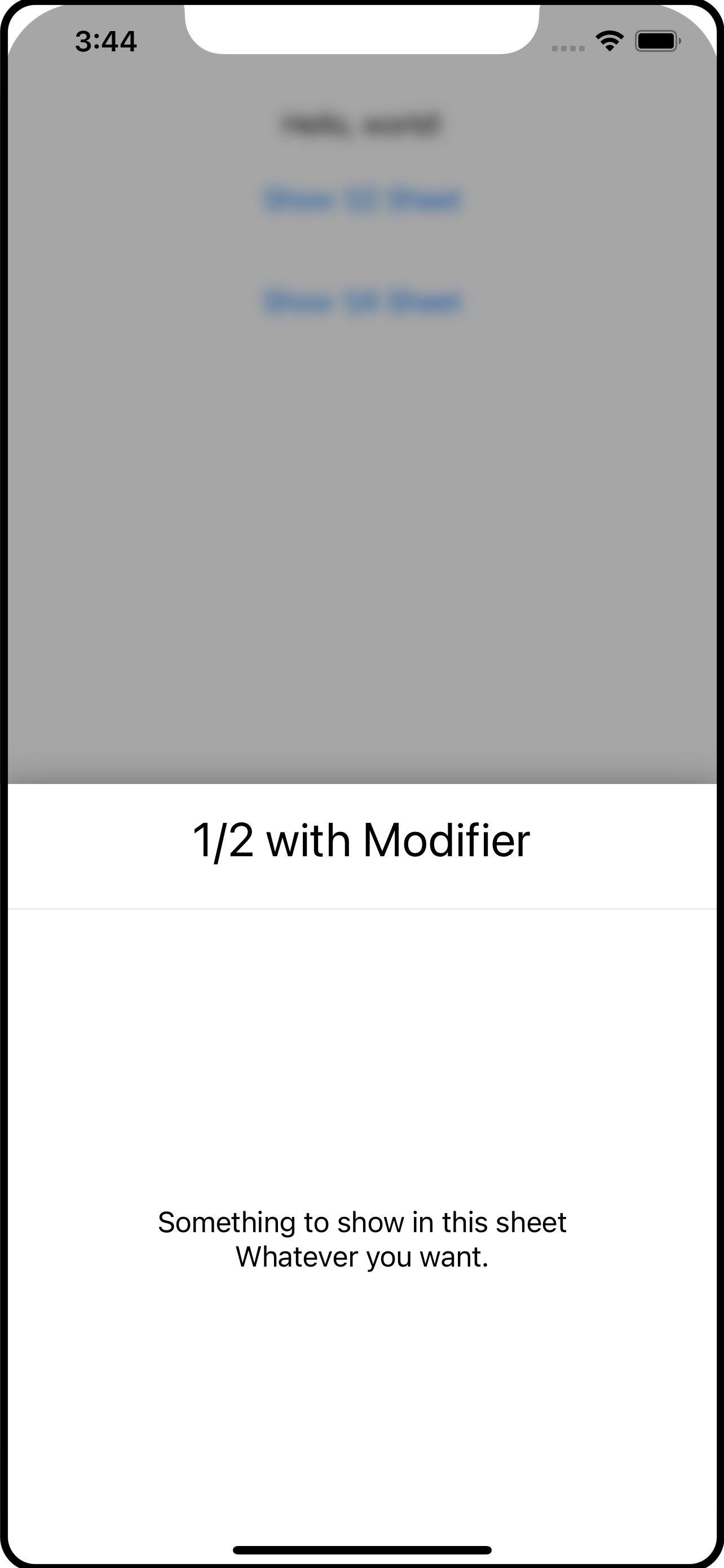
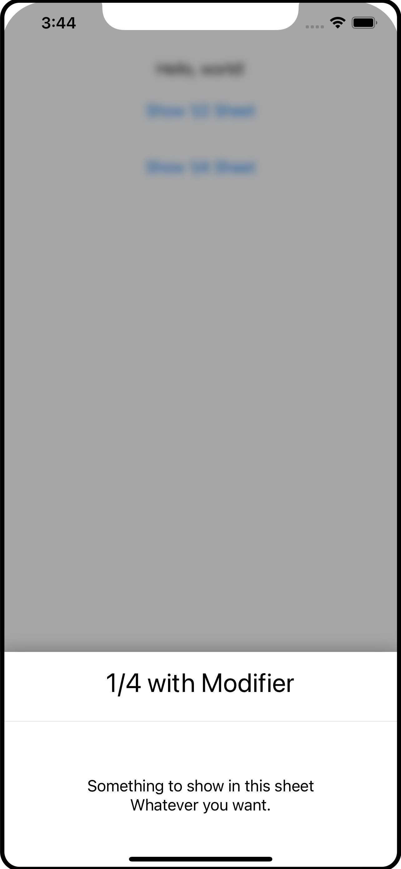
The problem with .sheet is that on the iPhone, it is a full screen affair. If you want to bring up a few details, a full screen sheet may not be what you want; the .sheet on the iPad is different; it floats up to the middle of the screen and does not take over the entire display.
What I’ve come up with is a different take on the sheet, using the .overlay modifier. In this article I will show you my HalfSheet and QuarterSheet overlays.
The code for this article is available in my GitHub Repository.
Normally, an article like this takes you on a journey, from the inception to building up the code to the final version. I’ve decided to just jump right into it and explain how it works. I’ll begin with how to use my half- and quarter-size sheets. Bear in mind that these are overlays and come with the caveats around overlays. Which are:
Overlays are the width of the view they are overlaying. You can modify that using
.framewith the size of the screen. I have not done that in this exercise.Overlays only overlay the view they are attached to. If you are expecting the overlay to always be on top, you should use
.overlayat the highest level (eg,ContentView).
How to Use The Sheets
The syntax for these sheet overlays is:
.halfSheet(isPresented: Binding<Bool>, content: ()->Content)
.quarterSheet(isPresented: Binding<Bool>, content: ()->Content)
You pass a binding to the sheet overlay and supply the content you want to see inside the sheet overlay. For example:
AnyView()
    .halfSheet(isPresented: self.$showHalfSheet) {
        SheetContents(title: "1/2 with Modifier")
    }
    .quarterSheet(isPresented: self.$showQuarterSheet) {
       SheetContents(title: "1/4 with Modifier")
    }
The SheetContents() view is irrelevant and you can see it in the screen shots. It’s just the content of the sheet.
To show the sheet, the app should change the binding within a withAnimation block. For example:
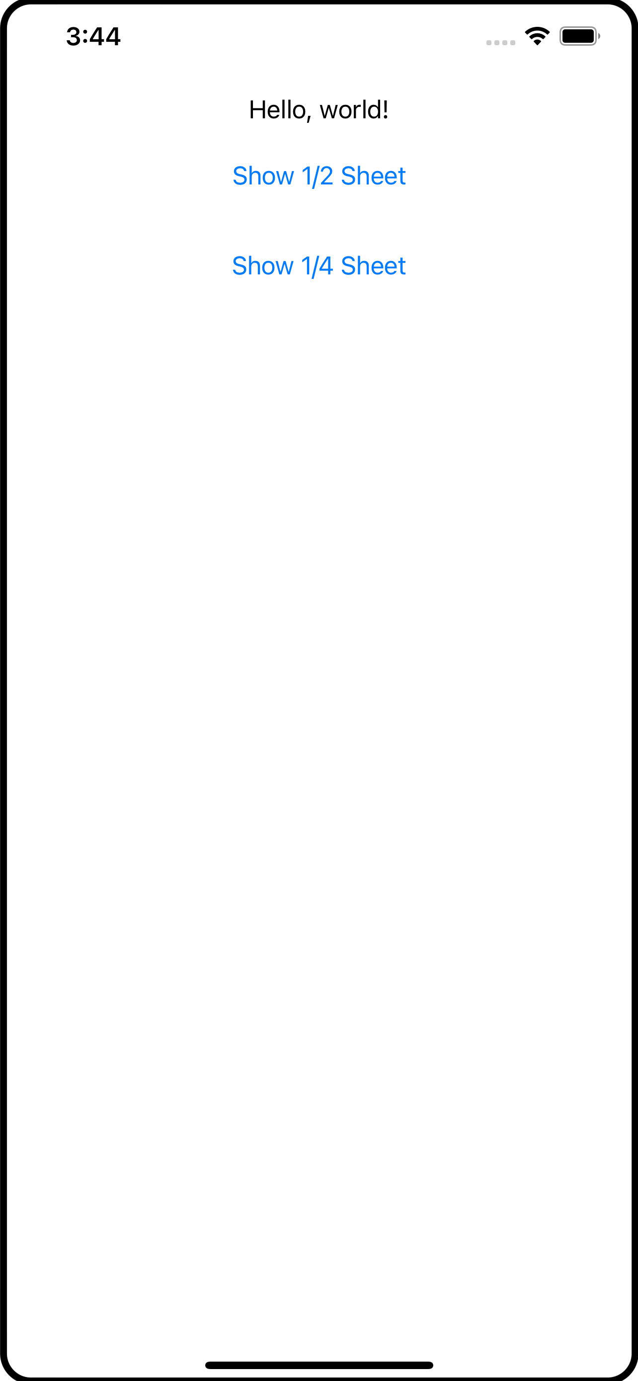
Button("Show 1/2 Sheet") {
    withAnimation {
        self.showHalfSheet.toggle()
    }
}.padding()
The withAnimation is necessary to trigger the transitions that are set up on the sheet overlays, which is shown later in this article.
So what are halfSheet and quarterSheet exactly? Let’s leave that for a moment and look at the overlay content itself.
The Code
PartialSheet
If you look at the code, you will find PartialSheet. This is actually the overlay content being shown as the sheet. It is what wraps SheetContents that you don’t see. Both the quarter and half sheet overlays use this.
struct PartialSheet<Content: View>: View {
    @Binding var isPresented: Bool
    var content: Content
    let height: CGFloat

    @State private var showingContent = false

    init(isPresented: Binding<Bool>, heightFactor: CGFloat, @ViewBuilder content: () -> Content) {
        _isPresented = isPresented
        height = heightFactor
        self.content = content()
    }
    var body: some View {
        GeometryReader { reader in
            ZStack(alignment: .bottom) {
                BlockingView(isPresented: self.$isPresented, showingContent: self.$showingContent)
                    .zIndex(0) // important to fix the zIndex so that transitions work correctly

                if showingContent {
                    self.content
                        .zIndex(1) // important to fix the zIndex so that transitins work correctly
                        .frame(width: reader.size.width, height: reader.size.height * self.height)
                        .clipped()
                        .shadow(radius: 10)
                        .transition(.asymmetric(insertion: .move(edge: .bottom), removal: .move(edge: .bottom)))
                }
            }
        }
        .edgesIgnoringSafeArea(.all)
    }
}
PartialSheet has three properties: the isPresented binding, the content to show inside (eg, SheetContents from above), and the height which is the percentage of the height to use.
The content comes in the form of a @ViewBuilder which is what lets this accept any View to use as the sheet (content inside).
I’ve used a GeometryReader to be able to get the dimensions of the area for the overlay which is used in the .frame and sets the height from the height value passed in.
I’ve used a ZStack to layer the components. There is BlockingView which is just a Color with a .onTapGesture to let the user tap in this area to dismiss the overlay; it is the translucent area between the sheet and the main app contents (see the screen shots).
When using transitions with
ZStackit is important to use fixed.zIndexvalues. This tells SwiftUI that these views should be reused and not re-created. If you leave off the.zIndex, SwiftUI will create new instances when the transitions happen and the transitions will not work as you expect.
Above the BlockingView is the actual content with a bunch of modifiers. One of the modifiers is the .frame to give it its height and a .transition to handle is appearance and disappearance. The .move will bring the view onto and off of the screen from the bottom. There is also a .shadow (and use .clipped so the shadow does not leak into the content).
The .edgesIgnoringSafeArea is applied to the outer component (GeometryReader) so you get a nice effect on the edges of the screen.
BlockingView
The BlockingView provides a means to shield the main app content from gestures while the overlay sheet is visible. You do not have to use this, but I think its a nice feature and consistent with the presentation of pop-ups and other overlays; it can be detrimental to your app if you allow the user to engage with the content while an overlay is visible.
private struct BlockingView: View {
    @Binding var isPresented: Bool
    @Binding var showingContent: Bool

    // showContent is called when the Color appears and then delays the
    // appearance of the sheet itself so the two don't appear simultaneously.

    func showContent() {
        DispatchQueue.main.asyncAfter(deadline: .now() + 0.25) {
            withAnimation {
                self.showingContent = true
            }
        }
    }

    // hides the sheet first, then after a short delay, makes the blocking
    // view disappear.

    func hideContent() {
        withAnimation {
            self.showingContent = false
        }
        DispatchQueue.main.asyncAfter(deadline: .now() + 0.25) {
            withAnimation {
                self.isPresented = false
            }
        }
    }

    var body: some View {
        Color.black.opacity(0.35)
            .onTapGesture {
                self.hideContent()
            }
            .onAppear {
                self.showContent()
            }
    }
}
The BlockingView is pretty simple: it shows a Color (I picked black but white gives a frosted feel). When the Color appears it triggers the showContent() function. An .onTapGesture captures a tap by the user and calls the hideContent() function.
The idea here is that you want to dim the view - THEN - show the sheet. When the sheet disappears, you want the sheet to go away BEFORE the Color fades out. The showContent() and hideContent() functions use asyncAfter to introduce a short delay while these effects run. And, importantly, they both use withAnimation blocks to change the state. This allows that transition on the content in PartialSheet view run correctly.
Test Run
You now have enough parts to make use of them, like this:
@State var showSheet = false
var body: some View {
  VStack { // just for something to look at
    Text("Hello World")
    Button("Show Sheet") {
      withAnimation {
        self.showSheeet.toggle()
      }
    }
  }
  .overlay(
    Group {
        if self.showSheet {
            PartialSheet(isPresented: self.$showSheet, heightFactor: 0.5) {
                SheetContents(title: "Trial Run")
            }
        } else {
            EmptyView()
        }
    }
  )
}
The .overlay uses a Group so that it shows either the PartialSheet or an EmptyView. The button changes the Bool and the sheet is displayed, SwiftUI running the transition to show it.
Let’s all well and good, but kind of messy. Your app code certainly needs to own and manage the boolean that is used to present the overlay sheet (eg, showSheet). But the .overlay and its content is just asking a lot, I think, if you need to use this in several places in your app.
And this is where .halfSheet and .quarterSheet come in. These are custom extension functions on View which makes use of ViewModifier.
View Extension
If you open the View+Modifiers.swift file, you will see how halfSheet and quarterSheet are defined:
extension View {
    func halfSheet<Content: View>(isPresented: Binding<Bool>,
                                  @ViewBuilder content: () -> Content) -> some View {
        self.modifier(PartialSheetModifier(isPresented: isPresented,
                                           heightFactor: 0.5
                                           sheet: AnyView(content())))
    }

    func quarterSheet<Content: View>(isPresented: Binding<Bool>,
                                     @ViewBuilder content: () -> Content) -> some View {
        self.modifier(PartialSheetModifier(isPresented: isPresented,
                                           heightFactor: 0.25
                                           sheet: AnyView(content())))
    }
}
The halfSheet function, for example, applies the PartialSheetModifier (defined below) and passes down the isPresented binding, a heightFactor of 0.5 (to make it a half sheet) and the content view. Using this, as shown at the beginning of this article, makes it easier for the developer to toss in a half or quarter sheet in the same vein as the SwiftUI .sheet modifier.
Notice that
@ViewBuildercontinues to follow through the code. However, when it reaches this point, we want to actually execute the builder and create the View, which is what happens in the call to the sheet initializers -content(). As you’ll read in a moment, the customViewModifieris expecting anAnyViewnot a builder.
The final piece of this is PartialSheetModifier:
private struct PartialSheetModifier: ViewModifier {
    @Binding var isPresented: Bool
    let heightFactor: CGFloat
    let sheet: AnyView

    func body(content: Content) -> some View {
        content
            .blur(radius: isPresented ? 4.0 : 0.0)
            .overlay(
                Group {
                    if isPresented {
                        PartialSheet(isPresented: self.$isPresented, heightFactor: heightFactor) {
                            sheet
                        }
                    } else {
                        EmptyView()
                    }
                }
            )
    }
}
PartialSheetModifier is a ViewModifier which is given the content (the View being modified, like a VStack) so you can add your own modifiers. Here, the content is given a blur effect if the sheet is being presented, and here you see the actual .overlay finally. As you read above in the trial run, the .overlay is a Group with a test that presents the sheet or an EmptyView.
To sum this up
An
.overlayis used to show the “sheet” which is whatever content you want in that sheet.@ViewBuilderis used to make it as flexible as possible to show content.The
.overlayis placed into a customViewModifierwhich itself is placed inside of a View extension function (eg,halfSheet).The
halfSheetandquarterSheetView extension functions usePartialSheetjust to pass in a specific height value (0.5 or 0.25).The
PartialSheetis aZStackwith aColorto block the user from interacting with the main app and the actual sheet content.Tap gestures to activate or dismiss the overlay sheet are done within
withAnimationblocks so a transition can be used to hide and show thePartialSheet.
I hope you’ve found this useful and can use it or even parts and concepts in your own apps.