
SwiftUI Modifiers
Modifiers in SwiftUI can do more than apply styling.
Modifiers, in SwiftUI, are like styles in other systems. Modifiers simply add more features to a component view. For example, changing the background color of an HStack to blue or changing its foreground color to white. When you declare a component view you very often give it at least one modifier (I assume padding() is a top favorite).
Custom Modifiers
You can, of course, create your own modifiers. They behave mostly like the built-in ones, and can be a handy way to avoid replicating the same set of modifiers. For instance, you might want all of your primary buttons to be capsule-shaped, have a green background, with bold white lettering, and with a subtle shadow:
Button("Push Me") { }
    .padding(10)
    .background(Capsule().foregroundColor(.green))
    .foregroundColor(.white)
    .font(.system(size: 17, weight: .bold, design: .default))
    .clipped()
    .shadow(radius: 6)
That’s a bunch of code to duplicate each time you want to have a primary-style button in your app, so a custom modifier is the way to go:
struct PrimaryButtonModifier: ViewModifier {
    func body(content: Content) -> some View {
        content
            .padding(10)
            .background(Capsule().foregroundColor(.green))
            .foregroundColor(.white)
            .font(.system(size: 17, weight: .bold, design: .default))
            .clipped()
            .shadow(radius: 6)
    }
}
And its now easy to apply:
Button("Push Me") { }
    .modifier(PrimaryButtonModifier())
Packaging a bunch of styling modifiers into a single place is nice and all, but modifiers can be even more helpful. Here are two examples that I’ve recently created.
Tap to Copy
I have this app which displays a bunch of Text components inside of a Form. I wanted the user to be able to tap on one and have the text copied to the clipboard. Because I had more than one of these, I created a modifier to do it:
struct CopyModifier: ViewModifier {
    let field: String

    @State private var showCopyAlert = false

    func body(content: Content) -> some View {
        content
            .contentShape(Rectangle())
            .onTapGesture {
                UIPasteboard.general.string = field
                showCopyAlert.toggle()
            }
            .alert("Field was Copied", isPresented: $showCopyAlert) {
                Button("OK", role: .cancel) { }
            }
    }
}
This modifier has a property, field, which is the string to copy. The body of the modifier:
adds a
contentShapeso it has a large tappable area. I do this withHStackcomponents to make sure even the whitespace in it can be tapped;uses the
onTapGestureto receive the tap and copy thefieldto the clipboard (akaUIPasteboard). Then it triggers analert;adds an
alertto let the user know the field was indeed copied.
Now you can use it like this:
HStack {
    Text(data.field1)
    Spacer()
}.modifier(CopyModifier(field: data.field1))
Hide Sheet
In one of my apps, I wanted to make sure any sheets being displayed were closed when the app became inactive. In a non-SwiftUI app I might have sub-classed the view and handled the event there, but since we cannot subclass structs, the next best thing was a modifier. Since I had a few sheets in the app, I created a modifier to do it:
struct HideSheetModifier: ViewModifier {
    @Environment(\.presentationMode) var presentationMode
    @Environment(\.scenePhase) var scenePhase

    func body(content: Content) -> some View {
        content
            .onChange(of: scenePhase) { newPhase in
                switch newPhase {
                case .inactive:
                    presentationMode.wrappedValue.dismiss()
                default:
                    break
                }
            }
    }
}
You apply this modifier to the top level View of your sheet and it:
uses the
@Environmentobject,scenePhase, to detect when the app is going inactive;uses the
@Environmentobject,presentationModeto dismiss the sheet.
This modifier will only apply to any sheets active, usually one, but if you layer of sheets, this will dismiss each one that has this modifier.
Summary
SwiftUI modifiers are not just for making things look good and simplifying styling. Modifiers can be pretty powerful and really extend the function of Views. Modifiers can use @Environment and @EnvironmentObject objects, be passed properties, apply gestures, etc. Since they are structs you can also make use of @State and @StateObject as well as having functions of their own.
I suspect my future apps will have way more modifiers than they do now. I hope yours do too.

Modal Dialogs with SwiftUI
A centralized way to display modal dialogs from anywhere inside a SwiftUI app.
A modal dialog is an interaction that interrupts the normal workflow and prevents anything happening except the dialog. The old Alert is a perfect example. When an Alert comes up you can do nothing but engage with the Alert.
SwiftUI has the Alert, but if you want to roll your own modal dialogs you have a take some things into account. You can use a SwiftUI Alert anywhere in your app. When the Alert is activated, it rises about all other content and puts up an input block to the rest of your app. Once the Alert has been addressed, it and the block go away.
And this is a key point: it rises above all other content no matter where in your View hierarchy it has been dispatched. If you want this same behavior in a custom modal dialog, you have to place it at the top of your View hierarchy, generally on the ContentView or whatever you are using as your main View.
I’ve come up with a way that makes it easier to mange and allows you to invoke your dialog anywhere in your app. The solution lies with two things: ObservableObject (in the form of a model) and enums with associated values.
A little while ago I wrote two blog articles: MultiDatePicker and custom sheets using .overlay. I’m going to combine these two in this article to show you what I came up with.
The Problem
First, it is not important that you use MultiDataPicker. I am using it here because its a control that takes a binding element and could work well as a modal dialog. But I could also use a TextField just as well. The custom sheets article basically moves the presentation of the sheet into a ViewModifier. I will use some of that here.
Secondly, I am creating a single modal dialog, but if you want to have different types (eg, pick a date, enter a phone number, rate a restaurant, etc.), you can easily adapt this example.
The idea is that from anywhere in your app you want to present the user with a modal dialog. The dialog should be above everything else and it should provide an input blocker so the user cannot use the app without addressing the modal dialog. Now I’m not saying using modal dialogs is a good or bad idea. But sometimes you need to get some info from the user at a particular point in time. For example:
You are on a travel site and pick the tab at the bottom for hotels.
The tab shows you a view with a list of hotels. You tap one of the hotels and navigates to a detail view about that hotel.
You pick the “Reservations” button, taking you a step deeper into the app to the reservations view.
Now you are on the Reservations view with a place to set your dates. You have traveled to:
ContentView->Hotel List View->Hotel Detail View->Reservations View.You now tap the dates field. If the app uses the SwiftUI
DatePickeryou are golden because it already operates as a modal dialog. But the developer of this app wants you to pick a date range (eg, check in, check out) decided to useMultiDatePickerinstead.The
MultiDatePickerappears floating above all other contents - the Navigation bar and the Tab bar, too, not just the content of the Reservations Screen (which might actually be a sub-area of another screen).
The Solution
The Dialog Model
We begin with the Dialog Model. This is a class that implements ObservableObject because we want to use it to set the type of dialog to open.
class DialogModel: NSObject, ObservableObject {
    @Published var dialogType: DialogType = .none
}
You see that it has a single @Published value for the dialogType. That is an enum defined as follows:
public enum DialogType {
    case none
    case dateDialog(Binding<ClosedRange<Date>?>)
  // add more enum cases and associated values for each dialog type.
}
What’s interesting about this enum is that for the dateDialog member, there is an associated value of ClosedRange<Date>? wrapped as a Binding. And it just so happens the MultiDatePicker has an initializer that also calls for an optional closed date range.
The Dialog Modifier
The next thing we are going to do is create a ViewModifier to activate the modal dialog based on the dialogType value of the DialogModel.
private struct DialogModifier: ViewModifier {

    // 1.
    @ObservedObject var dialogModel: DialogModel

    func body(content: Content) -> some View {
        content
            // 2.
            .overlay(
                Group {
                    switch dialogModel.dialogType {
                    // 3.
                    case .dateDialog(let dateRange):
                        ZStack {
                           // 4.
                            Color.black.opacity(0.35)
                                .zIndex(0)
                                .onTapGesture {
                                    withAnimation {
                                        self.dialogModel.dialogType = .none
                                    }
                                }
                            // 5.
                            MultiDatePicker(dateRange: dateRange)
                                .zIndex(1)
                        }
                        .edgesIgnoringSafeArea(.all)
                    default:
                        EmptyView()
                    }
                }
            )
    }
}
Some important bits about this DialogModifier:
This
ViewModifierneeds to use theDialogModelinstance, so it is declared as an@ObservedObjectbecause it implements theObservableObjectprotocol and because we want this to react to changes in its@Publishedmember,dialogType.An overlay is used to place Views above the
content. AGroupis used to select what to put into the overlay: anEmptyViewif no dialog is being displayed or aZStackwith the overlay Views.A
switchandcasestatement select for the dialog and grabs theBindingfrom the enum’s associated value.A simple
Coloris used for the blocker and a tap gesture set to make it possible to dismiss the dialog.The
MultiDatePickeritself, passing theenum’s associated value (dateRange) at initialization.
One thing to note: use static .zIndex values if using transitions with Views (which I did not use here, but you might want them).
Now let’s make this clean to use in the application with a little View extension:
extension View {
    func dialog(_ model: DialogModel) -> some View {
        self.modifier(DialogModifier(dialogModel: model))
    }
}
Applying the Dialog Modifier
This little extension function makes it a little bit nicer to apply the modifier:
import SwiftUI

@main
struct PlanWizardApp: App {
    // 1.
    @StateObject var dialogModel = DialogModel()

    var body: some Scene {
        WindowGroup {
            ContentView()
                // 2.
                .environmentObject(dialogModel)
                // 3.
                .dialog(dialogModel)
        }
    }
}
Declare and instantiate the
DialogModel. You want this to stick around so use@StateObject.Pass the
DialogModeldown into the app content views.Apply the
DialogModifierthrough the handy extension function, passing along theDialogModel.
That has set everything up. I told you that the dialogs needed to be at the top level, so it is in the App definition! When the DialogModel’s dialogType enum is set, the DialogModifier will take notice and display the appropriate dialog as an overlay on ContentView.
Showing the Dialog
So how do you actually make this work? Let’s assume you’ve got a Form someplace and it is from there you want to pop up the MultiDatePicker and display a date:
// 1.
@EnvironmentObject var dialogModel: DialogModel
// 2.
@State private var dateRange: ClosedRange<Date>? = nil
Form {
  // ...
  Section(header: Text("Dates")) {
    HStack {
      Text("\(dateRange)") // 3.
      Spacer()
      Button("Pick Dates") {
        // 4.
        self.dialogModel.dialogType = .dateDialog(self.$dateRange)
      }
    }
  }
}
Bring in the
DialogModelfor use in this View (see step 4).Declare a
varto hold the selected date range. In a real app you probably have this as part of some data model.Display the range selected. You will need a little more code here, but the idea is to show that this value has in fact changed.
Here is the key. When the
Pick Datesbutton is tapped, theDialogModelis set with the.dateDialogvalue and the associated value for theenumis set as a binding toself.dateRange. This is passed into theMultiDatePickerby theDateModifier. And because thedialogTypeis an@Publishedvarof theDialogModel, SwiftUI will cause theDateModifierto be executed and theMultiDatePickerwill appear as an overlay ofContentViewinside aZStack.
Summary
Maybe the ending was a little anticlimactic, but I think it paid off nicely.
Overlays only apply to the View they are attached to. If you want a “dialog” to appear above all other content you have to place the overlay on the topmost View. In this case,
ContentView. And do so in theAppdefinition.Overlays are modifiers, so a good place to encapsulate them is with a custom modifier like
DialogModifier. It can check a flag to see if the dialog view should be displayed or not. In this case itsdialogTypeof theDialogModel.You need to communicate the desire to see the dialog from anywhere in the app code all the way up to the
appdefinition. The best way to do that in SwiftUI is with anObservableObjectshared throughout the app using@EnvironmentObject(you could also define this as an@Environmentif you prefer).You also need to communicate data from the dialog back to whatever wants to see it (generally to a
@Statevar declared in the View that triggered the dialog’s appearance). One way to do that is through anenumwith an associated value that is aBinding.Combining the
enumsetter with@Publishedin theObservableObjectmodel make a good way to trigger the appearance of the dialog as well as provide a data bridge using aBinding.
So there you have it. I hope if you need dialogs (or even a centralized location for .sheet and .alert modifiers) you will find this solution handy.

Filter Bar with SwiftUI
An alternative to the text-only search bar.
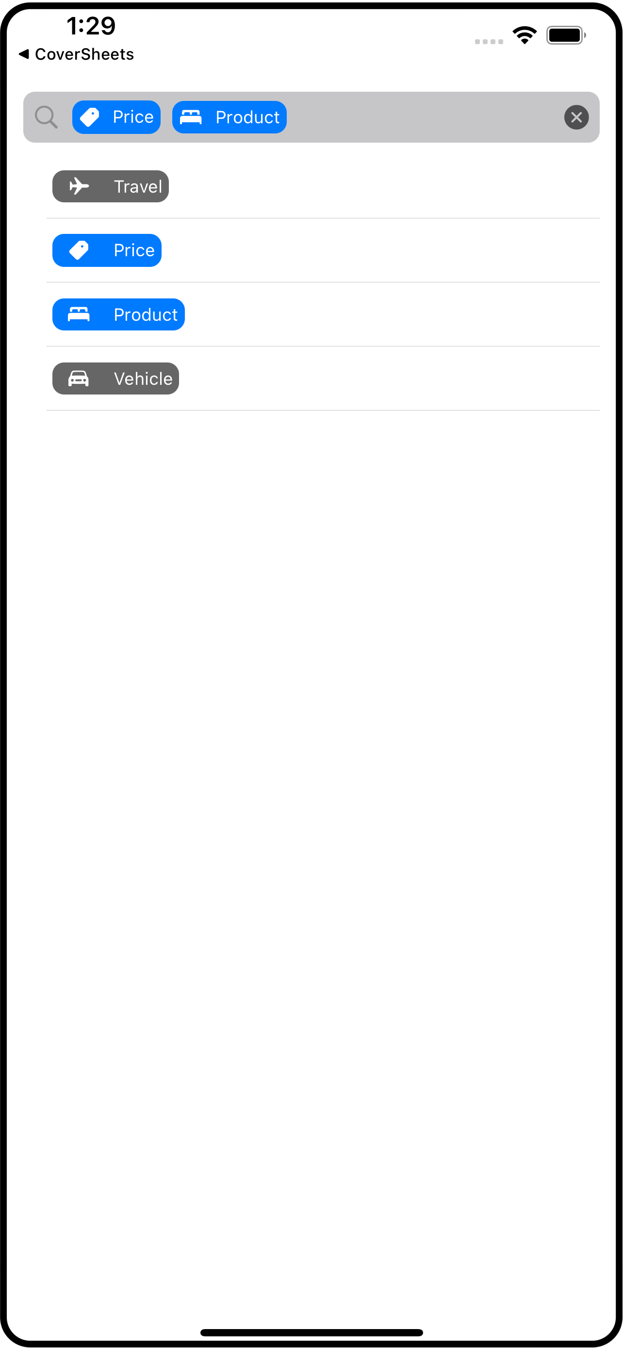
Sometimes you want do a search on categories or groups rather than on specific words or strings. I threw together this filtered search bar to help. You will have to combine the parts in ways that make sense for you, but at least you’ll have some pieces to use.
The idea is that you have a search bar-like area that gets filled with “filters” which I represent using image+title pairs (SwiftUI’s Label component).
Let’s begin with the model. Create a file called FilterModel.swift and place this definition of FilterData into it (you could put this into its own file, but it goes with the model):
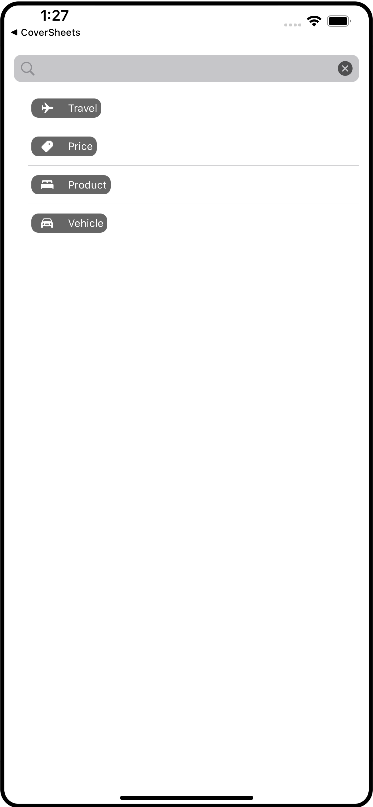
struct FilterData: Identifiable {
    var id = UUID()
    var imageName: String
    var title: String
    var isSelected: Bool = false
}
Below that, in this same file, define FilterModel itself.
class FilterModel: NSObject, ObservableObject {

    // 1. normally you would get this data from a remote service, so factor that in if you use
    // this in your own projects. If this data is not static, consider making it @Published
    // so that any changes to it will get reflected by the UI
    var data = [
        FilterData(imageName: "airplane", title: "Travel"),
        FilterData(imageName: "tag.fill", title: "Price"),
        FilterData(imageName: "bed.double.fill", title: "Product"),
        FilterData(imageName: "car.fill", title: "Vehicle")
    ]

    // 2. these are the FilterData that have been selected using the toggleFilter(at:)
    // function.
    @Published var selection = [FilterData]()

    // 3. toggles the selection of the filter at the given index
    func toggleFilter(at index: Int) {
        guard index >= 0 && index < data.count else { return }
        data[index].isSelected.toggle()
        refreshSelection()
    }

    // 4. clears the selected items
    func clearSelection() {
        for index in 0..<data.count {
            data[index].isSelected = false
        }
        refreshSelection()
    }

    // 5. remakes the published selection list
    private func refreshSelection() {
        let result = data.filter{ $0.isSelected }
        withAnimation {
            selection = result
        }
    }
}
The model’s job is to provide the data for the UI to display. Here we have:
The
datais the list ofFilterDataitems. In a real app this list would come from a remote API server. For this example they are just hard-coded.The
selectionare thoseFilterDatathat have been picked by the user for the search. Notice that this is@Publishedwhich means the UI can observe changes to this variable. More precisely, the UI will not notice changes to the array itself, just whether or notselectionitself has changed.The
toggleFilterfunction adds or removes aFilterDatafrom the selection. It does this by building a new array from theFilterDatawhere an item’sisSelectedvalue istrue.The
clearSelectionfunction just sets everyFilterData.isSelectedin thedatatofalse.The
refreshSelectionfunction is private and is called fromtoggleFilterandclearSelection. It is the function that builds a newselection. Notice that when it setsselectionto the new value it does so within anwithAnimationblock. You’ll see how this is used later.
Now that we’ve got a model, let’s look at how a FilterData is represented visually. Create a new SwiftUI View file called FilterTag.swift and put this code into it:
struct FilterTag: View {
    // 1
    var filterData: FilterData

    // 2
    var body: some View {
        Label(filterData.title, systemImage: filterData.imageName)
            .font(.caption)
            .padding(4)
            .foregroundColor(.white)
            .background(
                RoundedRectangle(cornerRadius: 8)  // 3
                    .foregroundColor(filterData.isSelected ? .accentColor : Color.black.opacity(0.6))
            )
            // 4
            .transition(.asymmetric(insertion: .move(edge: .leading), removal: .move(edge: .leading)))
    }
}
This
structhas aFilterDataproperty because that is what it going to reflect, visually.The
bodyis just a SwiftUILabelwith some modifiers to give it rounded rectangle background.Notice that background color is dependent on the
isSelectedproperty of theFilterData.Finally, you can see the
transitionproperty. This is where thewithAnimationcomes into play. This transition will be applied when theFilterTagis appears (inserted into the display list) and when it disappears (removed from the display list). I picked a slide effect but you can do whatever you think looks nice, of course.
The last piece is the FilterBar itself, so go ahead and create a FilterBar.swift SwiftUI View file and place this code into it:
struct FilterBar: View {
    // 1
    @EnvironmentObject var filterModel: FilterModel

    // 2
    var body: some View {
        HStack {
            Image(systemName: "magnifyingglass")
                .foregroundColor(.gray)
            // 3
            ScrollView(.horizontal, showsIndicators: false) {
                HStack {
                    ForEach(filterModel.selection) { item in
                        FilterTag(filterData: item)
                    }
                }
            }
            Spacer()
            Button(action: { filterModel.clearSelection() }) {
                Image(systemName: "xmark.circle.fill")
                    .foregroundColor(Color.black.opacity(0.6))
            }
        }
        .padding(6)
        .background(RoundedRectangle(cornerRadius: 8).foregroundColor(Color.gray.opacity(0.5)))
    }
}
The
FilterBarneeds aFilterModelto work. I usually pass around models using@EnvironmentObjectbut you could also pass it in as a property and declare it with@ObservedObjectsince you want this UI to watch for changes to it (ie, theselectionproperty).The “bar” is an
HStackwith a magnifying glass image, a horizontally scrollable collection ofFilterTagviews, and a clear button.The scrollable portion is itself an
HStackbuilt using aForEachcomponent using the model’sselectionproperty. Becauseselectionis a@Publishedproperty of anObservableObject, SwiftUI automatically watches it. When it gets changed, SwiftUI will re-run thisForEach.
To see all this in action, let’s modify ContentView to display the list of filters in the model’s data and when on is tapped, make it selected (or not):
struct ContentView: View {
    @ObservedObject var filterModel = FilterModel()

    var body: some View {
        VStack {
            FilterBar()
                .environmentObject(filterModel)
            Spacer()
            List {
                ForEach(0..<filterModel.data.count) { index in
                    FilterTag(filterData: filterModel.data[index])
                        .onTapGesture {
                            filterModel.toggleFilter(at: index)
                        }
                }
            }
        }
        .padding()
    }
}
And there you have a different type of search bar - one that uses “filters” that represents subsets of the data.
I used a simple list to present the filter choices, but you might need something more complex. For example, you might have a section for pricing. Each item of that section might be prices from $1000 and up, from $500 to $1000, from $250 to $500, from $100 to $250, and below $100. But the filter bar would just show the same visual tag - its just so the user knows they are filtering by price. You could expand FilterData to include enums or whatever else you needed to capture all the information so it can be easily sent to your backend system to carry out the filtering (or if you have all the data already loaded, do it instantly).
I hope you find some use in this or that it sparks some ideas.

Sheets with SwiftUI
An alternative to full screen action sheets using overlays in SwiftUI
If you’ve been using SwiftUI for a while now, you have undoubtedly come across the .sheet modifier. This takes a View and turns it into a slide-up view. Sheets are a great way to quickly display ancillary information or get some quick input from the user.
The problem with .sheet is that on the iPhone, it is a full screen affair. If you want to bring up a few details, a full screen sheet may not be what you want; the .sheet on the iPad is different; it floats up to the middle of the screen and does not take over the entire display.
What I’ve come up with is a different take on the sheet, using the .overlay modifier. In this article I will show you my HalfSheet and QuarterSheet overlays.
The code for this article is available in my GitHub Repository.
Normally, an article like this takes you on a journey, from the inception to building up the code to the final version. I’ve decided to just jump right into it and explain how it works. I’ll begin with how to use my half- and quarter-size sheets. Bear in mind that these are overlays and come with the caveats around overlays. Which are:
Overlays are the width of the view they are overlaying. You can modify that using
.framewith the size of the screen. I have not done that in this exercise.Overlays only overlay the view they are attached to. If you are expecting the overlay to always be on top, you should use
.overlayat the highest level (eg,ContentView).
How to Use The Sheets
The syntax for these sheet overlays is:
.halfSheet(isPresented: Binding<Bool>, content: ()->Content)
.quarterSheet(isPresented: Binding<Bool>, content: ()->Content)
You pass a binding to the sheet overlay and supply the content you want to see inside the sheet overlay. For example:
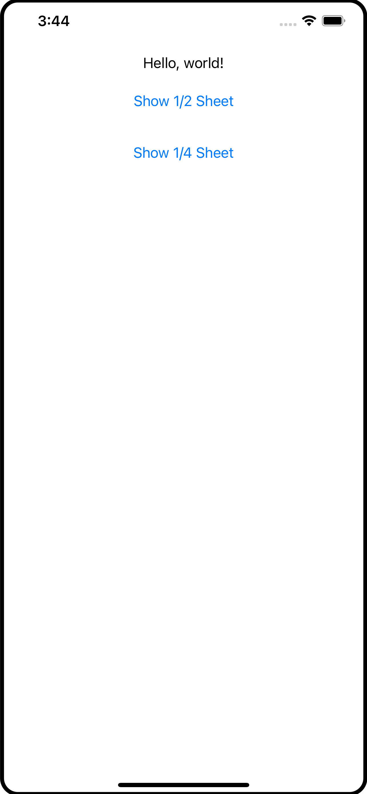
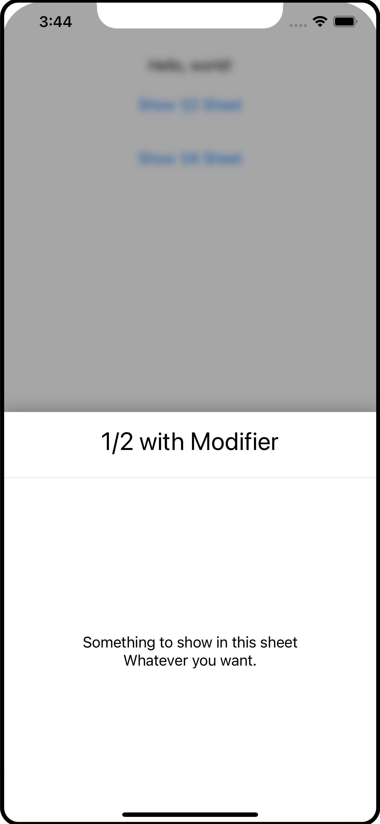
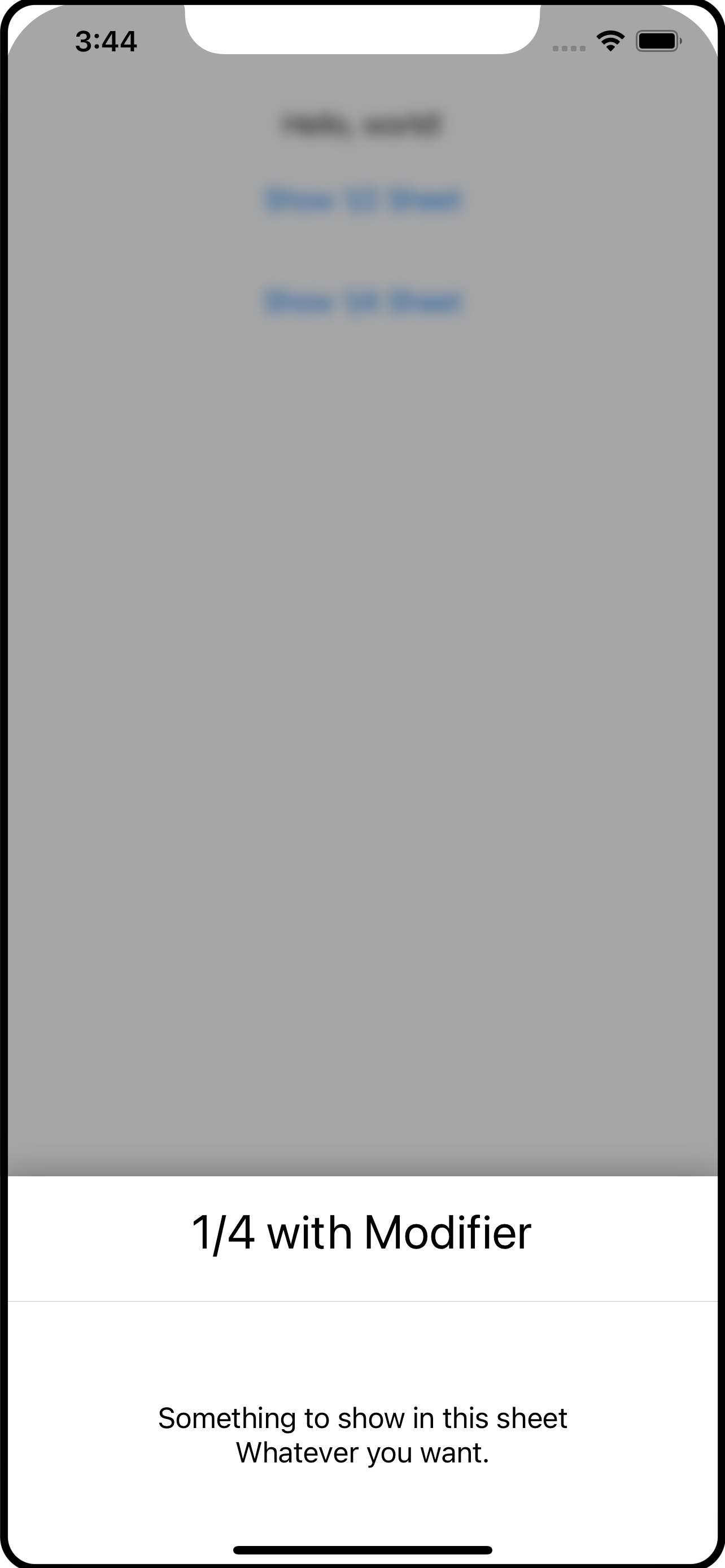
AnyView()
    .halfSheet(isPresented: self.$showHalfSheet) {
        SheetContents(title: "1/2 with Modifier")
    }
    .quarterSheet(isPresented: self.$showQuarterSheet) {
       SheetContents(title: "1/4 with Modifier")
    }
The SheetContents() view is irrelevant and you can see it in the screen shots. It’s just the content of the sheet.
To show the sheet, the app should change the binding within a withAnimation block. For example:
Button("Show 1/2 Sheet") {
    withAnimation {
        self.showHalfSheet.toggle()
    }
}.padding()
The withAnimation is necessary to trigger the transitions that are set up on the sheet overlays, which is shown later in this article.
So what are halfSheet and quarterSheet exactly? Let’s leave that for a moment and look at the overlay content itself.
The Code
PartialSheet
If you look at the code, you will find PartialSheet. This is actually the overlay content being shown as the sheet. It is what wraps SheetContents that you don’t see. Both the quarter and half sheet overlays use this.
struct PartialSheet<Content: View>: View {
    @Binding var isPresented: Bool
    var content: Content
    let height: CGFloat

    @State private var showingContent = false

    init(isPresented: Binding<Bool>, heightFactor: CGFloat, @ViewBuilder content: () -> Content) {
        _isPresented = isPresented
        height = heightFactor
        self.content = content()
    }
    var body: some View {
        GeometryReader { reader in
            ZStack(alignment: .bottom) {
                BlockingView(isPresented: self.$isPresented, showingContent: self.$showingContent)
                    .zIndex(0) // important to fix the zIndex so that transitions work correctly

                if showingContent {
                    self.content
                        .zIndex(1) // important to fix the zIndex so that transitins work correctly
                        .frame(width: reader.size.width, height: reader.size.height * self.height)
                        .clipped()
                        .shadow(radius: 10)
                        .transition(.asymmetric(insertion: .move(edge: .bottom), removal: .move(edge: .bottom)))
                }
            }
        }
        .edgesIgnoringSafeArea(.all)
    }
}
PartialSheet has three properties: the isPresented binding, the content to show inside (eg, SheetContents from above), and the height which is the percentage of the height to use.
The content comes in the form of a @ViewBuilder which is what lets this accept any View to use as the sheet (content inside).
I’ve used a GeometryReader to be able to get the dimensions of the area for the overlay which is used in the .frame and sets the height from the height value passed in.
I’ve used a ZStack to layer the components. There is BlockingView which is just a Color with a .onTapGesture to let the user tap in this area to dismiss the overlay; it is the translucent area between the sheet and the main app contents (see the screen shots).
When using transitions with
ZStackit is important to use fixed.zIndexvalues. This tells SwiftUI that these views should be reused and not re-created. If you leave off the.zIndex, SwiftUI will create new instances when the transitions happen and the transitions will not work as you expect.
Above the BlockingView is the actual content with a bunch of modifiers. One of the modifiers is the .frame to give it its height and a .transition to handle is appearance and disappearance. The .move will bring the view onto and off of the screen from the bottom. There is also a .shadow (and use .clipped so the shadow does not leak into the content).
The .edgesIgnoringSafeArea is applied to the outer component (GeometryReader) so you get a nice effect on the edges of the screen.
BlockingView
The BlockingView provides a means to shield the main app content from gestures while the overlay sheet is visible. You do not have to use this, but I think its a nice feature and consistent with the presentation of pop-ups and other overlays; it can be detrimental to your app if you allow the user to engage with the content while an overlay is visible.
private struct BlockingView: View {
    @Binding var isPresented: Bool
    @Binding var showingContent: Bool

    // showContent is called when the Color appears and then delays the
    // appearance of the sheet itself so the two don't appear simultaneously.

    func showContent() {
        DispatchQueue.main.asyncAfter(deadline: .now() + 0.25) {
            withAnimation {
                self.showingContent = true
            }
        }
    }

    // hides the sheet first, then after a short delay, makes the blocking
    // view disappear.

    func hideContent() {
        withAnimation {
            self.showingContent = false
        }
        DispatchQueue.main.asyncAfter(deadline: .now() + 0.25) {
            withAnimation {
                self.isPresented = false
            }
        }
    }

    var body: some View {
        Color.black.opacity(0.35)
            .onTapGesture {
                self.hideContent()
            }
            .onAppear {
                self.showContent()
            }
    }
}
The BlockingView is pretty simple: it shows a Color (I picked black but white gives a frosted feel). When the Color appears it triggers the showContent() function. An .onTapGesture captures a tap by the user and calls the hideContent() function.
The idea here is that you want to dim the view - THEN - show the sheet. When the sheet disappears, you want the sheet to go away BEFORE the Color fades out. The showContent() and hideContent() functions use asyncAfter to introduce a short delay while these effects run. And, importantly, they both use withAnimation blocks to change the state. This allows that transition on the content in PartialSheet view run correctly.
Test Run
You now have enough parts to make use of them, like this:
@State var showSheet = false
var body: some View {
  VStack { // just for something to look at
    Text("Hello World")
    Button("Show Sheet") {
      withAnimation {
        self.showSheeet.toggle()
      }
    }
  }
  .overlay(
    Group {
        if self.showSheet {
            PartialSheet(isPresented: self.$showSheet, heightFactor: 0.5) {
                SheetContents(title: "Trial Run")
            }
        } else {
            EmptyView()
        }
    }
  )
}
The .overlay uses a Group so that it shows either the PartialSheet or an EmptyView. The button changes the Bool and the sheet is displayed, SwiftUI running the transition to show it.
Let’s all well and good, but kind of messy. Your app code certainly needs to own and manage the boolean that is used to present the overlay sheet (eg, showSheet). But the .overlay and its content is just asking a lot, I think, if you need to use this in several places in your app.
And this is where .halfSheet and .quarterSheet come in. These are custom extension functions on View which makes use of ViewModifier.
View Extension
If you open the View+Modifiers.swift file, you will see how halfSheet and quarterSheet are defined:
extension View {
    func halfSheet<Content: View>(isPresented: Binding<Bool>,
                                  @ViewBuilder content: () -> Content) -> some View {
        self.modifier(PartialSheetModifier(isPresented: isPresented,
                                           heightFactor: 0.5
                                           sheet: AnyView(content())))
    }

    func quarterSheet<Content: View>(isPresented: Binding<Bool>,
                                     @ViewBuilder content: () -> Content) -> some View {
        self.modifier(PartialSheetModifier(isPresented: isPresented,
                                           heightFactor: 0.25
                                           sheet: AnyView(content())))
    }
}
The halfSheet function, for example, applies the PartialSheetModifier (defined below) and passes down the isPresented binding, a heightFactor of 0.5 (to make it a half sheet) and the content view. Using this, as shown at the beginning of this article, makes it easier for the developer to toss in a half or quarter sheet in the same vein as the SwiftUI .sheet modifier.
Notice that
@ViewBuildercontinues to follow through the code. However, when it reaches this point, we want to actually execute the builder and create the View, which is what happens in the call to the sheet initializers -content(). As you’ll read in a moment, the customViewModifieris expecting anAnyViewnot a builder.
The final piece of this is PartialSheetModifier:
private struct PartialSheetModifier: ViewModifier {
    @Binding var isPresented: Bool
    let heightFactor: CGFloat
    let sheet: AnyView

    func body(content: Content) -> some View {
        content
            .blur(radius: isPresented ? 4.0 : 0.0)
            .overlay(
                Group {
                    if isPresented {
                        PartialSheet(isPresented: self.$isPresented, heightFactor: heightFactor) {
                            sheet
                        }
                    } else {
                        EmptyView()
                    }
                }
            )
    }
}
PartialSheetModifier is a ViewModifier which is given the content (the View being modified, like a VStack) so you can add your own modifiers. Here, the content is given a blur effect if the sheet is being presented, and here you see the actual .overlay finally. As you read above in the trial run, the .overlay is a Group with a test that presents the sheet or an EmptyView.
To sum this up
An
.overlayis used to show the “sheet” which is whatever content you want in that sheet.@ViewBuilderis used to make it as flexible as possible to show content.The
.overlayis placed into a customViewModifierwhich itself is placed inside of a View extension function (eg,halfSheet).The
halfSheetandquarterSheetView extension functions usePartialSheetjust to pass in a specific height value (0.5 or 0.25).The
PartialSheetis aZStackwith aColorto block the user from interacting with the main app and the actual sheet content.Tap gestures to activate or dismiss the overlay sheet are done within
withAnimationblocks so a transition can be used to hide and show thePartialSheet.
I hope you’ve found this useful and can use it or even parts and concepts in your own apps.